




























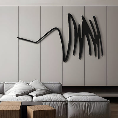

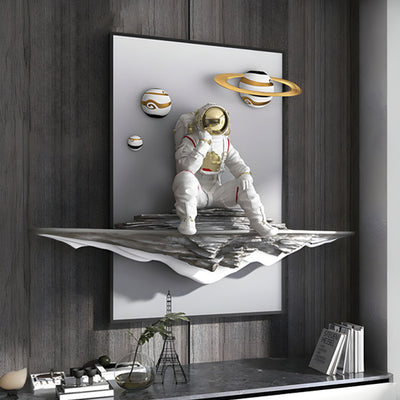

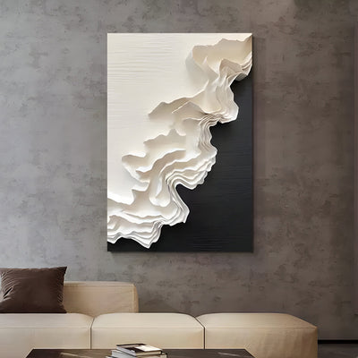
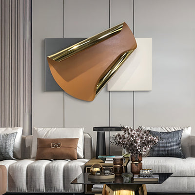

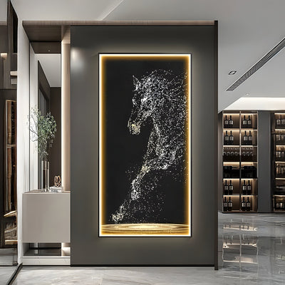
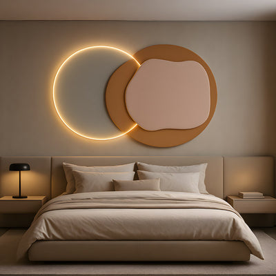
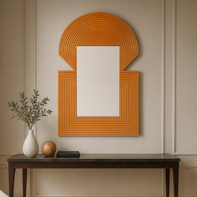
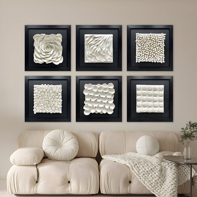
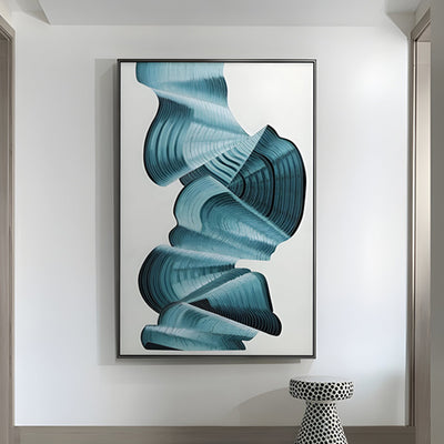
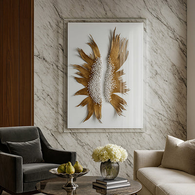
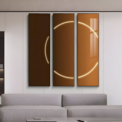
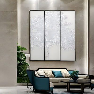













Stand in front of a 1930s bank tower and count the free-standing statues. You will usually reach zero. Art Deco architecture pulled its sculpture into the building itself: relief panels sunk into limestone, cast metal spandrels, chevrons carved straight above the entrance. That one habit explains most of the mistakes designers make when they add sculpture to a Deco interior or facade today.

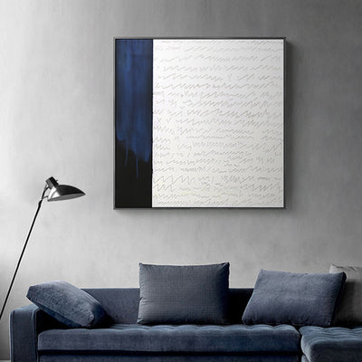
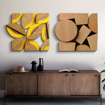
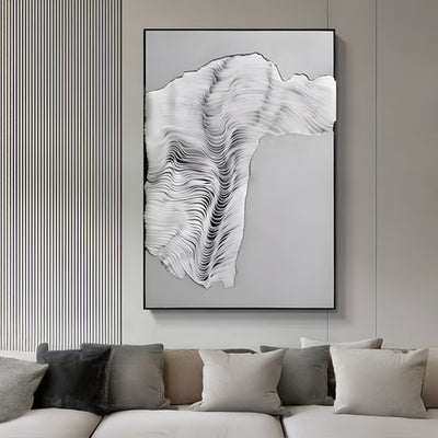
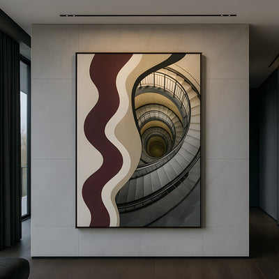
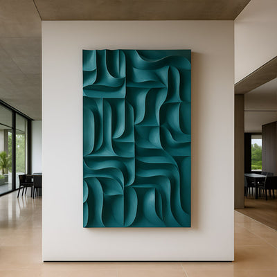
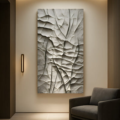
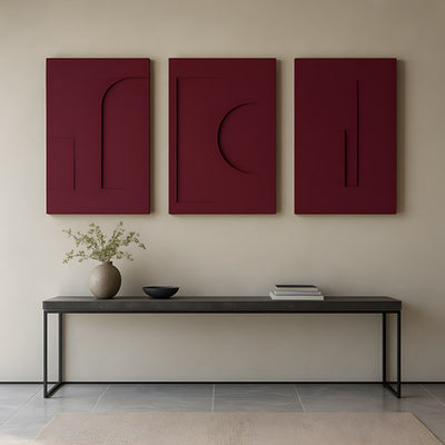
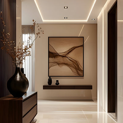
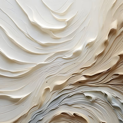
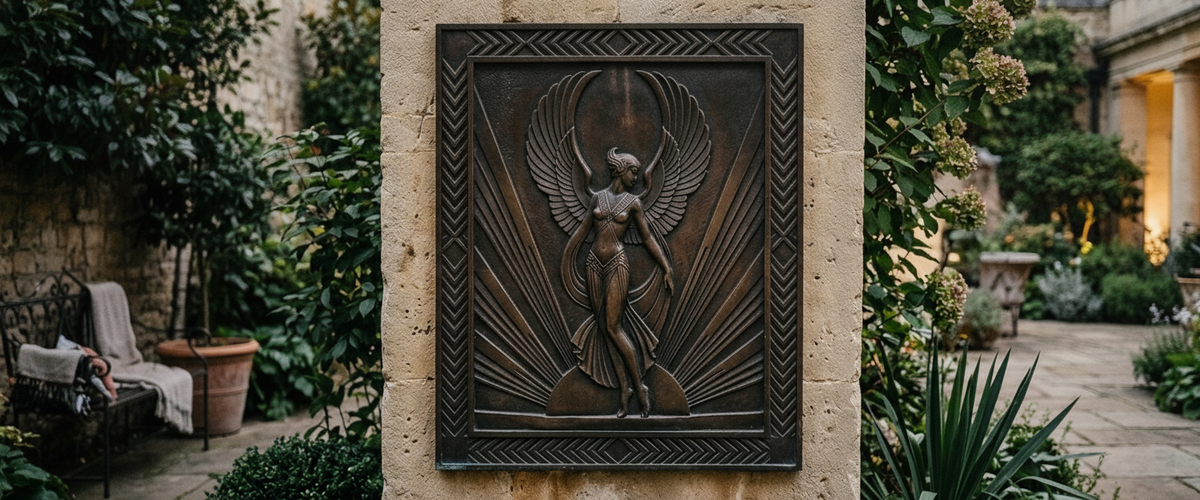
Relief rather than statuary: art deco architecture keeps ornament flat against the structure.
Key Takeaways
Art Deco architecture was designed for relief and applied ornament, so a free-standing figure parked in front of a Deco facade often reads as an afterthought.
The quickest way to separate Art Nouveau architecture from Deco is the curve: organic and asymmetric versus stepped, faceted and repeatable.
Beaux Arts architecture is symmetrical by nature, which means it usually demands matched pairs rather than a single hero piece.
Brass, chrome, black marble and cast stone remain the honest palette; polished stainless steel and patinated bronze are the modern equivalents we specify most.
Budget depends on material, scale, engineering, finishing and installation, so treat every Deco commission as a quoted project rather than a catalog pick.
Stepped Setbacks and Zigzags: Why Art Deco Architecture Wants Relief
The style came out of the 1925 Paris exhibition of decorative and industrial arts, and it carried one rule from the start: ornament belonged on the structure, flattened and stylized, keyed to the building's grid. Setbacks created stacked horizontal bands. Piers created vertical runs. Sculptors filled those bands with low relief because the geometry of art deco architecture left nowhere else to go.
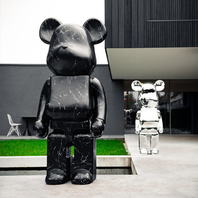
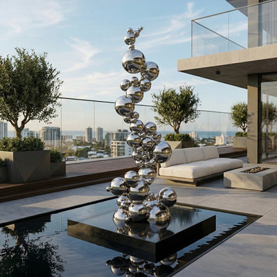
Commission for that condition and you get harmony. Cast bronze or aluminium relief panels, spandrel plaques, stylized figures compressed into a rectangle, incised stone lettering flanked by rays. Commission a full-round figure on a plinth and you fight the wall behind it. If the site genuinely needs a free-standing piece, place it away from the facade plane, in a forecourt or on axis in a courtyard, where the building becomes background rather than competition. Our architecture art collection is a useful reference for how architectural motifs behave when they stay flat against a surface.
Where Art Nouveau Ends and Art Deco Begins, Judged on a Single Curve
Clients confuse the two constantly, and it costs them. Art Nouveau architecture, roughly 1890 to 1910, is whiplash curves, iron tendrils, poppy stems, hair that turns into water. Nothing repeats exactly. The French phrasing art nouveau en architecture still turns up in European conservation writing, and it points to the same instinct: nature, drawn freehand, wrapped around structure. Look at a Nouveau balustrade and you can feel a hand behind it.
Art Deco architecture takes the same appetite for ornament and runs it through a drafting machine. Curves become arcs struck from a compass. Sunbursts are radial and even. Foliage becomes a stack of tapered fins. If a motif could be reproduced identically twenty times by a foundry or a metal shop, you are looking at Deco. If it looks like it grew, it is Nouveau. That test decides your material and your fabrication method before you sketch anything.

Beaux Arts Architecture Forces Pairs
Beaux Arts architecture, the academic classical style that dominated American civic building before Deco, is organized around a centre line. Paired columns, paired urns, paired lions. Drop a single sculpture beside a Beaux Arts staircase and most visitors will not read it as a bold gesture; they will read it as the moment the second one went missing.
We had exactly this conversation with a design team restoring an early twentieth-century hotel entrance. They wanted one large bronze at the base of the stair. We mocked up the single-piece option in the studio, then a matched pair at reduced height, and the pair won immediately. Symmetrical buildings answer to symmetry. Art Deco architecture, by contrast, tolerates a single asymmetric accent because the setbacks already break the massing.
Brass, Chrome, Black Marble and Cast Stone in Current Commissions
The original palette was deliberate: polished brass and nickel for hardware and grilles, black or green marble for bases and dados, cast stone for exterior relief, lacquered wood and etched glass inside. Reproducing it literally can look like a film set. Translating it works better.
In practice, that means patinated bronze in place of dulled brass, mirror-polished or satin stainless steel in place of chrome plate, honed dark granite where black marble is impractical outdoors, and Corten where a warm oxidized field is wanted on a modern wall. Interior metalwork still needs sensible care; the Smithsonian's Museum Conservation Institute publishes clear guidance on handling and cleaning metal surfaces, and the short version is that a soft dry cloth and restraint beat any proprietary polish. For wrought and cast ironwork with the linear geometry of art deco architecture, our iron art and wrought iron wall decor range shows how metalwork holds a wall without shouting at it.
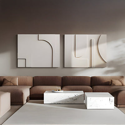
A datum-aligned metal relief sitting with, not against, the lobby's horizontal registers.
How to Read a Lobby's Rhythm Before You Commission Anything
Before specifying, spend twenty minutes measuring the room's repeats. Count the bay spacing. Note the height of the marble dado, the top line of the elevator surrounds, the depth of any coffer or reveal. Interiors built in art deco architecture run on horizontal registers, and a sculpture that ignores those lines will look tilted even when it is dead level.
Two rules we apply on almost every lobby project. First, align the top or bottom edge of new work with an existing datum line rather than centring it on empty wall. Second, respect the reveal depth; a relief that projects further than the surrounding architecture casts shadows the original designers never planned for. In a residential entry, a stepped geometric piece such as the Orbis White Geometric Multi-Tier Decorative Shelf is a cheap way to test how a datum-aligned motif sits against the wall before you commit to cast metal. Where the scheme calls for arcs rather than steps, the Orbis Mint Circular Multi-Tier Decorative Shelf carries the same compass-drawn language with less severity.

Deco Geometry on a Modern Garden Wall, and Where It Tips Into Pastiche
Motifs borrowed from art deco architecture work beautifully outdoors, particularly on the long blank render walls common in California and Arizona courtyards. A tall Corten or stainless fin panel with stepped shoulders and a radial fan reads as contemporary, not costume. Scale it generously; a 6 to 8 ft (1.8 to 2.4 m) panel holds a garden wall where a 3 ft (0.9 m) one disappears.
It tips into pastiche when the piece starts quoting period details it has no reason to carry: fake rivets, sunburst plus fluting plus zigzag stacked on one panel, or gold-effect paint standing in for gilding. Pick one motif, execute it precisely, and let the material be honest. Browse the outdoor wall art and broader wall art and wall decor ranges to see how single-motif panels behave at scale.
Commissioning Checklist for a Deco Setting
Photograph the elevation straight on and mark every horizontal datum before drawing anything.
Confirm whether the building is symmetrical; if it is, plan for a pair.
Decide relief depth early, since it drives casting method and fixing type.
Check wall build-up and structural capacity for a metal panel's weight and wind load.
Agree a finish sample in daylight and under the venue's actual lighting.
Set a maintenance interval for waxing bronze or rinsing stainless in coastal air.
Ask for a tailored quote covering fabrication, finishing, crating, shipping and install.
Art Deco architecture is the moment art and architecture stopped negotiating and merged into one surface. Commission with that in mind and the work looks like it was always there. Giant Sculptures builds bespoke relief panels, cast figures and engineered metalwork for buildings of every period, and we are happy to review drawings before you commit to a form.
For wider placement ideas, Living Room Wall Art: Why Scale Beats Style Every Time is useful companion reading before finalising the setting and sightlines.