














































Put a reproduction 1950s print inside a chipped, gold-sprayed "vintage" frame and you no longer have a living room. You have a theme bar with a sofa in it. Most framed retro art goes wrong at exactly this point: the buyer treats the frame as another period prop instead of the piece of engineering that decides how the print reads across the room. The image is already doing the nostalgia. The frame should do the discipline.
Quick Answer
Skip faux-vintage frames. Modern, quiet moldings make old graphics look deliberate.
Frame by genre. Pin-up, travel posters and graphic ads each need a different treatment.
Control reflections. Anti-reflective, UV-filtering glazing protects saturated mid-century inks and keeps dark tones dark.
Go wider on the mat than feels natural. Generous borders read as gallery; tight ones read as dorm.
Grid, don't scatter. In contemporary rooms, a tight grid beats a salon hang.

Pin-Up, Travel Poster or Ad? Match the Frame to the Genre
Most retro pin up art reached its audience small. Calendar pages and magazine illustrations were meant to be held, so they reward intimacy: a narrow molding, a wide mat and hanging at eye level where the brushwork and airbrushed gradients can be seen up close. Blow one up to poster scale and drop it into a heavy frame and the charm turns cartoonish.
Travel posters are the opposite. They were printed to be read from across a station platform, with flat fields of color and bold type. Give them a slim frame, little or no mat, and enough wall around them to breathe. Vintage advertising sits in between. The copy is busy, so a mat helps quiet the typography and gives the eye a rest before the logo.
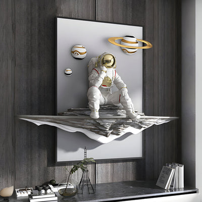
Three-dimensional retro pieces are their own category, because the box depth casts a real shadow and that shadow line is half the design. Where a wall needs object depth rather than another flat print, a shadow-box piece such as Cravatto Black Tie & Bow Framed 3D Wall Art should be chosen the way you would choose a wall-mounted sculpture: check projection from the wall and where the light falls before you check the color.
Glass, Acrylic or Open: What Reflections Do to Mid-Century Inks
Mid-century printing loved saturated reds, turquoise and deep navy. Those are precisely the colors that suffer most from glare, because a reflection lays a gray veil over the darks and the whole print flattens. Standard glass is cheap to replace and scratch-resistant but reflective. Acrylic is lighter and safer on large pieces and in shipping, though it scratches more easily and can attract dust.
For any framed retro art you care about, specify anti-reflective glazing with UV filtering. Light damage on paper is cumulative and irreversible, a point the Northeast Document Conservation Center makes plainly, and bright reds are often among the first inks to fade. Leave a piece open only if it is on varnished canvas or a sealed board.

Mats and Mounts: Gallery Hang or Dorm Wall?
A wide mat is the cheapest upgrade in framing. On a small print, a border of 3 to 4 inches (7.5 to 10 cm) instantly makes the image feel considered, and weighting the bottom slightly heavier stops it looking like it is sliding out of the frame. Use acid-free board. The Library of Congress guidance on paper care explains why acidic materials stain and weaken prints over time.
Depth matters too. A spacer or float mount keeps the print off the glazing, reduces the risk of condensation marks and sticking, and gives a faint shadow that makes framed retro art read as gallery quality from 10 feet (3 m) away.
Moldings That Let Retro Color Do the Talking
Three moldings cover almost every retro print. Thin black sharpens graphic posters and suits monochrome rooms. Raw or lightly oiled oak warms up pin-up illustration and sits well in farmhouse kitchens and beach houses. Brushed metal suits the chrome-and-lacquer side of mid-century design, especially cocktail and automotive imagery.
When the artwork carries a strong ground color, as the blue field behind Valet Noir Leather Flask Blue Framed Wall Art does, the frame's job is to stay out of the way. Match the molding to the room's hardware, not to the era of the image. That single rule keeps framed retro art from tipping into costume.
Hanging Framed Retro Art in a Contemporary Room
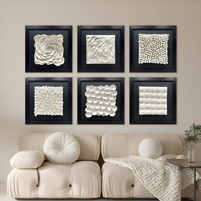
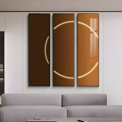
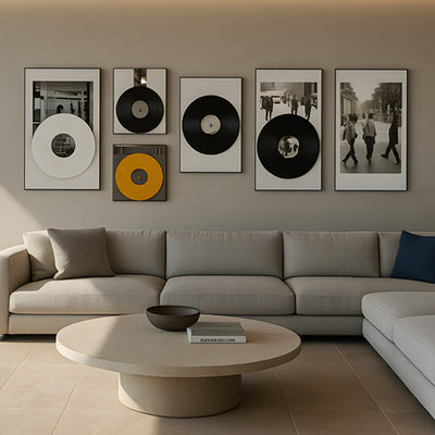
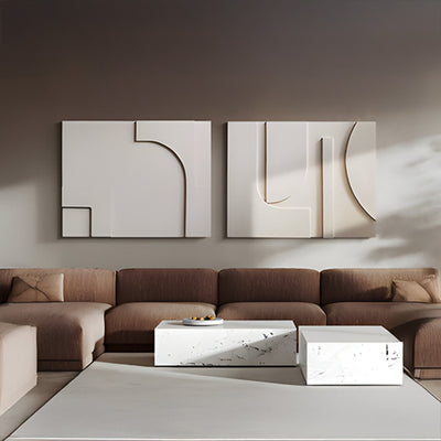
Salon hangs suit traditional interiors with picture rails and layered antiques. In a clean-lined loft or a glass-walled modern house, the same scatter looks like clutter. A tight grid of framed retro art, with identical frames and gaps of 2 to 3 inches (5 to 7.5 cm), turns a mixed set of images into one confident statement.
Bar walls show the problem fastest. Mix gold frames, black frames and three different mat widths, and under warm Edison bulbs the wall reads as a gift shop. Put the same prints in one brushed-metal profile with matching mats, hang them as a four-by-three grid, and they look curated. For a lounge wall like that, a matched run of pieces in the vein of CurioVault Cigar & Sheet Music Framed Wall Art carries the cigar-and-jazz mood better than one oversized statement print, because consistency of frame does more work than any single image.

Buyer Checklist Before You Frame or Commission
Identify the genre: pin-up, travel poster, ad or 3D object.
Decide viewing distance: small and intimate, or read from across the room.
Specify UV-filtering, anti-reflective glazing for paper prints.
Ask for acid-free mats and a spacer or float mount.
Pick one molding finish per wall and match it to room hardware.
For box frames, confirm projection depth and fixing method for the wall type.
Plan a grid on paper or with tape before drilling.
Giant Sculptures is best known for large-scale bronze, stainless steel and Corten commissions, and we bring the same thinking about scale, depth and long-term ownership to our retro art collection. If you need a set sized for a specific wall, a matching run for a hotel bar or a bespoke deep-box piece, budget depends on size, materials, glazing, complexity and installation, so the best route is a tailored quote from our team.
For wider placement ideas, Angel Statues for the Garden: Let the Pose Choose the Spot is useful companion reading before finalising the setting and sightlines.