














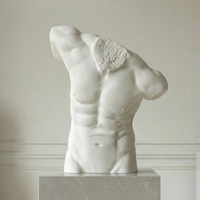
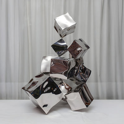


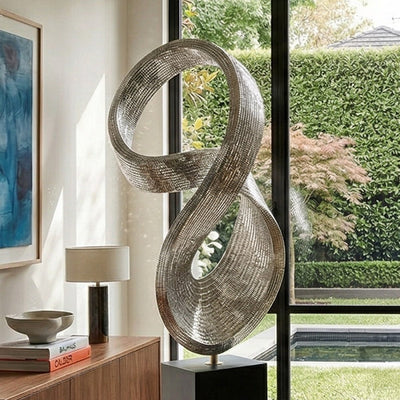
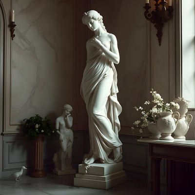
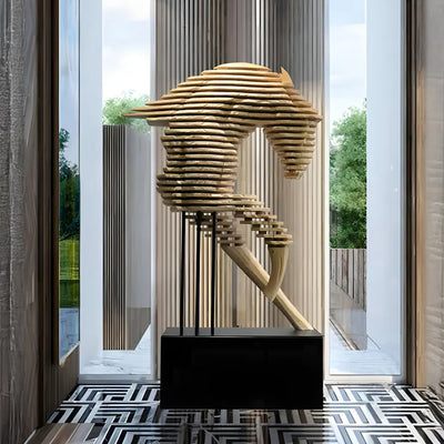
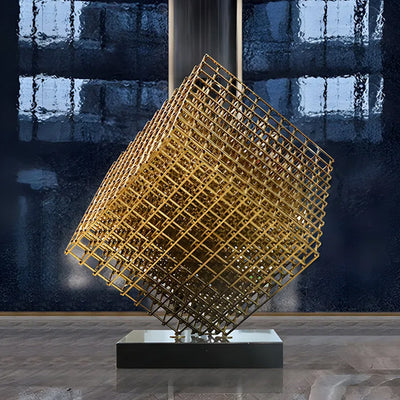
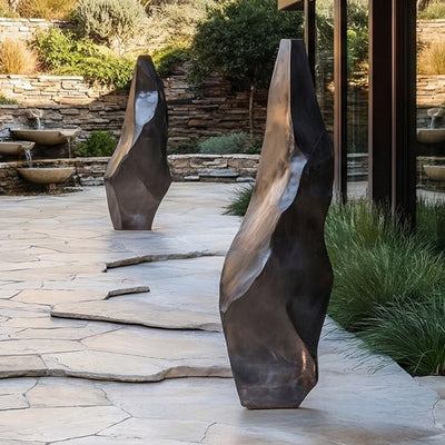


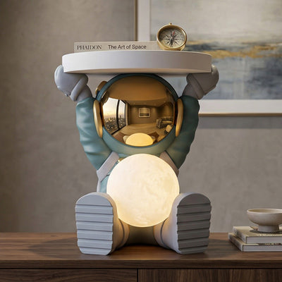


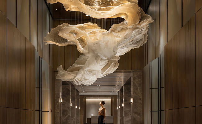


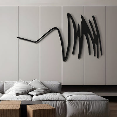

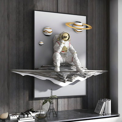

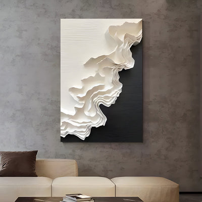
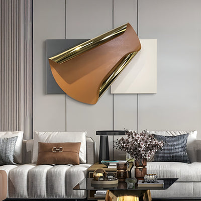
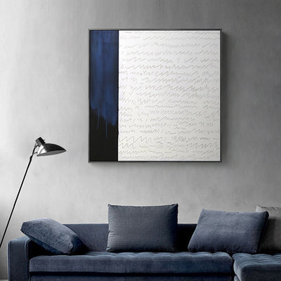
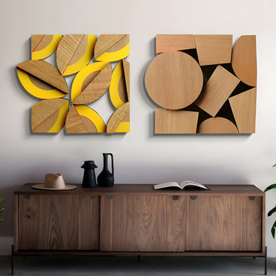

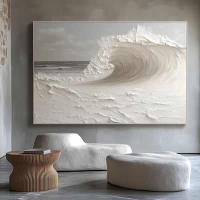
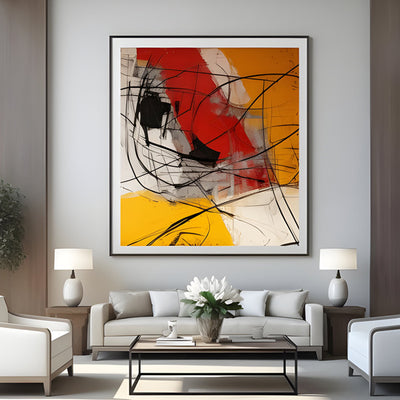
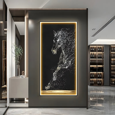
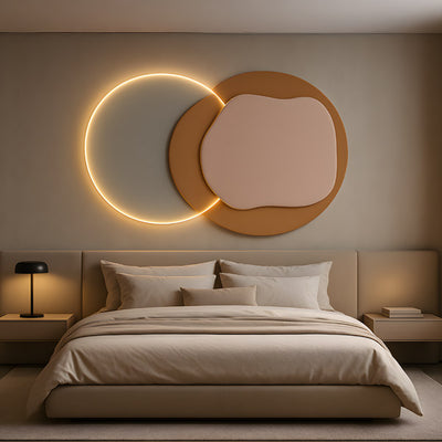
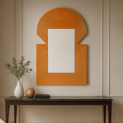
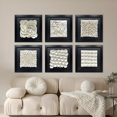
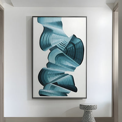
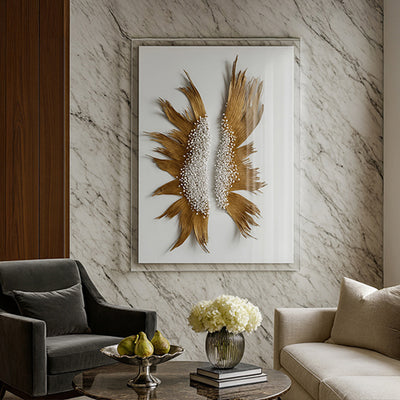
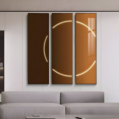
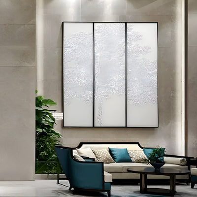
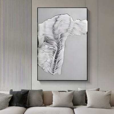
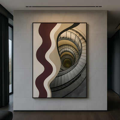
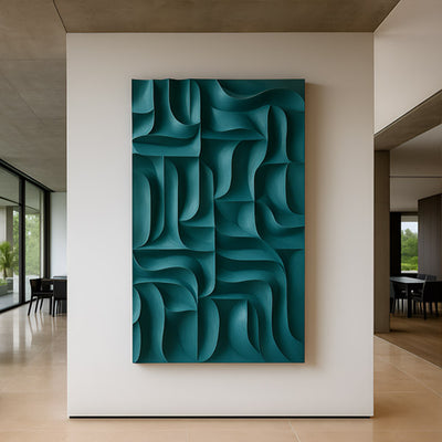
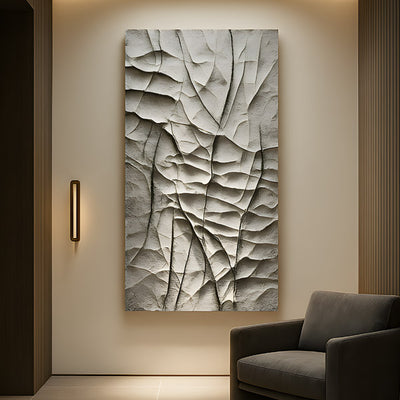
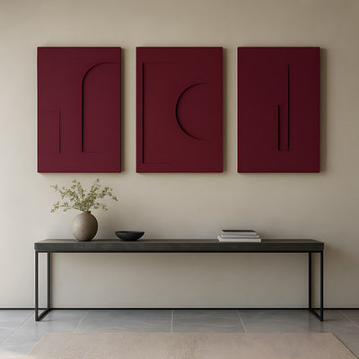
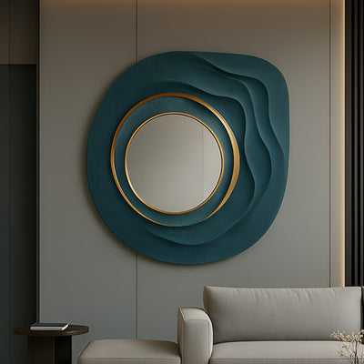
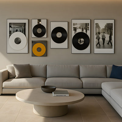
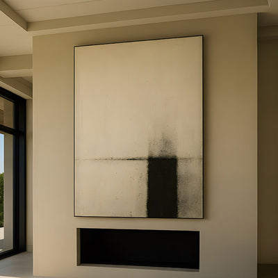
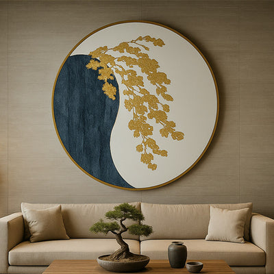
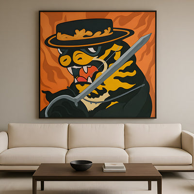
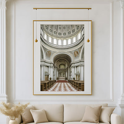
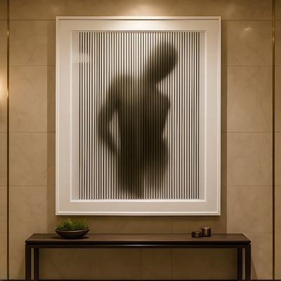
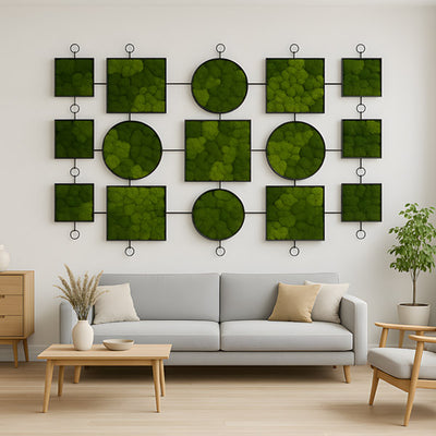
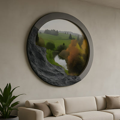
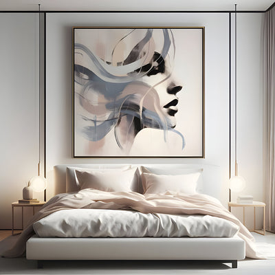
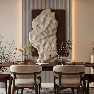
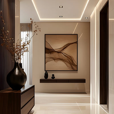
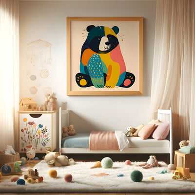
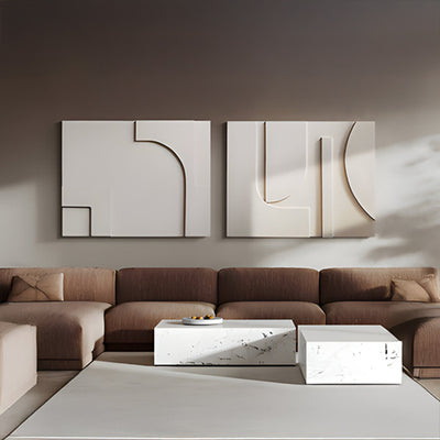
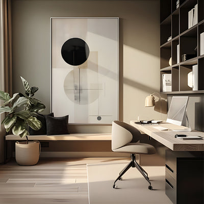


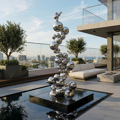








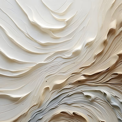
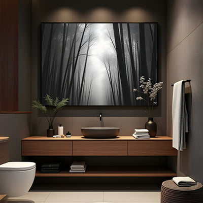
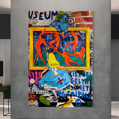
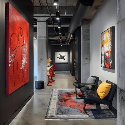
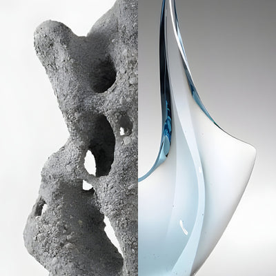
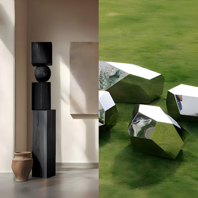


Hang a painting and a carved relief panel on the same wall and one of them will quietly lose. Wall art paintings read as pure surface, tone and edge doing all the work. A relief reads as geometry, its shadows shifting through the day. Put them shoulder to shoulder under one downlight and the relief takes all the attention while the canvas flattens into wallpaper. Most badly styled walls we are asked to fix are not a taste problem at all. They are a depth problem.
Weighing wall art paintings against relief and want the full range in this category? Browse our Bronze Wall Art collection for every available finish, size, and configuration.

Key Takeaways
A flat wall art painting and a raised panel need different light. Shared lighting almost always favors the relief.
Decide your depth hierarchy first: one piece sits proud of the wall, everything else recedes.
In bedrooms, 3D panels above a headboard cast shadow right at seated eye level, which is why they outperform wall art paintings there.
Keep the palette narrow when canvas shares a wall with carved wood, plaster or metal.
Lamp position changes the look of a wall more than swapping the artwork does.
Why Wall Art Paintings and Relief Panels Compete for the Same Light
A painting wants even, frontal light. Raking light across a canvas exaggerates weave, brush ridges and any slack in the stretcher. A relief wants the opposite: light arriving at an angle so the carved troughs go dark and the ridges catch. Ask one ceiling fixture to serve both and you get a compromise nobody likes, with a washed-out canvas and a relief whose shadows have been flattened out of existence.
Tate defines relief as sculpture that projects from a background surface rather than standing free, and that projection is the whole point. Depth is the medium. If you are buying 3D wall art expecting it to sit quietly like a print or a wall art painting, you will be disappointed by noon and delighted by 4pm, because the piece is doing exactly what it should.

Build a Depth Hierarchy Before You Buy Anything
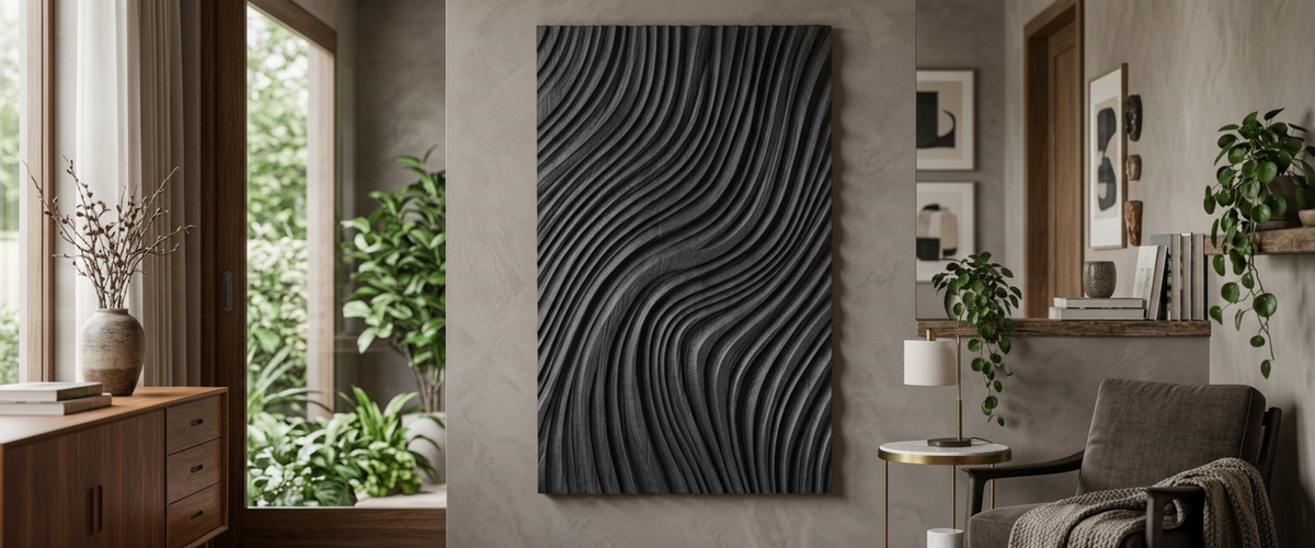
On a wall with more than one piece, rank them. One element sits proud and owns the shadow. Everything else recedes: flatter profile, quieter tone, tighter frame. Where you want the relief to lead, a deep-cut panel such as the Barwick Mocha Stroke Abstract 3D Carving Wall Art can carry the shadow on its own, with two smaller wall art paintings set back beside it in a muted range. Reverse the ratio and the wall turns into an argument.
The practical test is simple. Stand at the far end of the room and squint. If you cannot tell within a second which piece is meant to be read first, the hierarchy has failed. Wall art paintings are excellent supporting players in this arrangement; they carry color and mood without fighting for the light.
Wall Art Paintings for Bedroom 3D Schemes: The Headboard Question
Bedrooms are where this gets decided fastest. Sit up in bed and your eye line lands roughly at the lower third of whatever hangs above the headboard. A flat canvas at that angle gives you very little. A carved or mosaic panel gives you raking shadow at exactly the height you actually look at it. That is the case for most wall art paintings for bedroom 3D schemes we plan: texture survives low light far better than pigment does.
Shell mosaic behaves differently again. Where a room is used mainly after dark, Sandmere Shell Mosaic Abstract 3D Wall Art catches warm lamp light across dozens of small facets rather than one broad plane, so it stays alive in a way matte wall art paintings cannot. In a guest suite we supplied last year, the client swapped a large landscape canvas for a mosaic panel purely because the room was only ever used in the evening. It was the right call.

Palette Discipline When Canvas Meets Plaster or Metal
Mixed-material walls go wrong through color, not composition. Carved wood already brings grain and warm undertone. Brushed metal brings a cool gray shift that changes with the time of day. Drop high-chroma wall art paintings next to either and the wall starts to feel busy even when the layout is correct.
Our rule: pick one dominant hue family and allow a single accent. If the carved panel is charcoal, keep the wall art painting in the same gray-to-ink range and let the texture provide the contrast. Taupe and mocha carvings sit well with sand, bone and soft clay tones. When clients want a bolder canvas, we usually move it to a facing wall so the two never share a sightline. Comparing wood wall art and metal wall art side by side shows how quickly the undertones diverge.
Spacing We Actually Use on Install Day
Center height: around 57 to 60 inches (145 to 152 cm) from the floor to the visual center in a standing room. Drop it in a bedroom, where the viewing position is seated or lying down.
Above a headboard: leave a clear gap of roughly 6 to 10 inches (15 to 25 cm) so the panel reads as its own object, not a headboard extension.
Between grouped pieces: 2 to 3 inches (5 to 8 cm) for a tight grid, 4 to 6 inches (10 to 15 cm) when one piece has real relief depth and needs shadow room.
Long landings and corridors: space wall art paintings and panels so only one is fully in view from any single standing point. Crowding a hallway kills the rhythm.
Fixings: heavier carved and metal panels need substrate-appropriate anchors. Check what is behind the plasterboard before you commit to a center point.
When to Pull the Painting Off Entirely
Some walls only want one thing. A tall stairwell, a hotel reception behind the desk: these are single-object walls, and hanging three wall art paintings across them just chops the space into pieces. One large sculptural panel, scaled properly, holds far better than a gallery arrangement ever will. On a wall read from twenty feet away, a repeated carving such as the Barwick Charcoal Grid Abstract 3D Carving Wall Art still resolves at distance, where a painted canvas loses its detail.
This is also the moment to think about commissioning. If the wall is unusual in proportion, a bespoke panel sized to the bay is a better investment than three stock pieces fighting the architecture. Our studio scales carved and metal relief work to the wall it is going on, and cost depends on material, size, carving complexity, finish and installation, so it is worth requesting a tailored quote rather than guessing.

Lamp Position Decides More Than Either Piece Does
For wider placement ideas, Wood Mosaic Wall Art: Tone Beats Tile Count Every Time is useful companion reading before finalizing the setting and sightlines.
Move the light source 12 inches (30 cm) and a relief panel becomes a different artwork. Shadows lengthen, the carving gains weight, the whole wall changes mood. We tell clients to test with a portable lamp before drilling anything: try the light high and close for deep shadow, then lower and further out for a softer read.
Wall art paintings ask for restraint here. The Smithsonian's conservation guidance on light damage is worth reading before you aim a bright fixture at anything pigment-based, because cumulative exposure fades color permanently. Carved wood, stone and metal are far more forgiving, which is another quiet argument for letting sculptural work take the brightest wall in the house. Start with our full wall art and wall decor range and decide your depth hierarchy before you decide anything else.