























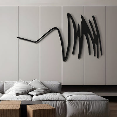

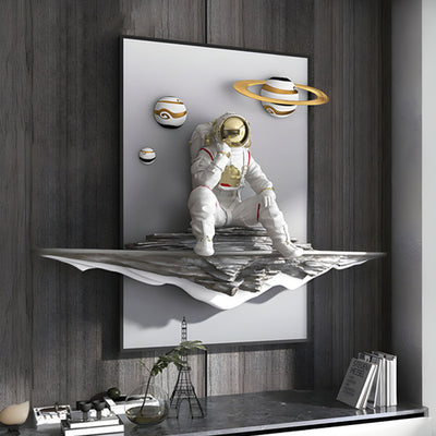

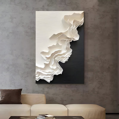
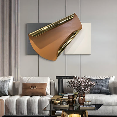
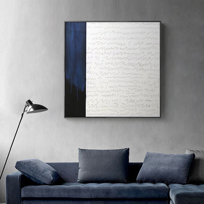
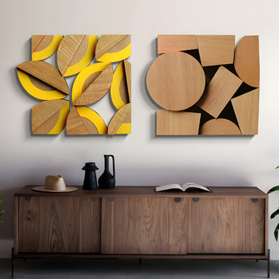

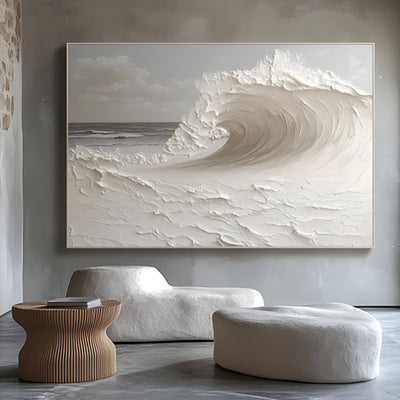
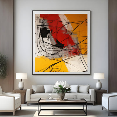
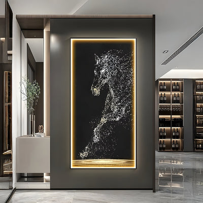
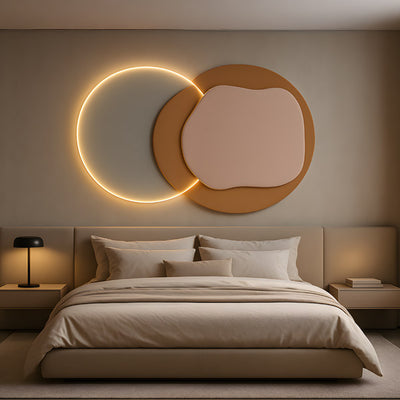
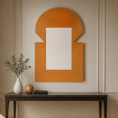
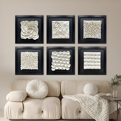
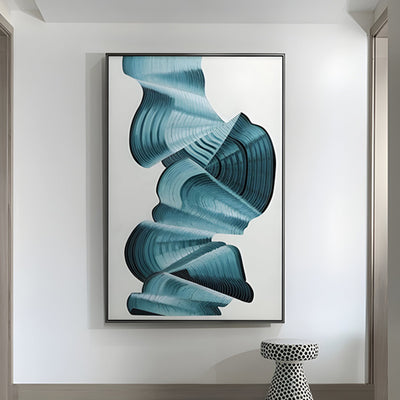
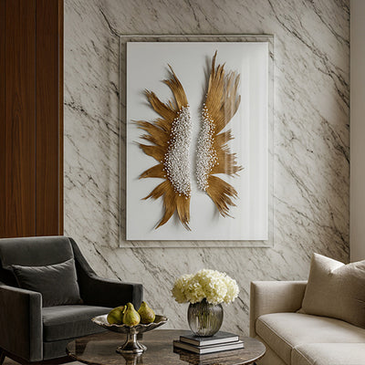
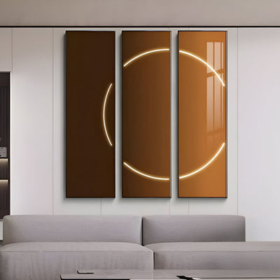
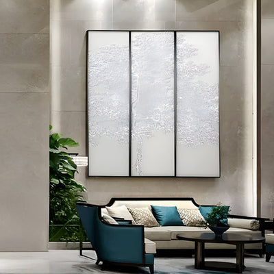
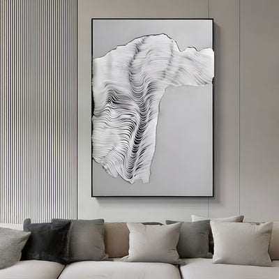
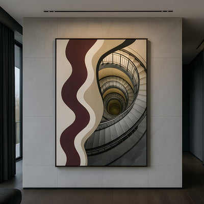
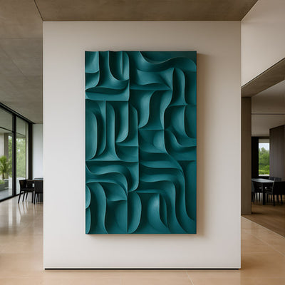
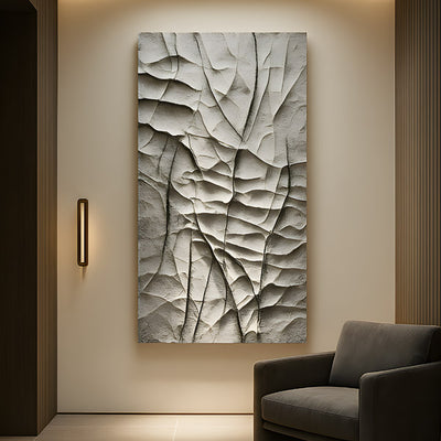
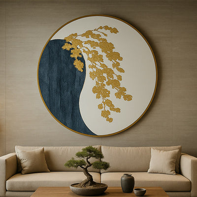
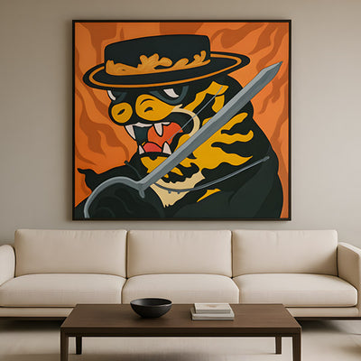
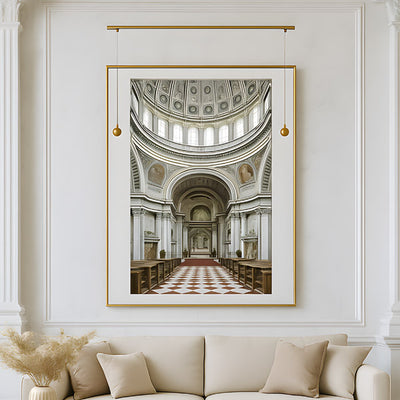
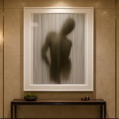










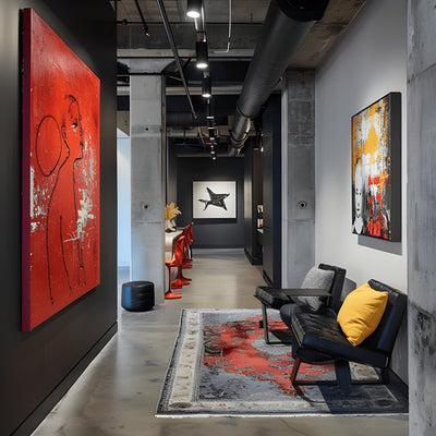

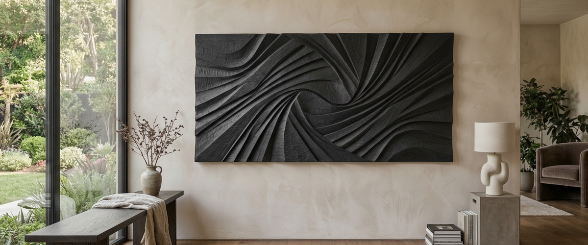

Most wall art ideas are judged from a standing position. You hold the piece against the plaster, step back, tilt your head, nod. Then everybody sits down to eat and the eye drops roughly 16 inches (40 cm), and the composition you approved is floating somewhere above the conversation like a notice board. It is the single most common mistake we see in photos clients send us, and it has nothing to do with taste. It is a viewing-height problem.
Large wall pieces are unforgiving that way. A small framed print can be nudged. A six-foot carved panel is a commitment to a wall, a light direction and a sight line, so the thinking has to happen before the fixings go in. Wall art ideas for dining room walls in particular have to survive that second, seated look.

Key Takeaways
Plan at seated height in any room where people sit for an hour or more. Dining rooms and lounges are sitting rooms, not standing rooms.
Size to the bay and the furniture. Aim for 55 to 70 percent of the clear wall bay, and roughly two-thirds to three-quarters the width of the table, sideboard or sofa below it.
Relief beats flat after sunset. Texture keeps working under low, warm light; a flat print goes gray.
One large piece is usually calmer than three medium ones. Grouping earns its place only when the wall has real architectural interruptions.
Budget is driven by material, scale, depth of carving or metalwork, finish and fixing, so ask for a tailored quote rather than guessing from a thumbnail.
Read the Light Before You Collect Wall Art Ideas
Before saving a single image, stand in the room three times in one day: north light at noon, side light at four, candle or pendant glow at nine. A wall that gets flat, even north light will flatten almost anything you hang on it, which is exactly when a deeply cut or folded surface earns its keep. A west-facing dining wall might get a half hour of raking gold that makes a shell mosaic panel look lit from inside, then nothing at all for the rest of the evening unless the pendant is doing the work.
Light also decides what survives. Works on paper and pigment prints fade under sustained daylight exposure, which is why conservators track cumulative light dose rather than brightness alone, the basis of Image Permanence Institute work on light and material stability. Carved wood, cast metal and mineral-surfaced panels do not carry that vulnerability in the same way, which is part of why clients with big glass elevations lean toward dimensional work. Filtering wall art ideas by material, not just by image, saves regret a few summers later.
Evening light, not showroom light, is the real test for a dining room wall piece.

The Scale Rule That Survives a Change of Furniture
Scale is where most wall art ideas come apart. Furniture moves. Tables get replaced, sideboards get swapped, sofas get reupholstered and pushed a foot left. A scale rule tied only to one dining set will break within a few years; a rule anchored to the wall's architecture as well will not.
Here is what we use in the studio. Measure the clear wall bay, edge to edge between door casings, corners or window reveals. Your piece should occupy about 55 to 70 percent of that bay. Then check it against the furniture: two-thirds to three-quarters of the table or sideboard width is the comfortable zone. If both numbers agree, the piece will still look right when the furniture changes.
Hanging height is separate. The standing gallery convention of centering around 57 to 60 inches (145 to 152 cm) is a museum habit borrowed from average standing eye level. In a dining room, drop the center to roughly 52 to 56 inches (132 to 142 cm), and leave 8 to 10 inches (20 to 25 cm) of clear air above a sideboard so the piece does not look glued to it. Mock it up with kraft paper cut to exact size, then sit in every chair. Half the time the paper moves twice.
Relief and Texture Hold the Room at Dusk
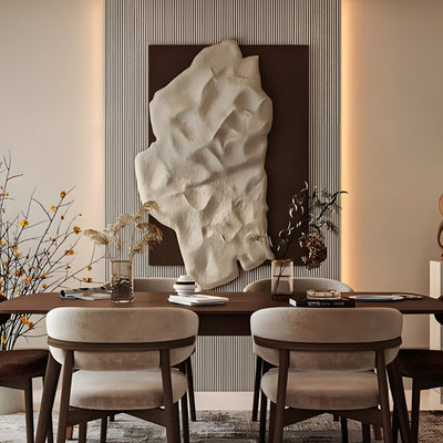
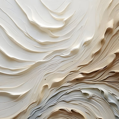
The reason we push carved and cast surfaces for dining spaces is simple: dinner happens in low light. A flat image needs even illumination to read. A relief surface makes its own image out of whatever light is left, because every ridge produces a highlight and a shadow. Turn the pendants down and a deeply cut panel gets more interesting, not less.
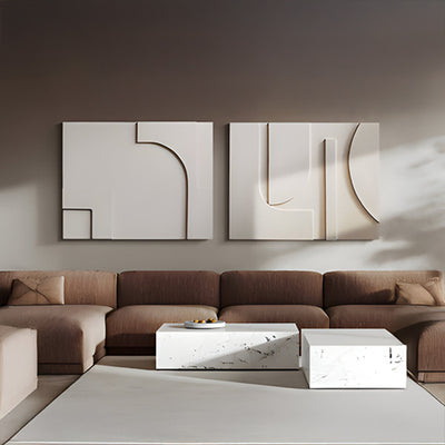
Cut direction does most of that work. Where a wall is lit by a single low pendant, angled channels like those on the Barwick Charcoal Flow Abstract 3D Carving Wall Art run across the light path and keep a rhythm moving over the surface after sunset, since no two ridges catch it at the same moment. A grid cut such as the Barwick Taupe Grid Abstract 3D Carving Wall Art behaves differently again: the shadows stay orderly rather than fluid, which suits a room with strong joinery lines and long horizontal sightlines. The wider 3D wall art range is worth walking through for that reason alone, because the cut sets the mood before color even enters the conversation.
Angled channels build their own highlights and shadows once the pendants come down.

One Large Piece or Three Medium Ones
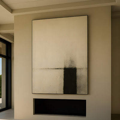
Grouping is the most repeated of all wall art ideas, and it is oversold. Three medium panels on an uninterrupted wall usually create two gaps that the eye has to keep crossing, and the room starts to fidget. A single large piece gives the wall a center and lets the table be the second event.
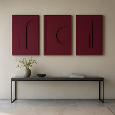
Grouping does work in two situations. First, when the wall is already broken by a chimney breast, a door or a run of windows, so each panel gets its own bay. Second, when you want a horizontal band above a long sideboard in a room with a high ceiling, where one piece tall enough to balance the height would be out of proportion to the furniture. In that case keep the gaps tight, 3 to 5 inches (8 to 13 cm), and keep the panels from the same family so the set reads as one object.
Mixed materials complicate this. Wood and metal in the same grouping need a shared geometry or a shared tone, otherwise you get a sampler. If you want that contrast, it is cleaner to put a metal wall piece on a different wall entirely and let each hold its own zone.
Wall Art Ideas Behave Differently in Each Room
An idea that works over a dining table can fail 20 feet away. Kitchens push moisture and cooking residue at anything within range, and timber responds to humidity swings by moving with the seasons; the US Forest Products Laboratory Wood Handbook documents that dimensional change in detail. Keep carved timber panels off the wall directly behind a range and away from a dishwasher vent, or go with metal or a mineral-surfaced panel there instead.
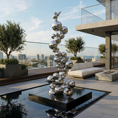
Hallways are a walking-speed problem. Nobody stands still, so fine detail is wasted; you want a strong silhouette and enough depth to register from a glancing angle. Garden and terrace walls flip the problem again. Outdoor glare flattens midtones at midday, so exterior pieces need either deep shadow relief or a material with real surface interest, which is where Corten, stainless steel and cast bronze earn their place over anything intended for interior use.
Wall Art Ideas for the Dining Room That Collapse on Second Viewing
These are the ones that come back to us as "it looked right on the day."
The piece hung too high. Approved standing, fails seated. Fix: drop the center 4 to 6 inches (10 to 15 cm) and re-check from a chair.
The polite, safe neutral. A quiet tonal panel in a room of quiet tonal surfaces disappears within a month. Fix: keep the color restrained but push the depth of relief, so the contrast comes from shadow rather than pigment.
The piece sized to the wall, not the table. A big blank wall tempts you to fill it edge to edge. Fix: check both the bay percentage and the furniture width before ordering.
Glass in a candlelit room. Glazed frames mirror the pendants back at whoever is sitting opposite. Fix: choose an unglazed dimensional surface instead; a shell-set panel such as the Sandmere Shell Mosaic Abstract 3D Wall Art breaks candlelight across hundreds of small facets rather than throwing one hard reflection back across the table.
Fixings chosen after purchase. Heavy panels on plasterboard without blocking are a repair waiting to happen. Fix: confirm substrate and weight before you buy, and specify a cleat system.

Commissioning at the Scale You Actually Need
Catalog sizes suit most rooms. Some they do not, and that is where wall art ideas turn into a commission. We have made panels to span the full run behind a 12-seat table, and pieces for entry halls where the ceiling height made anything standard look like a postage stamp. Bespoke work at Giant Sculptures usually starts with three numbers from you: the clear bay width, the ceiling height, and the seated eye level in that room. From there we talk material, carving depth or metal gauge, finish, and how the piece fixes to the wall.
Cost follows those decisions rather than square footage alone, because a deeply carved surface, a hand-applied patina or a concealed steel subframe all change the making time. Send dimensions and a photo of the wall with the furniture in place and we will quote the real job rather than a guess. If you are still collecting wall art ideas, the full wall art and wall decor range is the easiest way to compare depth, tone and format side by side.
For wider placement ideas, 3D Mirror Wall Art: Check the Opposite Wall Before You Buy is useful companion reading before finalising the setting and sightlines.