

















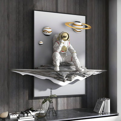

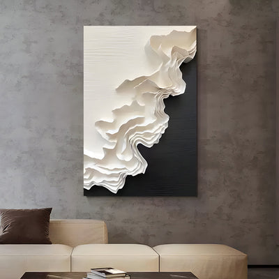
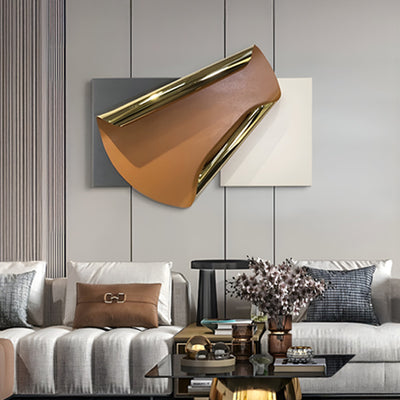
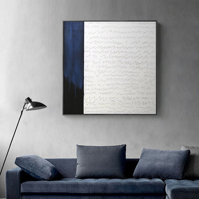

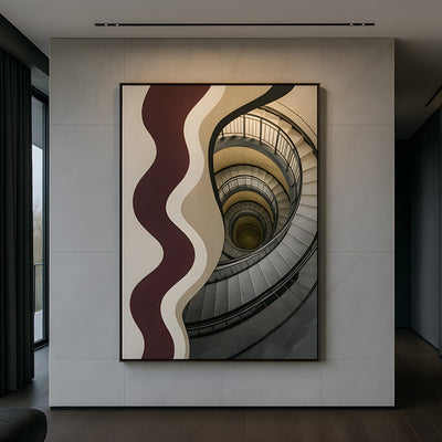
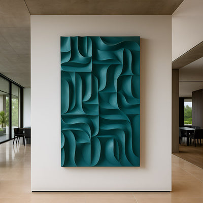
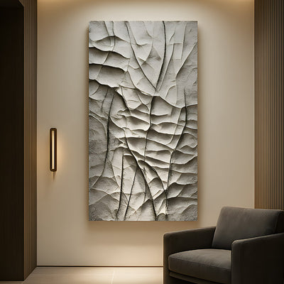
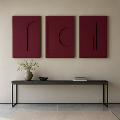
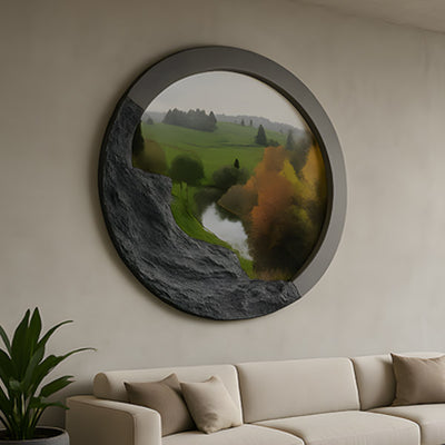
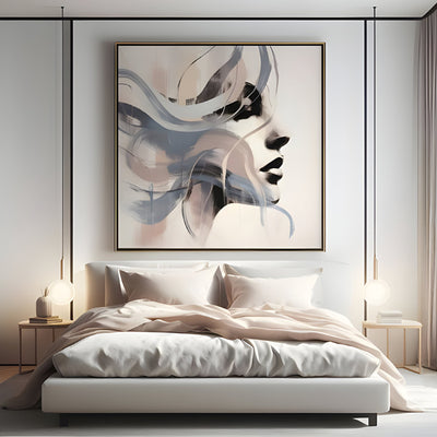
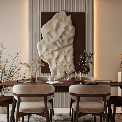
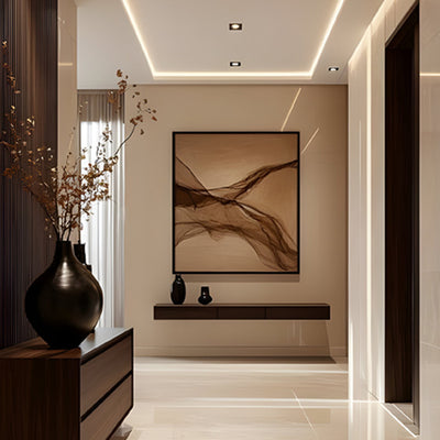









A client in Marin County once called us three days after installation, convinced we had shipped the wrong panels. The blue she had approved in daylight looked like wet slate by evening. Nothing was wrong with the piece. Her recessed cans were 2700K, her walls were a cool gray, and every warm bulb in that room was quietly eating the pigment. Abstract blue wall art is the least forgiving color category we sell, because blue is the first hue to collapse under warm domestic light and the first to look cheap when it is paired badly with gold.
Looking for the full range in this category? Browse our Wall Art & Wall Decor collection for every available finish, size, and configuration.

Key Takeaways Before Buying Abstract Blue Wall Art
Warm bulbs mute blue. Below about 3000K, cobalt drifts toward slate and teal drifts toward gray-green.
Wall tone does half the work. Cool gray plaster drains blue; warm off-white and limewash push it back forward.
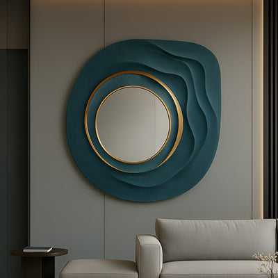
Material changes the temperature of the same pigment. Brushed metal cools it, cast resin holds it warm and deep, layered glass shifts it by viewing angle.
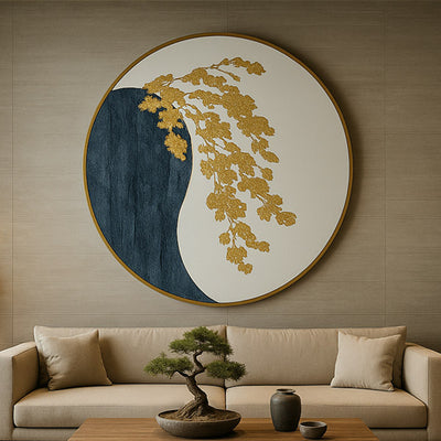
Keep gold under roughly a third of the surface. Past that, an abstract blue and gold modern wall art set of 3 starts reading like a hotel gift shop.
Blue exposes crooked spacing more than charcoal or black ever will.
What Warm Bulbs Do to Cobalt, Teal and Indigo
Blue pigments reflect the short end of the visible spectrum. Warm domestic bulbs emit very little light at that end, so there is little for the surface to bounce back. Cobalt turns dusty. Teal loses its green lift and reads gray. Indigo, which already sits close to black, can disappear entirely into the wall after sunset. This is a color rendering problem, and the Illuminating Engineering Society publishes the color rendition metrics behind it, worth a skim if you are specifying lighting for artwork rather than just for a room.
The practical fix is not a full relamp. Keep your warm ambient layer for comfort, then add one dedicated fixture at 3500K to 4000K aimed at the artwork. In our studio we photograph blue work under both temperatures before it ships, because the difference surprises people. The same panel of abstract blue wall art can look moody and expensive under one lamp and washed-out under another.
The same cobalt panel under 2700K (left) and 4000K (right). Nothing changed but the lamp.

Cool Gray Plaster Drains Blue, Warm Limewash Gives It Back
Gray walls have been the default in American new-build interiors for a decade, and they are the worst neighbor abstract blue wall art can have. A cool gray shares enough of blue's undertone to compete with it, so the artwork flattens into the plane behind it. Warm off-whites, bone, and limewash finishes with a hint of ochre do the opposite. They sit on the opposite side of the color wheel and hand the blue back its saturation.
If repainting is off the table, use depth instead. Relief and dimensional pieces cast their own shadow lines, which separates the work from the wall even when the color values are close. This is where sculpted wall art beats a flat canvas print, and why so many of our 3D wall art commissions go into gray-walled rooms in Austin and Scottsdale. If the wall is fixed and the palette is still open, a warm carved relief such as Barwick Mocha Drift Abstract 3D Carving Wall Art solves the same flatness problem from the other direction, warming the plane rather than fighting it.
Brushed Metal, Cast Resin and Layered Glass Change the Same Pigment
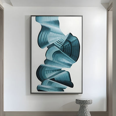
Specify the same blue across three materials and you get three colors. Brushed metal reflects the room's ambient temperature back at you, so blue over aluminum or steel reads cooler and more graphic, with a slight metallic haze in the highlights. Cast resin and porcelain hold pigment in suspension, giving a saturated depth closer to a glaze than a paint. Layered glass is the most theatrical and the most conditional: it shifts as you cross the room, which is glorious in an entry hall and distracting above a dining table.
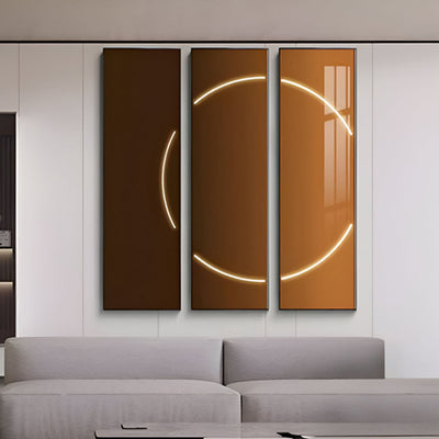
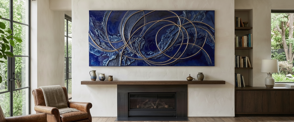
For a room where daylight is unreliable and the blue needs a body that holds pigment instead of glazing over it, Aurelios Cosmic Blue Crystal Porcelain & Gold Orbit 3D Wall Art is the right specification. The crystal porcelain body keeps the blue dense rather than glassy, while the gold orbit lines catch directional light and stop the panel going flat once the sun drops. A light-holding body paired with a light-catching accent is the combination that survives a difficult room.

Blue With Gold: Where a Set of Three Goes Wrong
Gold abstract wall art works with blue because the two sit near opposite each other in warmth and cut through each other cleanly. Ultramarine and gilding have been paired for centuries for exactly that reason, as anyone who has stood in front of a Renaissance panel at the Metropolitan Museum of Art will recognize. The ratio is what separates the two outcomes.
Our working rule: gold should read as line, edge or accent, not as field. Once metallic coverage passes roughly a third of the visible surface, an abstract blue and gold modern wall art set of 3 stops looking composed and starts looking merchandised. Restraint also ages better. A set where gold traces a single arc across all three panels still looks deliberate in ten years; a set that is half gold leaf does not.
One more warning on finish. Bright polished gold and matte brushed brass behave differently under the same lamp. Polished gold throws a hard specular highlight that can blow out next to deep indigo. Brushed and antiqued metallics diffuse the light and hold the blue as the dominant color, which is usually what buyers actually wanted.
North-Facing Rooms and the Two-Lamp Fix
North-facing rooms get consistent, cool, low-intensity daylight with no direct sun. Any abstract blue wall art hung there survives the morning better than most colors, then dies in the dead stretch between about 3 p.m. and dusk when there is neither daylight nor evening lamplight doing any real work.
The fix is two lamps, not one. A single spotlight centered on a blue panel creates a hot core and dark corners, which flattens the piece into a bright rectangle. Two sources set wide on either side, each roughly 30 degrees off the face of the wall, cross-light the surface and keep relief shadows legible. For dimensional work, that cross-lighting matters more than raw brightness. Deep-carved pieces such as Barwick Charcoal Flow Abstract 3D Carving Wall Art live or die on how their grooves are raked, and the same logic applies to any blue relief you hang.

Spacing an Abstract Blue Wall Art Triptych
Blue exposes alignment errors that charcoal and black hide. A pale wall showing between three saturated blue panels turns every gap into a bright vertical stripe, so a few millimeters of inconsistency reads instantly.
Gaps measured edge to edge, not hardware to hardware, then checked again after dark.
Set the gap by panel width, not by habit. Narrow panels want a tighter gap; wide panels can carry more air between them.
Match all gaps to within about an eighth of an inch (3 mm). Measure between panel edges, not between hardware.
Use a laser level for the centerline, then hang from a single horizontal datum rather than aligning each panel to the one before it.
Check gaps at night with the lamps on. Side lighting throws shadows into the gaps and reveals errors daylight forgives.
Center the group on the furniture, not the wall, if a sofa or console sits below it.
Commissioning Abstract Blue Wall Art at Scale
Standard panel sizes stop making sense in double-height rooms, long corridors and hospitality lobbies. That is where we spend most of our time: bespoke wall sculpture engineered for a specific wall, with a mounting system sized for the substrate and a finish sampled under the client's actual lighting before anything is committed. We routinely send finish samples to US addresses so buyers can hold the blue against their own plaster at 4 p.m. and again at 9 p.m.
Budget on a commission depends on scale, material, relief depth, metallic finishing, engineering and installation access, so we quote per project rather than publishing bands. If you are still narrowing direction, browse the abstract art range for composition, then the metal wall art collection to see how the same palette behaves on a reflective body. Talk to us before you paint the wall. That order of operations saves more projects than any lighting trick.
For wider placement ideas, Blue Wood Wall Art: How to Keep the Carving From Disappearing is useful companion reading before finalizing the setting and sightlines.