





















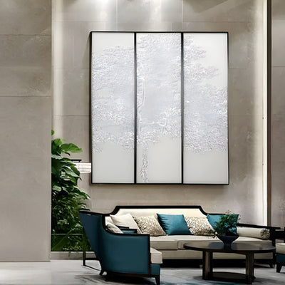
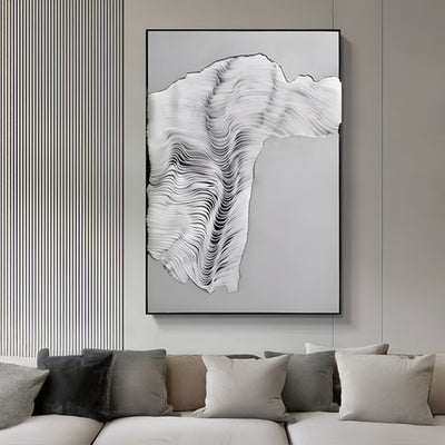
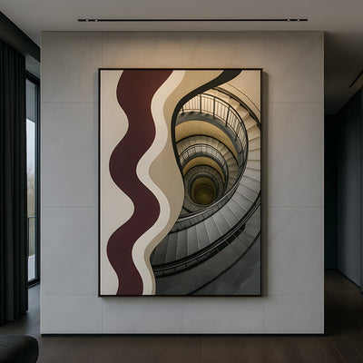
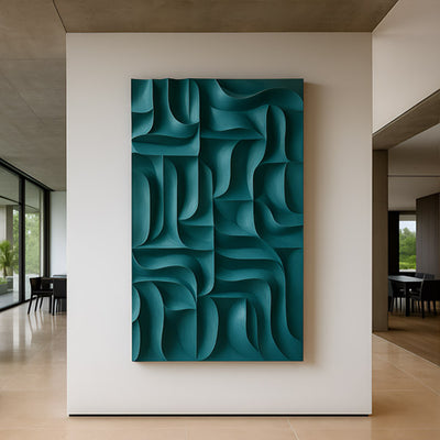
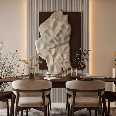
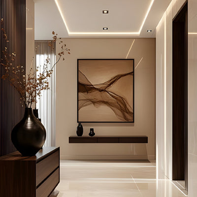
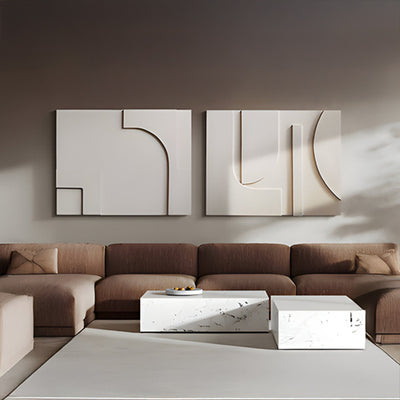








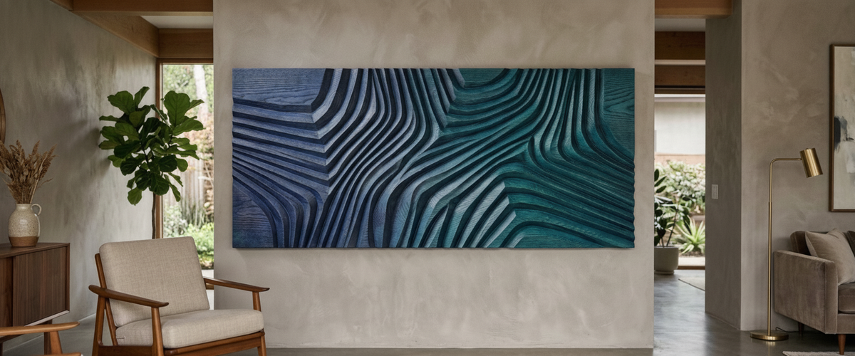

Blue is the fastest way to ruin a carved panel, and the fastest way to make one sing. Most blue wood wall art fails at the same moment: the color goes on thick, the relief fills in, and a piece that was cut with genuine depth reads as a flat printed board from eight feet (2.4 m) away. Handle the finish properly and the reverse happens. The blue sinks into the grain, the ridges throw their own shadows, and the panel changes character three times between breakfast and dusk.

Key Takeaways Before You Buy
Stain over paint when the piece is carved. Paint is for silhouette work; stain is for depth.
Timber choice changes the color. The same blue pigment reads cool on ash, muddy on red oak, and chalky on paulownia.
Deep blues absorb shadow. The darker the tone, the more the carving depends on directional light to show up at all.
Warm gray and clay walls hold blue. Cool gray and stark white fight it.
Blues drift. Some go green under years of UV, some just go quiet. Pigment selection decides which.
Multi-board commissions need one batch, one hand, one day. Color matching across joins is the hardest part of the job.
Stain Lets the Figure Breathe, Paint Buries It
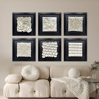
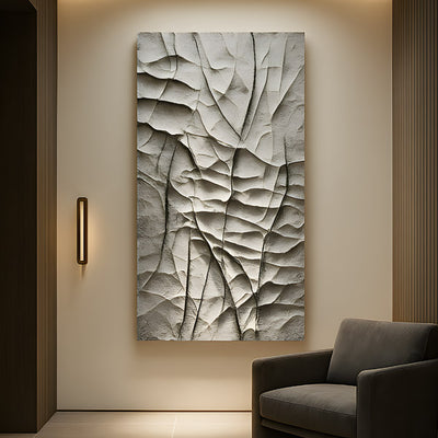
This is the first fork in the road for any piece of blue wood wall art, and almost everything downstream depends on it. A pigmented stain penetrates the fiber and leaves the grain visible, so a chisel mark still looks like a chisel mark. Opaque paint sits on top as a film. On a smooth board that film looks crisp and graphic. On a deeply cut relief it rounds every arris, pools in the valleys, and quietly erases about a third of the work the carver put in.
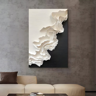
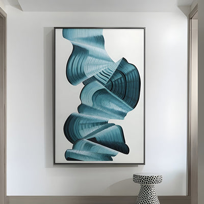
Two coats of paint on a hand-carved panel can cost you the very thing you paid extra for. If you want strong, flat color and a bold outline, buy a painted piece and enjoy it for what it is. If you want the surface to move as you walk past it, insist on stain, dye, or a translucent glaze knocked back with a clear topcoat. Where the brief calls for blue that grades rather than sits flat, a treatment like the one on the Wenlock White & Teal Gradient Wood Relief 3D Wall Art runs the color as a graded wash across the ridges, so tonal shift and physical relief reinforce each other instead of competing.
Stain keeps tool marks and grain readable across a carved surface.

Oak, Ash and Paulownia Take the Same Blue Three Different Ways
Buyers often assume blue is blue. It is not, once wood gets involved, and the species beneath the finish does half the color mixing for you. White oak has enough tannin and enough of a golden undertone to shift a mid blue toward teal or slate. Red oak, with its open pores and pink cast, tends to muddy anything in the cobalt family. Ash is the cleanest canvas of the three, with a pale, even ground and a pronounced grain figure that a blue dye will exaggerate in a way most clients love once they see it in person.
Paulownia is a different animal. It is light, soft, and very absorbent, so blue goes in fast and reads chalkier and more matte, closer to a limewash than a lacquer. That softness also makes it a poor choice for high-traffic corridors. For a large panel destined for a hallway in a Texas ranch house where luggage and shoulders will pass within inches, we steer clients toward a harder timber even if the color needs an extra sample round to land.
Blue Wood Carving Wall Art: Why Strong Color Eats the Shadow
Here is the part nobody warns you about. Shadow is a contrast effect, and dark saturated color reduces the contrast range available to the eye. A navy or indigo panel can lose the read of its own carving because the deepest cut and the highest ridge are already close in value. Choose blue wood carving wall art in a deep tone and you need one of three fixes: raking light across the surface, a lighter tone in the recesses, or a dry-brushed highlight along the top edges.
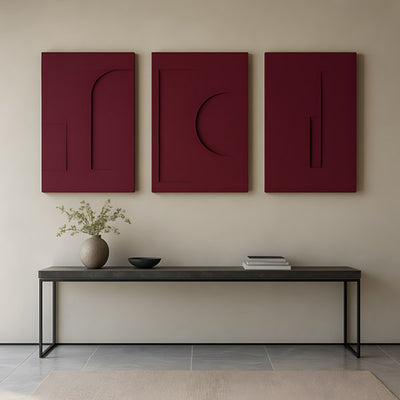
Mid-tone and graded blues sidestep the problem entirely, which is why the most successful blue wood wall art tends to sit in the middle of the value range. So does contrast within the piece itself. Coarse geometry survives a low value range in a way fine detail never does, which is why a structure like the Barwick Charcoal Grid Abstract 3D Carving Wall Art stays legible in a dark finish while delicate carving in a deep blue is the combination that disappoints most often.
Wall Colors That Fight Blue, and the Warm Grays That Hold It
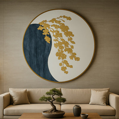
Cool gray walls are the usual mistake. Put blue wood wall art on a blue-leaning gray and both surfaces go dull, because there is no temperature contrast to push against. Warm gray, greige, clay, putty, and unbleached plaster all hold blue beautifully, letting the wood tone come forward. Off-white with a yellow base works well. Bright cold white flattens the panel into a graphic and kills the sense of carved mass.
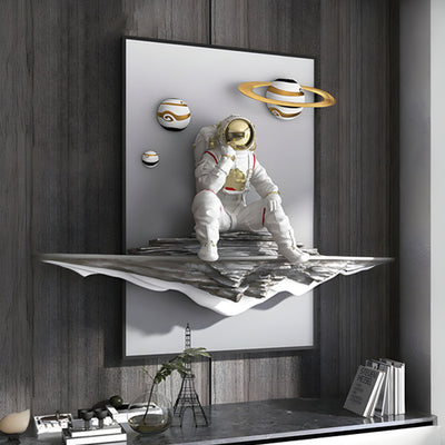
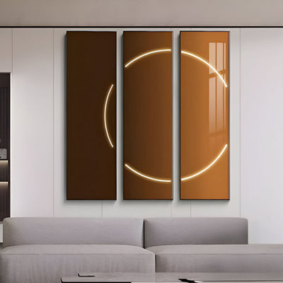
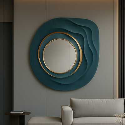
Wood-paneled walls need care. Blue against warm walnut is a classic pairing, but the panel needs a clear margin around it or the two woods argue. Against exposed brick or board-formed concrete, blue reads sharper and more architectural, which is why it works so well in Napa tasting rooms and Aspen entryways where the background is already textured. Where a hard, contemporary interior wants blue without the warmth of timber, Aurelios Cosmic Blue Crystal Porcelain & Gold Orbit 3D Wall Art is closer to the right design language, since the reflective surface carries the color rather than relying on carved shadow to hold it.

North Light Versus a South Window
One panel, two rooms, two entirely different pieces. The same blue wood wall art behaves nothing like itself when the light source changes. Steady north light is cool and even, which flatters blue by keeping it true, but it produces soft shadows that undersell deep relief. A south-facing room delivers hot, raking, moving light: the carving looks superb in the late afternoon and the blue can look bleached and warm at midday. West light will push a blue toward violet around sunset.
The practical answer is to view samples on the actual wall at two times of day before you commit. We ship finish samples for exactly this reason, and it has saved more than one client from ordering a color they only liked at 10am.
Five Years of UV: Which Blues Drift Green and Which Just Go Quiet
Wood fades and so do dyes, but they fade differently. Ultraviolet light breaks down lignin in the timber itself, which is why an unprotected panel yellows underneath its color and pushes a cool blue toward green over time. The USDA Forest Products Laboratory has documented this substrate-level degradation extensively, and it is the reason blue wood wall art hung near glass needs a UV-inhibiting topcoat more than it needs an expensive pigment.
On pigment, the split is simple. Mineral-based blues in the ultramarine and cobalt families are considerably more lightfast than organic dye blues, which lose intensity first and often shift hue as they go. Conservation research on pigment stability, including work published by the Smithsonian's Museum Conservation Institute, backs up what our finishing bench sees: a well-chosen mineral pigment goes quietly softer, while a cheap dye blue turns a color you did not order.

Matching One Swatch Across Joined Boards
Commission a wide panel and it will be built from multiple boards. Each board has its own density, grain direction, and absorbency, so identical stain applied identically produces visibly different results. This is the single most common source of disappointment in large blue wood wall art, and it is entirely avoidable with the right process:
One batch, one finisher, one session keeps color continuous across joins.
Boards selected from one log or one batch wherever possible, then laid out for grain continuity before any cutting starts.
A pre-stain conditioner on absorbent species to even out uptake.
One mixed batch of stain for the whole panel, applied in a single session by one finisher.
Off-cuts from the same boards used as approval samples, never a generic sample chip.
Photographs under the client's actual lighting temperature before shipping.
For a stairwell commission we shipped to a Brooklyn townhouse, the client had specified a single continuous blue across a run of vertical panels. Two boards drank the stain harder than the rest and had to be recut. Better to catch that at the bench than at the wall.
Choosing With Confidence
Work through the decisions in order: relief depth first, then timber, then finish type, then tone, then wall color and light. Get those in the wrong order and you end up choosing a beautiful blue that the panel cannot carry. Browse the full range of wood wall art and 3D wall art to see how different relief depths behave, and if the piece you want does not exist yet, Giant Sculptures builds bespoke panels to specification. Cost depends on scale, timber, carving complexity, finishing and installation, so the honest answer on budget is a tailored quote rather than a guess.
Blue wood wall art rewards patience. It is the color that most repays a proper sample process, and the one that punishes a rushed decision hardest.
For wider placement ideas, Carved Wood Wall Art Only Works if the Shadows Do is useful companion reading before finalising the setting and sightlines.