











































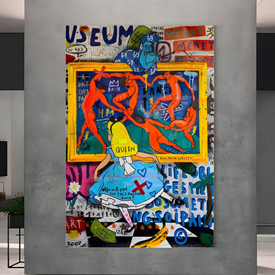
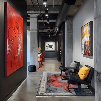


Hang four retro posters on one wall and the room stops being a room. It becomes a themed bar with a lease. That is the risk with retro art prints: individually they are charming, disciplined, graphically confident pieces, and collectively they can flatten a space into pastiche. We see it often when clients send us photos ahead of a sculpture install, and the fix is usually subtraction rather than addition.

Key takeaways
The "art retro style" label covers at least four unrelated eras of retro art prints. Mixing them without a shared palette is what reads as costume.
One large multi-panel piece usually beats five small posters for wall authority and object count.
Ink chemistry decides whether your 1950s coral is still coral in year eight.
The moulding carries the period. A wrong frame can make a good print look like a reproduction.
Past roughly 12 feet (3.7 m) of blank wall, a print starts losing the argument and metal relief wins it.
Four Eras of Retro Art Prints That Refuse to Share a Wall
Deco poster work from the 1920s and 30s is built on geometry, deep flat fields, metallic accents and heroic diagonals. Mid-century travel posters, the airline and resort school of the 1950s and 60s, are lighter: fewer colors, softer humor, screen-print flatness. Retro futurism art sits apart again, all chrome curves, atomic orbits and rocket optimism. Retro pin up art is the odd one out technically, because it is painted illustration with modeled skin tones and airbrushed gradients rather than flat graphic blocks. Those four families are what most sellers lump together under one label.
Pair two of these retro art prints only when they share something concrete: a palette, a printing method, or a line weight. Deco and retro futurism can work together because both love the machine. Pin-up next to a Deco liner poster rarely does, because one is soft and painterly and the other is hard and architectural. If you want variety in a single room, get it from scale instead of era.
Two eras can share a wall when the palette agrees; scale, not decade, should carry the variety in retro art prints.
The Theme-Bar Tipping Point Arrives on the Fourth Object
One retro piece is an accent. Two is a pair. Three reads as a small collection. The fourth object is where a media room in Austin becomes a diner set, especially once a neon sign, a jukebox or a chrome stool joins in. Count everything in the room that references the same decade, not just the framed retro art prints.
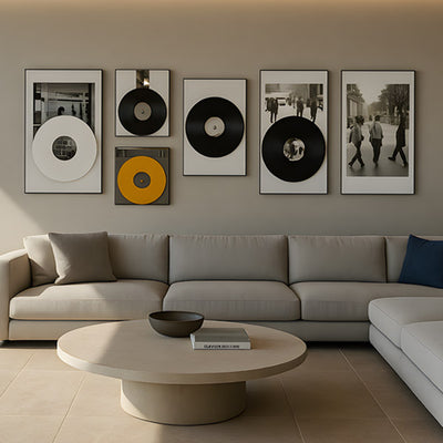
The cleanest way out of a crowded wall is consolidation. Where a wall currently carries four small framed posters, a single wide multi-panel work such as Pressline Beatles Retro Record Montage 5-Panel Wall Art does the same graphic job across the same width while still reading as one object. In our experience that swap calms the wall down and frees hanging space for something in a different register.

Retro Halloween Art Belongs on Rotation, Not a Permanent Hook
Seasonal retro art prints are the exception to almost every rule here. Retro Halloween art is ephemera by nature, all orange-and-black die-cut cats and grinning moons, and it works because it is temporary. Hang it year-round and it reads as a shop display. Buy it in one or two standard sizes, use a frame with a hinged or magnetic back so inserts swap in minutes, and keep the off-season prints flat rather than rolled, interleaved with acid-free tissue in a rigid portfolio. A print stored rolled for eleven months will fight you every time you try to flatten it.
Why Cheap Ink Turns a 1950s Palette Into Mud by Year Three
The fastest way to ruin retro wall art is buying dye-based inkjet output on thin coated stock. Magenta and yellow fade first, so a 1950s coral goes brick, then brown, and the whole print drifts toward a muddy cast while the blacks stay put. That uneven shift is what makes a print look tired rather than vintage. Pigment inks on cotton rag, or true screen prints, hold their hue far longer, and light exposure is the main variable you actually control. Conservation guidance from the Image Permanence Institute is blunt about the combination to avoid: strong light plus heat plus fluctuating humidity.
Practical version: ask the seller whether the ink is pigment or dye, specify UV-filtering acrylic or museum glass on any framed retro art going on a sunlit wall, and never hang a print on a west-facing wall without glazing that blocks UV. Retro art prints in a pool house or entry hall also need the paper protected from humidity swings, which means a sealed frame package rather than a cheap open-back.
Framed Retro Art: The Moulding Carries the Period
Frames do more period work than most buyers expect, and the moulding dates retro art prints faster than the image does. Stepped black lacquer or slim brass suits Deco poster imagery. Mid-century travel prints prefer plain maple, oiled walnut or a narrow white profile with a generous mat. Retro futurism art looks right in brushed aluminum. Pin-up illustration takes warm wood or restrained gilt, often float-mounted so the paper edge shows. The wrong choice is loud: a heavy ornate gold frame will make a 1960s airline poster look like a reproduction of a reproduction.
Framed retro art lives or dies on the moulding: brushed aluminum for atomic-era graphics, plain maple for travel posters.
Mat width matters too. Original travel and advertising posters were printed large, and the Cooper Hewitt, Smithsonian Design Museum poster holdings show how much of the design depends on that generous format. A skinny mat on a small reprint tightens the composition and loses the drama.
Hanging Retro Prints Near Sculpture So They Frame, Not Compete
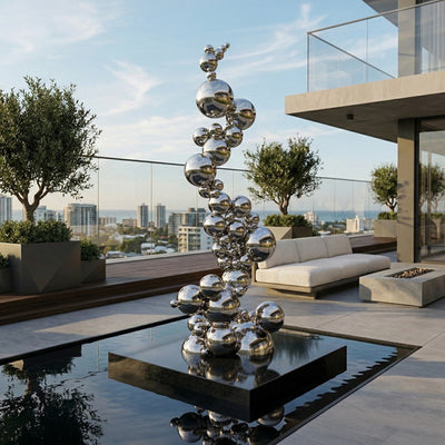
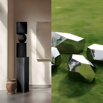
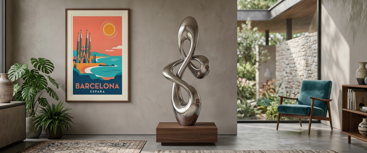
We installed a polished stainless piece in a Hamptons pool house where the client had hung three mid-century travel posters on the same wall behind it. The glazing threw the posters straight back at the viewer in the reflective surface, and both objects lost. Moving the prints to the perpendicular wall solved it in ten minutes. Two rules came out of that job. Keep glass-fronted prints off any wall that a polished or mirror-finish sculpture faces directly. And give a freestanding piece at least 30 inches (76 cm) of visual clearance from framed work at similar eye height.
Used well, retro art prints become a backdrop field rather than a rival. A flat, low-contrast retro print behind a matte bronze or Corten form reads as a color ground. Our stainless steel sculptures want the opposite: plain wall, no pattern, no glass nearby.

Checklist Before You Buy Retro Art Prints
Name the era you are buying, then count how many objects in the room already reference it.
Confirm pigment ink and paper weight, not just image size.
Specify UV-filtering glazing for any wall that gets direct sun.
Choose the moulding for the decade, not the sofa.
Measure the wall width and height before choosing print size; most buyers go too small.
Keep seasonal retro Halloween art in swap-ready frames.
Check sightlines against any sculpture, mirror or polished metal in the room.
When a Print Has Run Out of Authority and the Wall Wants Metal
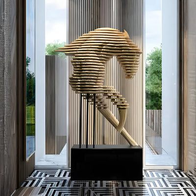
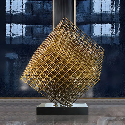
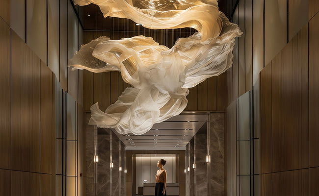
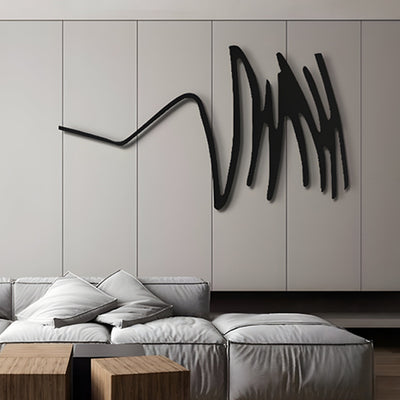
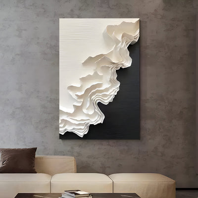
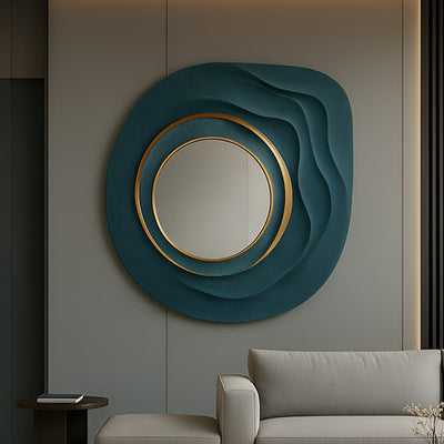
There is a point where paper cannot hold a space. Double-height entries, long commercial corridors, restaurant feature walls, exterior-facing courtyards in Napa or Aspen: at that scale even excellent retro art prints look like postcards. A multi-panel format buys you a few more feet of wall before that happens, which is why a piece the width of the Pressline Beatles five-panel montage tends to be the last comfortable stop for print-scale work. Past it, a wall-mounted metal relief is the honest answer. Bronze, Corten steel and powder-coated aluminum all carry graphic retro geometry well, and Corten in particular gives you the warm rust register that suits atomic-era motifs without needing a single drop of ink.
Commissioning changes the conversation from browsing to engineering. Panel weight has to land on structure, not plasterboard. Outdoor pieces need fixings that allow thermal movement and drainage behind the panel. At Giant Sculptures we work through those details on every bespoke commission, and budget depends on material, scale, complexity, engineering, installation and finishing, so the sensible next step is a tailored quote rather than a guess. The retro art collection covers the print-scale end of the decision, and the main catalog is the place to start if the wall is asking for something with mass.
For wider placement ideas, Moss Wall Art Panels: The Honest Guide to Keeping Them Green is useful companion reading before finalising the setting and sightlines.