
























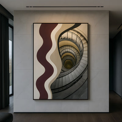
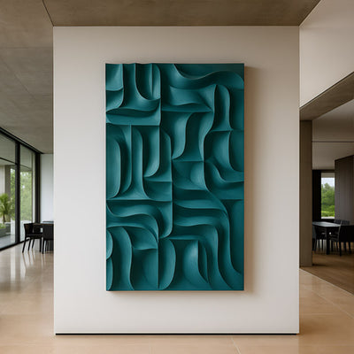
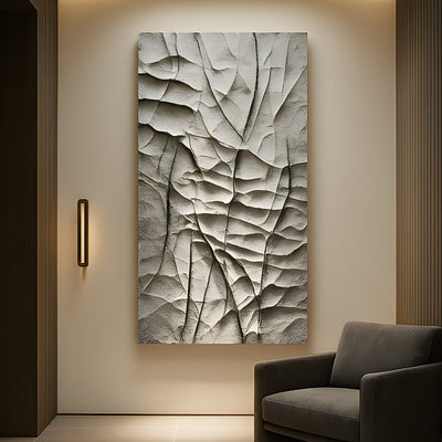
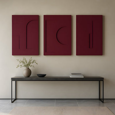








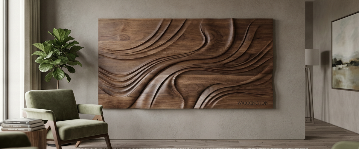

Most personalized wood wall art fails in the same place: the name. A surname routed in big letters across a walnut panel looks confident on a screen mockup, then reads like a nameplate once it is hanging in a Dallas hallway or a Manhattan reception. At Giant Sculptures we carve bespoke wall pieces for homes, offices and venues, and the commissions that still look right years later share one habit. The lettering is part of the carving, not stuck on top of it.

At a Glance
Keep the name secondary. The best personalized wood wall art lets form, grain and shadow carry the piece. The personalization rewards a closer look.
Pick letterforms with a long history. Classical serifs and restrained sans-serifs age well. Trend scripts do not.
Match species to detail. Walnut and oak hold a crisp serif. Ash tends to soften fine strokes in dry, heated rooms.
Match depth to distance. Deep relief reads across a boardroom. Laser engraving only reads at arm's length.
Proof at full size, on the actual wall, before any wood is cut.
Why the Name Belongs in the Carving, Not the Headline
Make a family name or company mark the biggest element on the panel and you have commissioned a sign. Signs get read once. Good personalized wood wall art gets looked at again, and it repays that second look when the personalization is woven into the surface: initials cut into the lower edge of a relief, a founding date that follows the line of a carved ridge, a monogram that appears where two forms meet.
Size is the practical test for any personalized wood wall art. If the name could be lifted off the panel and the carving would still stand on its own as a composition, the balance is right. If removing it leaves a blank board, the piece was built around the wrong thing.
Personalized Wood Wall Art: Lettering That Settles Into the Grain
Lettering dates faster than any other part of a personalized wall piece. Brush scripts, ultra-thin geometric sans and distressed farmhouse stencils all carry the fingerprint of a particular few years. Roman capitals descend from inscriptions cut in stone nearly two thousand years ago, and they have survived every change in fashion because they were designed to be carved. Their wedge-shaped serifs and varied stroke widths catch light, and that is what a chisel or router does best.
On personalized wood wall art, grain direction matters just as much as typeface. Thin horizontal strokes cut across the grain are the first to chip, so our carvers lay out letters to run with the figure wherever possible and thicken any stroke that has to cross it. A good letterform in the wrong orientation still fails.
Initials cut small into the lower edge of a walnut relief, running with the grain.

Walnut, Oak and Ash: How Each Species Holds a Letter
Black walnut is the studio favorite for fine lettering on personalized wood wall art. It is dense and even-textured, so a serif keeps its point, and its dark tone lets the cut read through shadow rather than color contrast. White oak is coarser but strong, and its ray fleck adds a quiet texture behind bold capitals. Both suit serifs at modest sizes.
Ash is beautiful and often specified for its pale, Scandinavian look. It is also ring-porous, with soft open bands between hard latewood. The Wood Database profile of white ash shows that contrast clearly. When a delicate serif crosses a soft band and the room dries out under winter central heating, the edges feather and round over. In ash we recommend heavier letterforms and a little more depth.
Deep Relief or Laser Engraving? Reading Distance Decides
Laser engraving is shallow and relies on a scorched tone to show the letter. Stand more than a few feet back and it disappears into the grain. That is fine for a desk plaque or a gift box. It is wrong for personalized wood wall art that people see from a doorway.
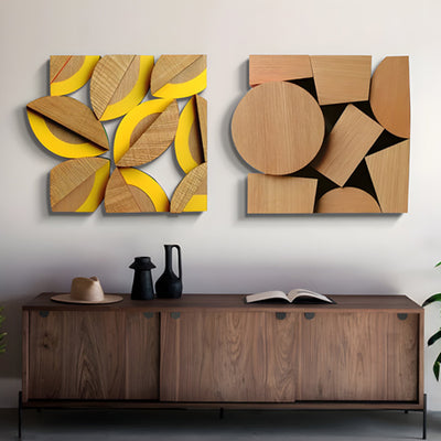
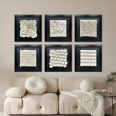
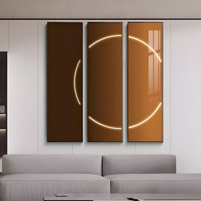
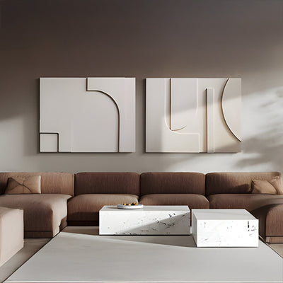
Deep relief works through cast shadow, which carries much further. For a wall seen from the far end of a long boardroom, a multi-panel carving such as Harmonic Forms 4-Panel Brown Wood Carving makes more sense than a single engraved board, because its carved surface throws real shadow under downlights. Apply the same logic to the personalization: if a name has to read from the far end of a conference table, it needs to be carved, not burned.

Personalized Wood Wall Art for Office Receptions
Personalized wood wall art for office receptions works best when the logo becomes texture rather than signage. Most firms already have a lit sign by the door, and repeating it in wood behind the front desk just doubles the branding. Instead, pull a curve, angle or rhythm from the mark and carry it across the panel as a repeating relief.
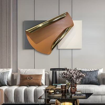
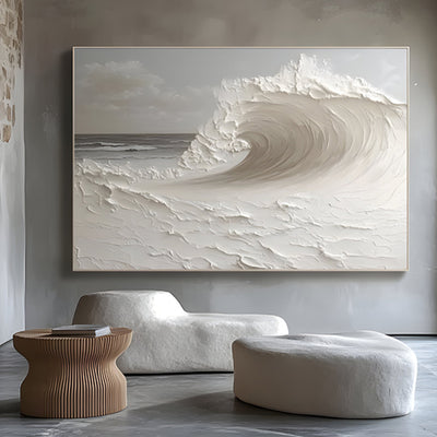
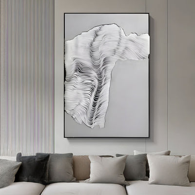
A common first brief is a logo four feet wide in oak. The stronger result usually takes the arc or angle of the mark and turns it into a field of carved ridges, with the wordmark cut small near the base. Clients notice the brand on the second glance, which is the point. Where a reception needs warmth and layered depth rather than a literal logo, a relief closer to Arcuza Terracotta III Wood Carving Sandstone 3D Wall Art speaks the right design language, and it is a useful gauge of how much surface texture a front-desk wall can carry before it starts to feel busy. For a crisper accent, a small bronze or stainless steel inlay from our metal wall art range can carry the logo while the wood provides the atmosphere.
Proof It at Full Size Before the First Cut
Every personalized wood wall art commission we take on gets a full-size paper proof. Tape it to the actual wall, then look at it from the doorway, from a seated position, and from wherever visitors wait. Check it in morning light and again under evening downlights, because the angle of the light changes how deep the letters appear.
A full-size paper proof checked from a seated position before any wood is cut.
The proof catches mistakes renderings hide. A monogram can sit perfectly at standing eye level, then vanish behind a sofa back the moment guests sit down. Spotted on paper, the fix is simple: drop it by six inches (15 cm) before a single board is cut.

Buyer Checklist: Deciding on a Personalized Piece
Viewing distance: Arm's length suits engraving. Across a room needs carved relief.
Room climate: Heated or air-conditioned offices favor walnut or oak for fine detail.
Typeface age: Would the letterform have looked right twenty years ago? If so, it will likely look right in twenty more.
Hierarchy: Does the carving still work if you cover the name?
Grain layout: Ask how letters will be oriented to the figure.
Proofing: Insist on a full-size template on site before production.
Budget for personalized wood wall art depends on species, overall size, carving depth, panel count, finishing and installation, so we quote each bespoke commission individually. Look through our wood wall art collection or the wider 3D wall art range for forms you like. Then send us the wall dimensions and the name or mark you want to include. We will tell you honestly whether it should whisper or speak.
For wider placement ideas, Metal Wall Art for Office Spaces: Finish, Relief and the Ten-second Rule is useful companion reading before finalizing the setting and sightlines for your personalized wood wall art.