





























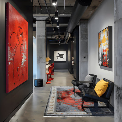



Most office art briefs start with the wrong wall. The client points at the big blank surface behind the boardroom table, while every visitor spends their first ten seconds staring at a narrow strip beside the elevator doors. If you want to customize wood wall art for an office, start by walking the route a guest takes, from the lobby door to the chair they finally sit in, and note where they pause. That route decides where timber earns its place. The floor plan does not.
At a glance
Plan by route: reception, corridor and boardroom each need a different scale and depth of carving.
Relief carving reads as art. A flat routed logo reads as signage, however good the walnut.
Size detail to viewing distance: bold silhouette for long sightlines, fine tooling where people stand close.
Choose dense, stable hardwoods and let panels acclimatize on site before hanging.
Win brand sign-off with a physical sample, never a render alone.

The First Wall a Visitor Faces Is Rarely the Empty One You Planned For
We see this on almost every commercial commission. One tech client sent us drawings for a 16-foot (4.9 m) feature wall in their main meeting room. When we asked for photos of the arrival sequence, the more important surface turned out to be a half-height wall facing the elevator, the only thing a guest sees while signing in. The client moved most of the budget there. The boardroom got a quieter piece, and nobody has missed the bigger one.
Before you customize wood wall art for any wall, stand where guests stand and count the seconds they spend at each stop. A lobby where people wait two minutes for a host deserves your richest carving. A wall people pass at walking pace needs rhythm more than detail.
Reception, Corridor, Boardroom: Each Stop Gives the Timber a Different Job
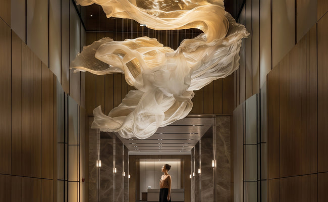
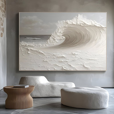
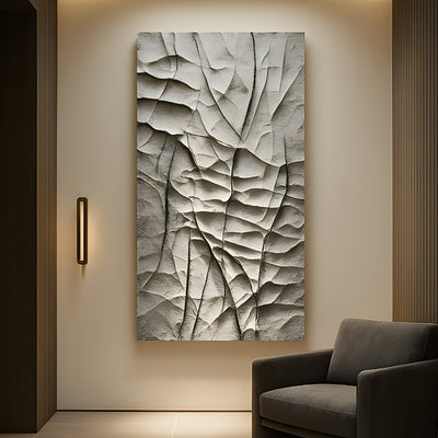
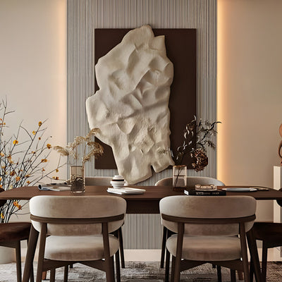
Reception is about arrival. The piece has to hold attention from the door and still reward a close look while someone waits. Deep relief, strong shadow and a single confident form do this well.
Deep relief and a close-set grazer let a reception piece hold attention from the door.
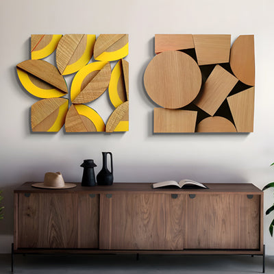
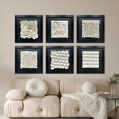
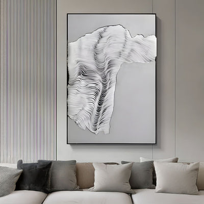
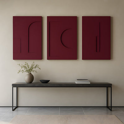
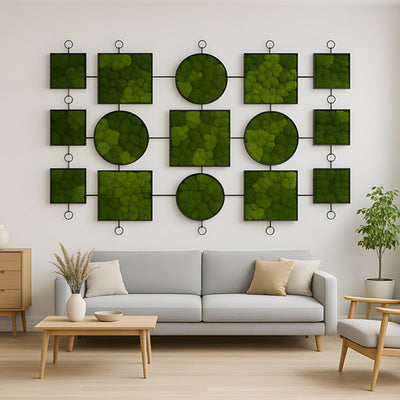
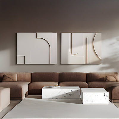
Corridors are about pace. A run of panels works better here than one big object, because the eye collects them as you walk. Along a long hallway, a multi-panel carving such as Harmonic Forms makes more sense than a single oversized relief: the repetition reads as movement, and the panels can be spaced to match door bays or a column grid.
Boardrooms are about sitting still for an hour. Skip anything busy enough to fight a presentation screen. Lower relief, a restrained palette and texture you notice in the third meeting rather than the first tend to wear well with the people who use the room every week.

Why a Routed Logo at the Front Desk Reads as Signage While Relief Carving Reads as Art
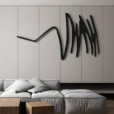
A CNC-routed logo is a flat graphic cut to a uniform depth, and the brain files it alongside door plates and wayfinding. Relief carving changes depth continuously, so light rakes across it and the surface shifts as you move. That shift is what makes people stop.
A law practice we worked with had already installed a routed oak logo behind reception and asked why it felt "like a sign in a nicer material." More logo would not have helped. We carved a sculpted panel for the adjacent wall that borrowed the curve from their mark and turned it into a field of ridges, then moved the routed logo to the desk front, where signage belongs. Visitors now ask about the panel; nobody asked about the logo.
Sightlines at 33 Feet Versus 6 Feet: Sizing Detail to Where People Stop
From about 33 feet (10 m), a typical lobby-door distance, the eye reads silhouette, shadow mass and overall color. Carved detail finer than roughly an inch (25 mm) starts to merge into general texture. The reception piece therefore needs a bold outline and relief deep enough to throw real shadow.
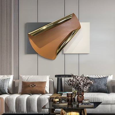
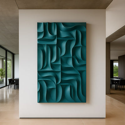
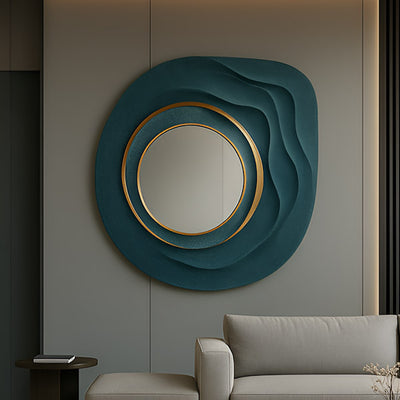
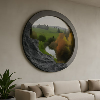
At 6 feet (2 m), in a corridor or beside an elevator, everything flips. People read grain, tool marks and the edge where two planes meet, and some will touch. Finish quality matters more than size. This is where mixed surfaces pay off: when carved wood meets a sandstone-textured face, as in Arcuza Terracotta II, the contrast only registers up close, which makes it a better fit beside an elevator than across a lobby.
At elevator distance, grain, tool marks and material contrast do the work.
A studio rule worth stealing: whenever you customize wood wall art for a specific wall, make a full-size paper template, tape it up, and check it from the farthest point a visitor sees it and the nearest point they stand. If it fails either test, change scale or depth before you touch the design.

Office Lighting and Dry Air: Which Woods Keep Crisp Edges Along the Route
Commercial buildings are hard on timber. Winter heating and constant air conditioning pull indoor humidity down, and wood shrinks across the grain in response. The USDA Forest Products Laboratory's Wood Handbook sets out how moisture content tracks relative humidity and how much each species moves. In practice, a panel built in a humid workshop can open hairline cracks at its glue lines during the first heating season.
For carving with sharp edges, we favor dense, close-grained hardwoods: hard maple, cherry, walnut and quarter-sawn white oak. Softer carving woods bruise at shoulder height in busy corridors. Ask for panels to be built at a moisture content suited to the destination building, and let them sit unwrapped on site for several days before hanging.
Light is the other variable. Flat LED ceiling panels wash relief out, while a downlight or wall grazer set close to the surface brings it back. Watch south- and west-facing glazing too, since UV darkens cherry and yellows maple over the years. If the wall takes direct sun, specify a UV-inhibiting finish or pick a species whose aging you are happy to live with.
How to Customize Wood Wall Art for an Office Without Flattening the Grain
Brand guidelines are written for screens and print, and wood refuses to behave like a swatch. The same stain lands differently on earlywood and latewood, and two boards from one tree will never match exactly. When you customize wood wall art around a brand palette, agree a color tolerance up front ("within the family of brand green") instead of an exact code.
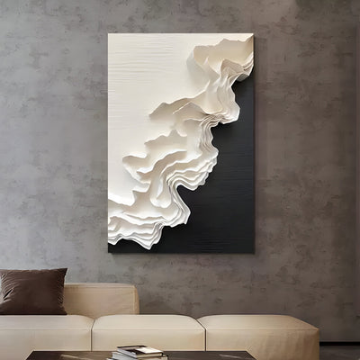
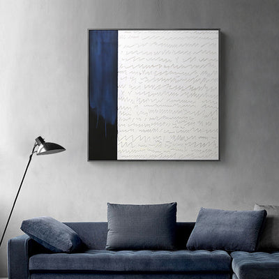
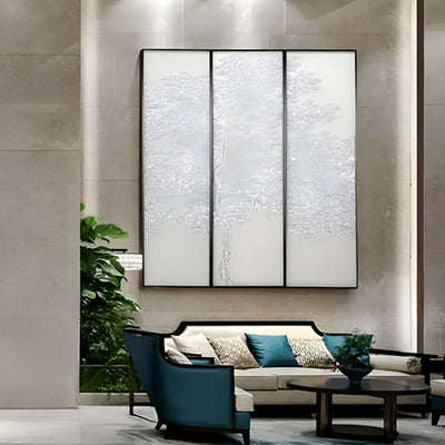
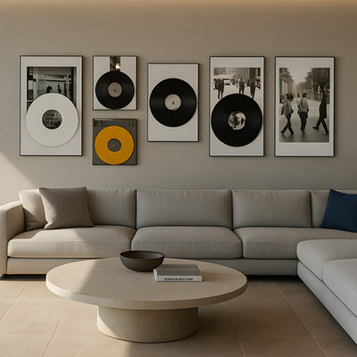
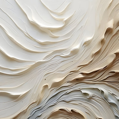
Hand-painted relief is often the best compromise. Where the brand palette leans neutral, a painted weave such as Elorium White Weave sits comfortably beside white walls and pale joinery while the carved texture keeps it obviously timber. For a stronger brand color, translucent washes let grain show through in a way opaque paint cannot. Translate the logo into a curve, a rhythm or a proportion rather than reproducing it; insiders catch the reference and everyone else sees art.
Then put a physical sample in front of the brand team, under both daylight and office light. The commissions where clients skipped that step are the ones that needed a second round.

Checklist Before You Customize Wood Wall Art for the Office
Walk the visitor route and rank walls by dwell time, not by size.
Fix a viewing distance for each wall before agreeing scale.
Confirm species, moisture content and finish against your HVAC and glazing.
Check wall construction: heavy hardwood panels may need blocking behind drywall or a concealed French cleat.
Agree a color tolerance and approve a sample in real light.
Bring lighting into the electrical plan so grazers go in with the build.
Request a tailored quote covering design, carving, finishing, crating and installation, since budget moves with every one of them.
Giant Sculptures carves and ships bespoke pieces for offices, hotels and private clients worldwide. Our wood wall art collection is a good place to compare scale, depth and finish before you brief us, and the wider 3D wall art range helps if a lobby calls for something in metal or mixed media instead.
For wider placement ideas, Metal Wall Art for Office Spaces: Finish, Relief and the Ten-second Rule is useful companion reading before finalising the setting and sightlines.