




















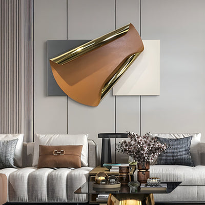
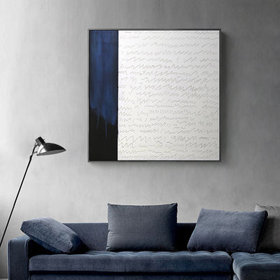
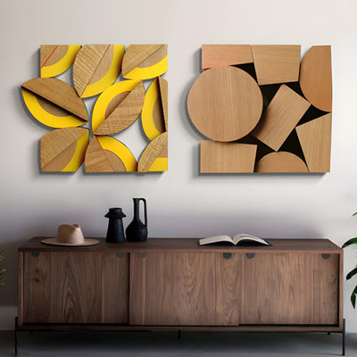

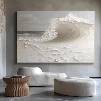







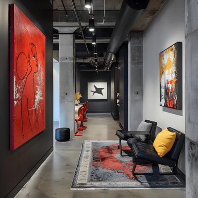

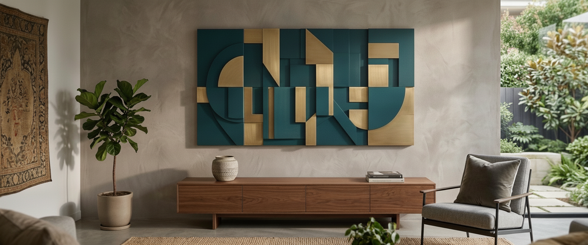

A coral powder-coated panel that looked electric on the studio floor can read like wet terracotta by the time service starts and the dimmers drop. That gap between sample and site is the most common reason buyers feel let down by vibrant metal wall art, and it usually has nothing to do with the artwork itself. The color was fine. The light was working against it.

Key Takeaways Before You Choose a Color
Warm 2700K light flatters bronze, brass, ochre and rust, and quietly kills clean reds, corals and pinks.
Cool daylight around 4000K to 5000K is where saturated blues, teals and greens hold their punch.
Powder coat outperforms sprayed paint under a fixed spotlight that hits the same square foot every day.
Satin is the safest sheen in hospitality; gloss sends glare straight into seated eye level.
Always view vibrant metal wall art samples under the actual specified fittings, not showroom light or a phone screen.
Warm 2700K Dining Light and the Reds, Corals and Ochres It Turns to Mud
Most restaurant fit-outs land somewhere between 2400K and 2900K because it makes skin, timber and food look good. That same warm spectrum is thin in the blue and pure-red wavelengths, so a color that depends on clean red pigment has nothing to reflect. Coral goes brown. Raspberry goes liver. Bright pink turns dusty. None of that is a fault in the panel; it is why vibrant metal wall art needs a lighting brief as much as a design brief. Low color rendering makes it worse, and the Illuminating Engineering Society publishes the metrics worth asking your lighting designer about before you sign off a palette.
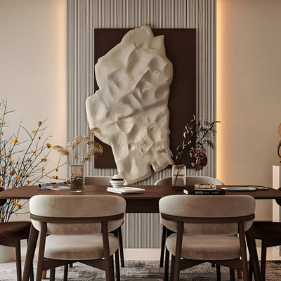
What does work under warm light is anything with a metallic base. Bronze, aged brass, copper, burnt orange and deep ochre all gain depth because the light is feeding the exact wavelengths those surfaces bounce back. We once mocked up a scarlet panel for a steakhouse under the lamps the fit-out team had specified, and it looked like dried ketchup on the wall. The client switched to patinated bronze and the piece now reads as the warmest thing in the room. Where a dining wall needs presence without relying on pigment, a cast relief such as the roughly 4 ft (120 cm) Galloping Herd Bronze Relief Wall Art - 120cm behaves the same way: the highlights lift, the recesses hold shadow, and no dimmer setting flattens it.
Metallic finishes gain depth under warm dining light, while clean reds lose saturation.

Cool Daylight Offices: Where Saturated Blues and Greens Finally Behave
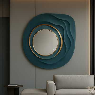
Corporate lobbies, showrooms and boardrooms usually sit at 4000K or higher, often with real glazing alongside. This is the environment where cobalt, teal, emerald and electric blue stop looking gray, and where vibrant metal wall art finally performs the way the render promised. Mixed metallics behave well too, since cool light sharpens the contrast between polished gold and a deep-pigment field. Where the scheme calls for cool saturation rather than warm metal, Aurelios Cosmic Blue Crystal Porcelain & Gold Orbit 3D Wall Art is closer to the right design language: the blue needs cool ambient light to stay saturated, while the gold orbit reads clearly at any temperature.
If a single scheme has to cover both conditions, split the difference. Specify the boldest color for the daylight zone and a metallic or Corten-toned piece for the warm dining or lounge zone. Buyers who force one color to work everywhere almost always end up compromising both rooms. Browse the full metal wall art range with the light temperature of each room in mind, not the mood board.
Powder Coat or Sprayed Paint Under a Spotlight That Never Moves
Commercial spotlights are relentless. They hit the same section of surface for twelve hours a day, every day, and over a couple of years you will see the difference between finishes. Powder coating cures to a dense film that holds pigment far better under constant UV and heat load; architectural grades are measured against FGIA performance specifications for gloss retention and chalking, which is the language to use when you ask what your panel is actually coated with.
Sprayed automotive-style paint can give you a color match that powder cannot always reach, and for interior pieces away from direct light it is a fair choice. For anything under a fixed beam, a covered terrace or a west-facing atrium, we steer clients to powder coat every time, because it keeps vibrant metal wall art saturated for years under that kind of load. For genuinely exposed positions, stainless steel and Corten sidestep the problem entirely, because their color comes from the metal rather than a coating applied on top.
Gloss, Satin, Matte: Which Sheen Throws Glare Back at Booth Four
Sheen is the detail buyers skip and diners notice, and it decides whether vibrant metal wall art reads as artwork or as a mirror. High gloss reflects every downlight in the ceiling, which is fine on a double-height lobby wall and miserable at seated eye level, where a guest in a corner booth gets a hot white blob across their view of the art. Matte solves glare but drinks light and can look flat and chalky once the dimmers go low. Satin is the workhorse: enough sheen to carry a highlight, not enough to act as a mirror.
One practical rule from the studio. If the piece sits below about 5 ft (1.5 m) off the floor in a seated area, avoid gloss. Above head height on a feature wall, gloss earns its keep.

Uplight, Wash or Track, and Why One Fitting Flattens a Whole Panel
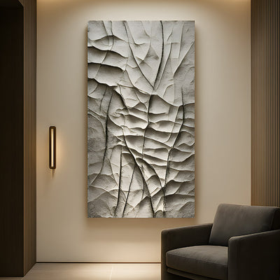
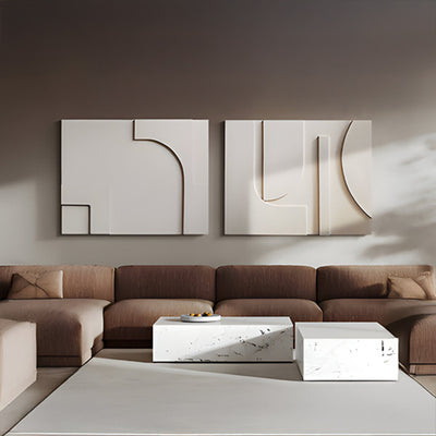
Three-dimensional metalwork lives on grazing light. A single downlight directly above a relief throws hard shadow into the top third and leaves the lower half dead. A flat wash from the front removes shadow altogether, which makes a textured panel look like a printed graphic. Track heads angled at roughly 30 degrees from the wall plane, or a discreet uplight at the base, give the surface the raking angle it needs to show its depth. Ask your lighting consultant to reserve a circuit for the art rather than borrowing the general scheme, and check the layered effect in the 3D wall art category, where relief depth matters most.
Raking light at roughly 30 degrees keeps relief depth visible without glare at seated eye level.
Testing Vibrant Metal Wall Art for Restaurants Before the Commission Is Signed
Run this checklist before approval. It takes an afternoon and saves reworks.
Get the lamp spec from the fit-out team: color temperature, color rendering figures and dimming range.
Request physical finish samples large enough to judge, not chips the size of a credit card.
View them on site, on the actual wall, at both full output and typical service dimming.
Hold samples against the real backdrop material along with the upholstery and tabletop finishes.
Do not treat a photograph as evidence. Cameras auto-correct white balance and will lie to you.
Check the sheen from a seated position in the nearest booth or chair.
Confirm coating type, coating grade and fixing method in writing before production starts.
Brick, Pale Plaster and Dark Timber: Three Backdrops, Three Different Pieces
Exposed brick is already busy and mid-toned, so it swallows detail. Go larger, simpler and higher in contrast; a bold single-color field or a polished metal form will read, while fine relief detail vanishes. Pale plaster is the most forgiving surface in hospitality and the place where saturated color and crisp shadow both work, which is why a carved relief such as Apollo and the Muses Marble Relief Wall Art - 180cm at around 6 ft (180 cm) sits so comfortably against it, with the plaster doing the work a painted background would otherwise have to. Dark timber needs metallic warmth rather than pigment: brass, bronze and copper separate from the grain, while a navy or forest panel simply merges into it.
Scale is the other half of the decision. A panel that looks generous in a sample image can read as a postage stamp on a 20 ft (6 m) feature wall. Our team sizes bespoke vibrant metal wall art against elevation drawings rather than guesswork, and we can adjust proportion, relief depth, coating and sheen within the same design.

Commissioning With Confidence
Vibrant metal wall art earns its place when the color, finish and lighting are specified as one decision rather than three. Budget depends on material, scale, relief complexity, engineering for the fixing system, installation access and the finishing route you choose, so the sensible next step is a tailored quote rather than a guess. Send us the wall dimensions, the lighting schedule and a photograph of the backdrop, and Giant Sculptures will come back with material and colorway options built for that specific room. You can also work through the wider wall art and wall decor range first to narrow the direction before a commission brief goes out.
For wider placement ideas, Metal Wall Art for the Office: Buy for the Room and the Camera is useful companion reading before finalising the setting and sightlines.