



































Most retro art dies at arm's length. From across a room, a flat print of a finned diner sign or a chrome ray gun looks convincing; walk within four feet (about 1.2 m) and it collapses into ink on paper. That gap between promise and delivery is the central problem with the category, and it is why our studio builds retro art as raised metal relief rather than pressing it onto stock.

Key Takeaways Before You Buy
Relief depth of roughly an inch and a half (about 40 mm) is where a retro art motif starts casting its own shadow and stops reading as a poster.
Palette discipline matters more than subject. Four or five colors carry retro futurism; eight tip it into novelty.
Framed retro art lives or dies on the edge return and the mount, not the moulding.
Retro futurism, pin-up and Halloween motifs all age differently. Choose the one that suits how long the wall has to hold it.
Budget depends on scale, material, relief complexity, finishing and installation, so ask for a tailored quote rather than working from a headline figure.
The 40mm Test: What Raised Relief Does That Flat Print Cannot
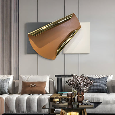
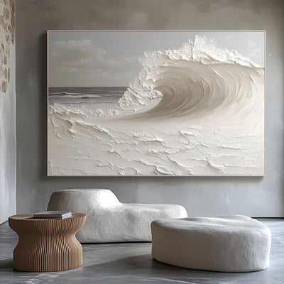
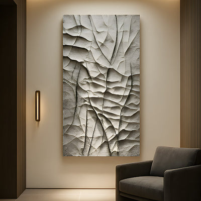
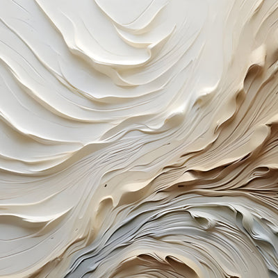
Take any retro poster art motif: a streamlined locomotive, a spacecraft with too many fins, a neon-script coffee cup. Raise the primary forms about an inch and a half (roughly 40 mm) off the backing plate and something changes immediately. The piece throws a real shadow that moves with the sun or the track lighting, so the image is different at 9am and 9pm. Flat retro art cannot do that. It has one appearance and holds it forever.
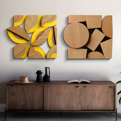
Depth also solves the scale problem. Large retro wall art in print form gets thin fast; enlarge a 1950s advertising illustration to eight feet (about 2.4 m) wide and you are enlarging its flaws. Built in laser-cut steel or aluminum with layered planes, the same composition gains structure. We build the background field, then the mid-ground shapes, then the hero object, and each layer gets its own finish. Brushed metal behind, gloss color in front, and the eye reads hierarchy instead of a blown-up graphic.
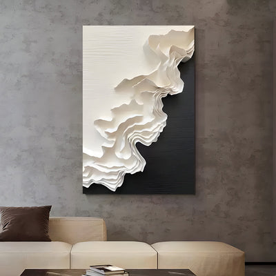
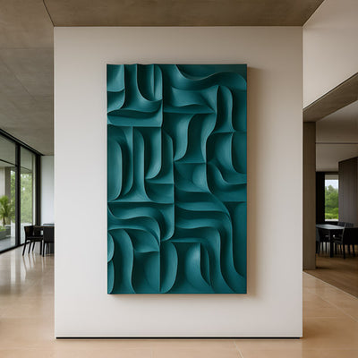
Layered steel planes at roughly 40 mm depth, photographed under raking light.

Palette Discipline, or How Three Colors Too Many Turn Retro Futurism Into Kitsch
The original mid-century designers were working under real constraints. Screen printing and litho runs cost money per color, so the palettes stayed tight: a warm ground, one or two saturated accents, a metallic, black. That restraint is exactly what makes the work read as designed rather than decorated. The Wolfsonian's machine age design collection is full of examples where speed lines and a two-color scheme do all the work.
Where modern retro art prints go wrong is abundance. Digital printing costs nothing extra for the sixth color, so the sixth color gets added, then a gradient, then a drop shadow. Our rule on commissions is simple: pick a ground, two hero colors, one metal and one near-black. If a client wants a seventh tone, something else has to go. Retro pin up art is especially unforgiving here, because skin tones, hair and fabric already eat three slots before you touch the background.
Why Retro Futurism Art Outlasts Every Other Revival on Our Order Book
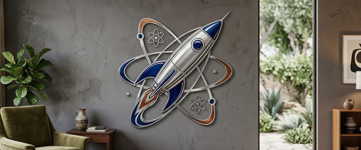
Atomic-age optimism keeps selling. Orbital rings, finned rockets, ringed planets, radar sweeps: retro futurism art has a geometric backbone that survives being scaled up and cut in metal, which most nostalgia styles do not. Diner signage relies on typography, and typography at fifteen feet (about 4.6 m) becomes a headline rather than an artwork. Rockets and orbital geometry stay legible at any size.
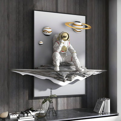
It also has range. The same visual language reads as playful in a games room and as serious engineering in a tech company lobby. We shipped a nine-panel orbital composition to an office fit-out where the brief was explicitly "nothing that looks like a mural," and the metal depth is what let it pass as sculpture rather than graphics. You can see the general direction across our retro art collection.
A nine-panel orbital composition in brushed and coated aluminum.

Framed Retro Art: Edge Returns, Floating Mounts and Killing the Poster Look
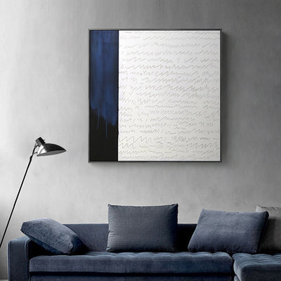
Framing is where good retro wall art gets undermined. A black box frame and a white mat announce "print" before the viewer has processed the image. Two details change that.
First, the edge return. If the piece has a folded or fabricated edge of an inch or two (roughly 25 to 50 mm) running back toward the wall, it reads as an object with volume. Second, the float mount. Hidden cleats that hold the panel three quarters of an inch (about 20 mm) off the plaster create a shadow line all the way around, and that shadow does more than any frame. For outdoor or humid installs we specify architectural-grade powder coating to a recognized specification; Qualicoat publishes the durability classes worth quoting to your fabricator.
Retro Halloween Art That Reads as Design, Not Seasonal Tat
Retro Halloween art is a genuine sub-genre with real history behind it: die-cut German paper decorations, 1930s crepe party goods, orange-and-black cats with impossible geometry. Built as relief metal in a strict two-color scheme, a grinning moon or a stylized black cat sits happily on a bar wall in February, reading as retro art rather than seasonal dressing. Printed as a novelty, it goes into storage on November 2nd.
Our test for clients: would you keep it up year round? If the answer is no, the palette is too literal or the motif is too cartoonish. Push the shapes toward mid-century abstraction and the seasonal reference becomes a wink rather than a costume.
Rooms That Carry Retro Without Irony
Some spaces absorb retro art naturally. Basement bars and whiskey rooms handle saturated color because the ambient light is already low and warm. Home cinemas take retro poster art at genuine scale, though one client ran a fourteen-foot (about 4.3 m) rocket relief along the corridor outside the screening room rather than inside it, which was the right call; you see it on the way in, not during the film. Hospitality lobbies want the restrained end: brushed steel, one accent color, geometry over illustration.
The rooms that fight it are period-sensitive interiors with heavy traditional joinery, and any space where the artwork has to compete with a strong existing pattern.

When an Off-the-Shelf Retro Print Stops Being Enough
The ready-made retro art prints buyers find online work fine below about three feet (roughly 900 mm) wide in a domestic room. Beyond that, three things usually force a commission: the wall dimensions do not match any standard size, the colors need to answer a specific interior scheme, or the piece has to survive an environment that paper cannot.
Run through this before you brief anyone:
Measure the negative space, not the wall. Leave breathing room on both sides.
Check viewing distance. Under six feet (about 1.8 m), relief depth and finish quality carry the piece; beyond twenty feet (about 6 m), silhouette does.
Confirm the substrate. Stud walls, masonry and glazed partitions all need different fixings, and weight climbs quickly with steel.
Lock the palette early. Bring paint chips or fabric, not screenshots.
Decide indoor or outdoor. Exterior work needs marine-grade fixings and a coating system specified for the climate.
Ask about lead time and access, including whether the piece can be built in sections for stair or elevator access.
Giant Sculptures handles retro art commissions the same way we handle large figurative and abstract work: engineering drawings first, finish samples second, fabrication third. If you already have a reference image, an original illustration or a rough sketch on a napkin, that is enough to start a conversation about scale, material and cost.
For wider placement ideas, Bronze Framed Wall Art: How to Buy a Piece That Earns Its Wall is useful companion reading before finalising the setting and sightlines.