




















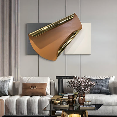
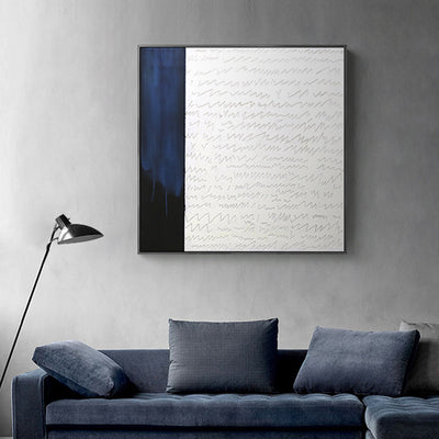
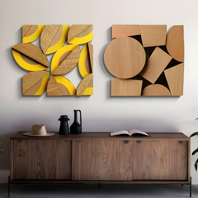

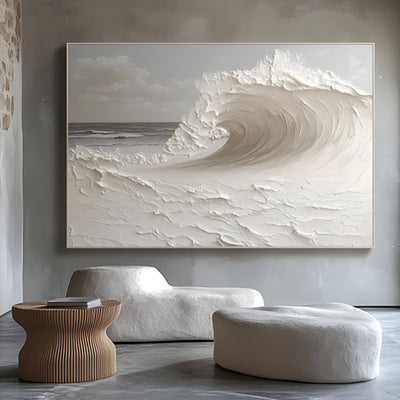
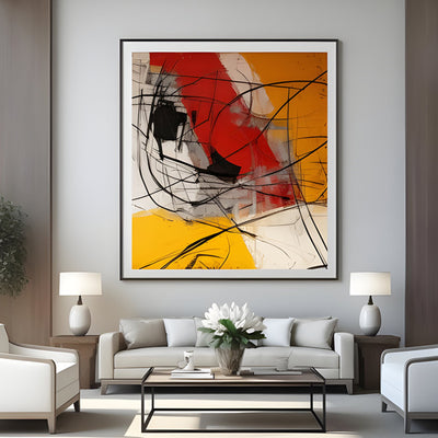
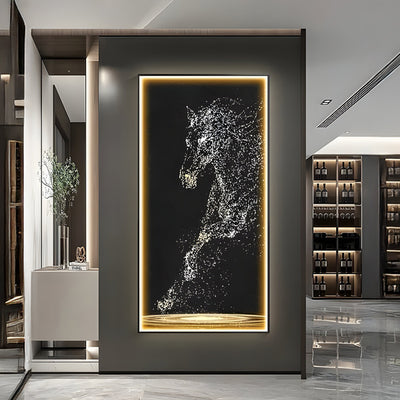
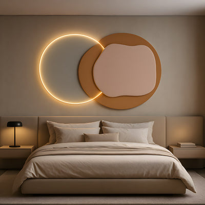
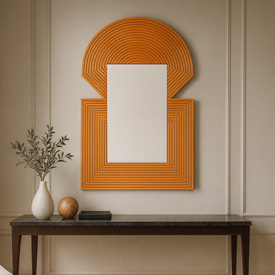
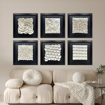
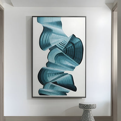
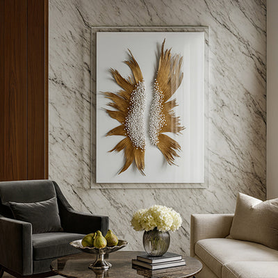
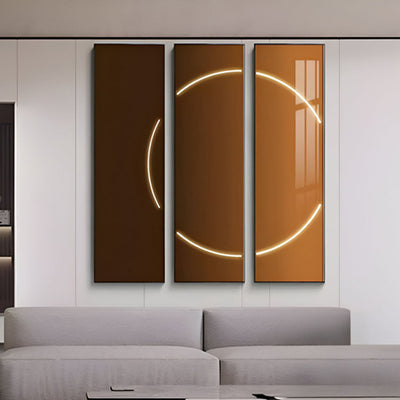
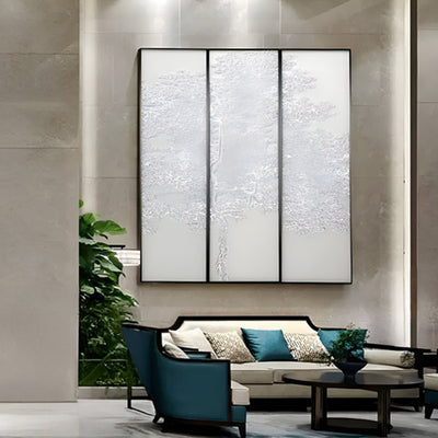
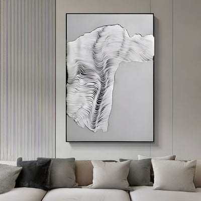
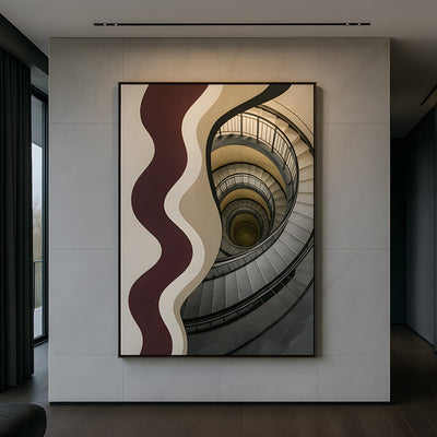
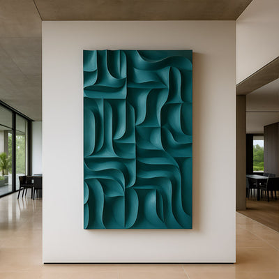
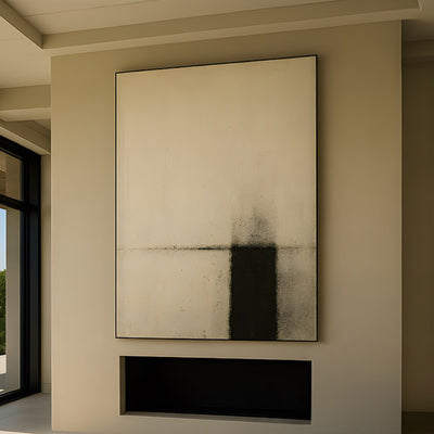
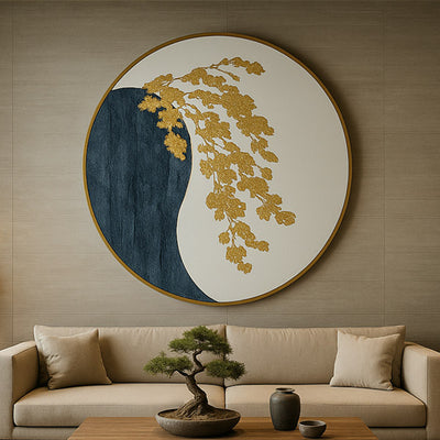
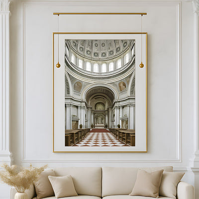
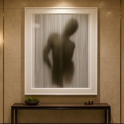
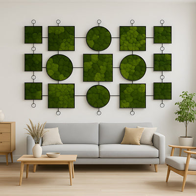
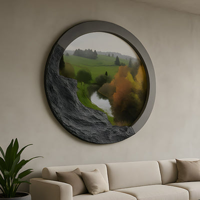
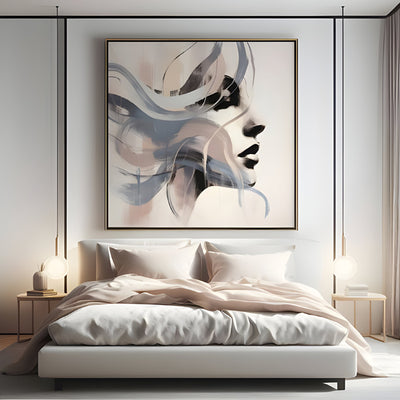
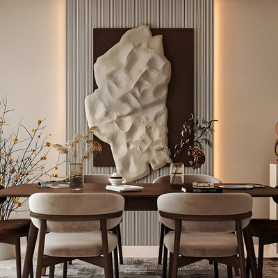
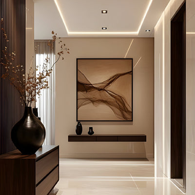
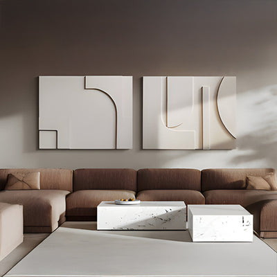
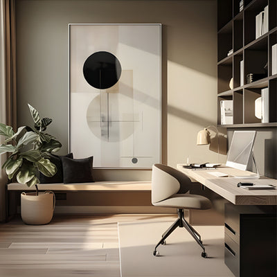


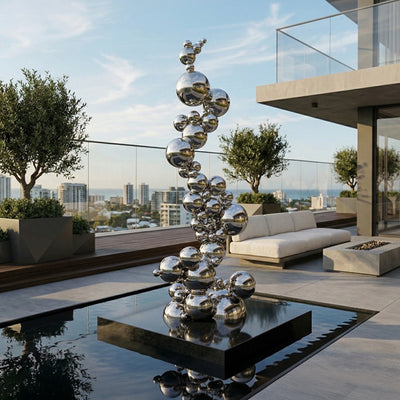








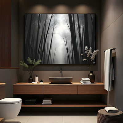

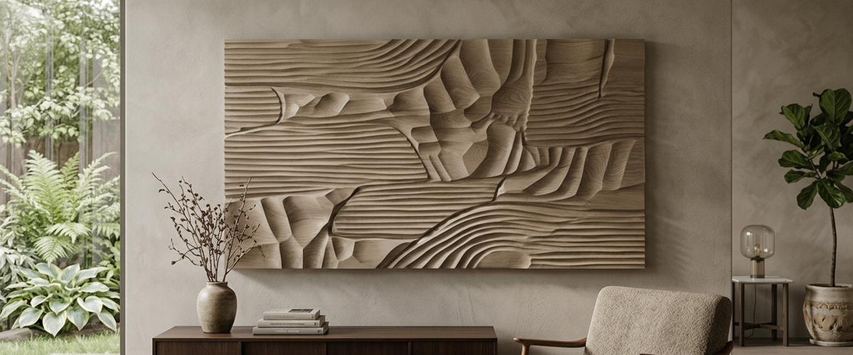

Beige is the hardest color to buy without standing in front of it. It shifts under a lamp, changes character against a floor, and reads one way at 8am and another at 8pm. Which is why so much abstract beige wall art gets ordered, hung, lived with for a fortnight, then quietly packed back up. The artwork is rarely the problem. Beige is not a single color, and most people choose it from a backlit screen in a room that shares nothing with the wall it is heading for.
Looking for the full range in this category? Browse our Wall Art & Wall Decor collection for every available finish, size, and configuration.

Quick Answer: What Actually Decides Whether Beige Works
Six things decide whether abstract beige wall art settles into a room or sits wrong in it for years:
Undertone first. Pink-beige, green-beige and gray-beige behave like three different colors. Name yours before you shop.
Judge against your floor, not your wall. Oak, walnut and pale stone each push beige in a different direction.
Texture protects you. Carved timber and plaster relief hold their color under bad light; flat print does not.
Test at dusk. A piece that looks right in north-facing daylight can turn yellow under 2700K bulbs.
Horizontal formats above a bed are the least forgiving. Clashes sit at eye level every morning.
Use physical samples. Screens are calibrated for contrast, not for the difference between greige and mushroom.
Pink-Beige, Green-Beige, Gray-Beige: Naming the Thing You Are Actually Choosing
Ask five people to describe the same panel and you will get taupe, sand, greige, mushroom, oatmeal and stone. None of those words carry information. Undertone does. Hold a sheet of plain printer white against the piece and the bias shows up immediately: a faint rose cast, a faint olive cast, or a cool slate cast underneath the warmth.
Pink-beige flatters warm rooms with brass, terracotta and linen, and fights anything cool. Green-beige sits beautifully with sage, stone and aged bronze, but can look tired next to bright white trim. Gray-beige is the most flexible and the easiest to make dull. Once you can name yours, narrowing down abstract beige wall art inside a broad abstract art range becomes a five-minute job instead of weeks of second-guessing.

Why One Panel Reads Warm Against Oak and Dirty Against Walnut
Color is relative, and floors are the biggest color surface in most rooms. Pale white oak reflects a lot of light back up the wall and pushes beige toward cream, so a mid-taupe suddenly looks crisp and intentional. Walnut absorbs light and carries its own red-brown depth, so the same panel can look washed out, almost grubby, against it.
This is where a slightly deeper tone earns its keep. Over walnut floors or heavy stained joinery, abstract beige wall art works harder as a mocha-based relief such as Barwick Mocha Orbital Abstract 3D Carving Wall Art than as a pale taupe, because it meets the floor at a similar depth instead of trying to float above it. In a room with pale oak and off-white plaster, the same logic runs backward and a taupe panel does the work.
Texture as Insurance: Why Carved Relief Holds a Beige That Flat Canvas Loses
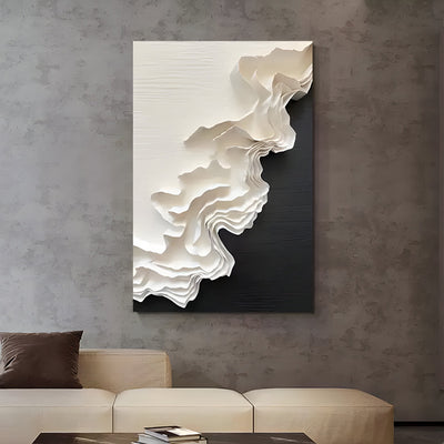
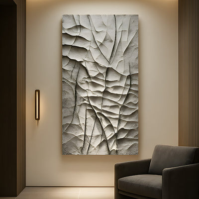
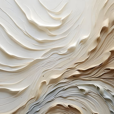
Here is the studio observation that changes most people's shortlist. A flat surface gives you one color reading. A carved surface gives you three or four at once: the lit face, the shadowed groove, the soft transition between them. That range is what keeps a neutral from going lifeless when the light is poor, and it is why carved work survives rooms that flatten a print.
Carved relief gives abstract beige wall art several tonal readings at once: lit face, shadowed groove, and the transition between them.
We shipped a pair of carved taupe panels to a Napa guest suite last year for a client who had already returned two framed canvas prints. Same nominal color both times. The prints died under the room's low evening light; the relief work kept reading as a designed object because the shadow lines held structure even when the color drained. The denser the carving, the more forgiving the piece: a tightly gridded panel like Barwick Taupe Grid Abstract 3D Carving Wall Art carries far more shadow edges per square foot than a looser sweeping cut, which is the main reason our 3D wall art outperforms print in soft-lit bedrooms.
Timber does need respect as a material. Carved hardwood panels respond to changes in humidity, and the US Forest Products Laboratory's wood handbook covers how moisture content drives dimensional movement in service (Wood Handbook, FPL). In practice that means keeping large panels off damp exterior walls and away from direct bathroom steam.

North-Facing Daylight Versus 2700K Bulbs
Judge the same piece twice, in the same room, on the same day. North-facing daylight is cool and even, and it exposes any green in a beige. Warm domestic bulbs at 2700K push everything toward yellow and can turn a careful gray-beige into something closer to café latte. Two samples can match under morning daylight and separate completely under lamplight, and that behavior is metamerism, well documented in color measurement (NIST, color and appearance).
Practical rule: whichever light you use the room in most, that is the light that decides. Bedrooms are evening rooms, so judge abstract beige wall art at dusk.
Horizontal Formats Above a Bed, Where a Clash Is Hardest to Ignore
Above a headboard is the highest-stakes placement in the house. You look at it from close range, lying down, in the worst light of the day. Searches for abstract beige horizontal wall art framed canvas print for bedroom walls dominate for an obvious reason, since a long, low format matches the bed, but the format is the easy part. Getting the undertone to agree with bedding, headboard fabric and nightstand timber is the real task.
A long, low format tracks the bed and leaves a clear hand's width of wall above the headboard.
Scale rules that hold up: aim for a piece roughly two-thirds to three-quarters of the headboard width, and leave a clear hand's width of wall between the top of the headboard and the bottom edge. For that proportion, long, low abstract beige wall art such as Barwick Taupe Trace sits better above a bed than a squarer panel of the same area, and where a stock size does not fit the wall, we size bespoke commissions to the exact bed width rather than asking the room to compromise.

When a Framed Canvas Print Still Makes Sense
Print is not the enemy. Flat abstract beige wall art is light, easy to hang on plasterboard without heavy fixings, and it works well in rental properties, hospitality guest rooms where turnover is high, and corridors with strong daylight. Flatness is the trade-off you accept.
Choose relief or metal instead when the wall is a focal point, when evening light dominates, or when the room is otherwise low on texture. Brushed and patinated finishes in our metal wall art range and the deeper pieces in wall sculptures both give you that same shadow structure in a harder material.
Buyer Checklist: Matching Beige from Physical Samples
Request a finish sample or swatch before committing to a large panel or a commission.
Tape the sample to the actual wall, not a table. Vertical surfaces receive light differently.
Look at it against your floor, your headboard and your closest paint color.
Check it at three times: morning, mid-afternoon, and after the lamps go on.
Photograph it with flash off and compare against the product images, but trust your eyes over the photo.
Confirm wall construction and fixing requirements early, especially for heavier carved or metal work.
For bespoke work, agree the undertone in writing against a physical reference, not a hex code.
Giant Sculptures builds a lot of bespoke wall work, and much of it is abstract beige wall art matched to a client's own reference sample. Working from a physical swatch is the cheapest insurance in the process: sending one takes days, while reworking a 6 foot (1.8 m) carved panel because the beige leaned pink takes considerably longer. Budget depends on material, scale, depth of carving, finishing and installation, so ask for a tailored quote once you know the size and tone you want.
The Short Version
Good abstract beige wall art is chosen the way a designer chooses paint: undertone named, floor accounted for, light tested at the hour you actually use the room. Get those three right and beige stops being a safe default and starts being a deliberate choice.
For wider placement ideas, Blue Goes Gray After Dark: How to Choose Abstract Blue Wall Art is useful companion reading before finalising the setting and sightlines.