


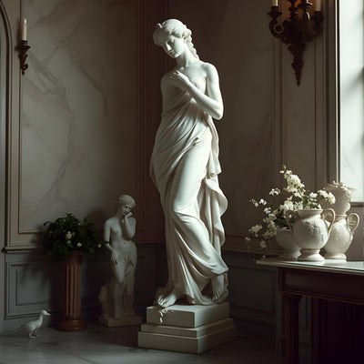


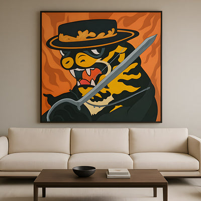
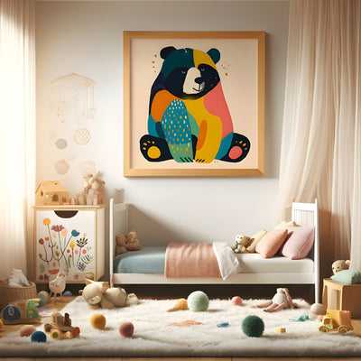


Dining room art has a far greater impact than many people realise. The way artwork is placed can influence how spacious a room feels, how welcoming it is for guests, and even how comfortable everyday meals become. You might have beautiful pieces already, but if they are hung too high, too low, or without balance, they won’t achieve their full effect.
Key Takeaways
- Center your dining room art at 145-155cm from the floor so seated and standing guests both feel included.
- Leave 15-25cm between the bottom of the frame and the sideboard or table to keep art visually grounded.
- Size a single piece to two-thirds or three-quarters of the table width for proper proportion.
- Keep gallery wall gaps consistent at 5-7cm so multiple frames read as one cohesive display.
- Tape paper templates to the wall before drilling to test scale, height, and sightlines from the chair.
This guide focuses on dining room art placement rather than simply what to buy. By understanding proportion, spacing, height and visual flow, you can transform your dining space without changing furniture or redecorating. These placement principles work whether your style is modern, traditional or somewhere in between.

Why Dining Room Art Placement Matters So Much
The dining room is a social space. It’s where people sit for longer periods, talk face-to-face and spend time looking around the room. Poorly placed art can feel distracting or awkward, while well-positioned dining room art helps the room feel calm, balanced and considered.
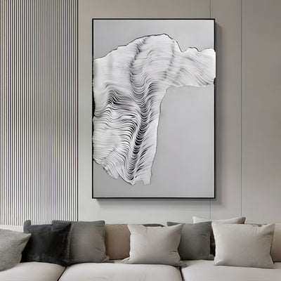
Placement determines whether art feels intentional or accidental. A piece that is too small for the wall can make the room feel empty, while artwork that dominates the space can overwhelm the table beneath it. Getting placement right allows your art to support the room rather than compete with it.
When dining room art is positioned correctly, it anchors the space visually. It connects the walls to the furniture and draws the eye naturally around the room, creating a sense of cohesion that people notice immediately, even if they can’t quite explain why the room feels better.
The Ideal Height for Dining Room Art
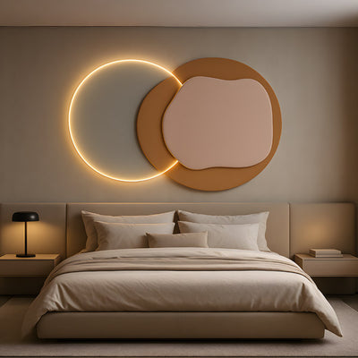
One of the most common mistakes is hanging artwork too high. In dining rooms, art should relate to the people seated at the table, not just those standing.
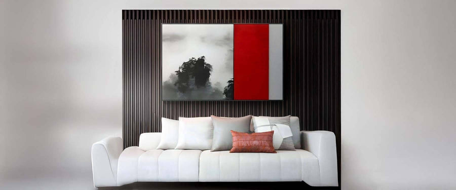
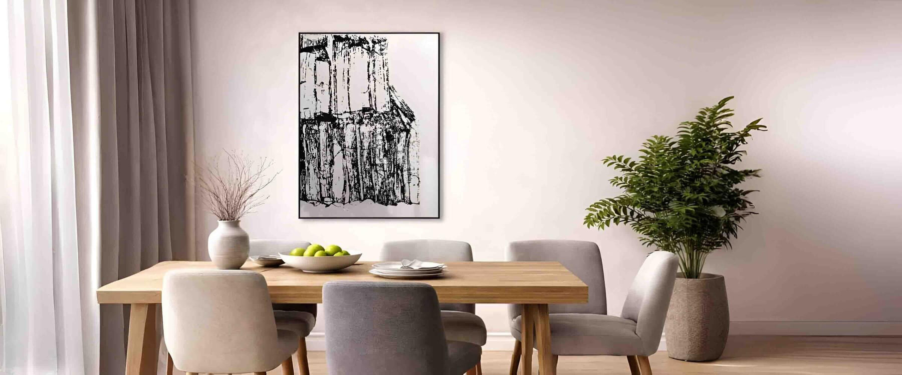
As a general rule, the centre of your dining room art should sit at around eye level when standing, roughly 145-155cm from the floor. However, if the artwork is placed above a dining table or sideboard, the bottom edge should usually sit about 15-25cm above the furniture.
This spacing prevents the artwork from feeling disconnected from the table. When art floats too far above furniture, the room can feel disjointed. Keeping the artwork visually tied to the table creates a grounded, comfortable look that works for both everyday dining and entertaining.

Quick Dining Room Art Placement Checklist (Use This Every Time)
If you want dining room art to look intentional (not like it was hung in a rush), run through this quick checklist before you commit to nails in the wall:
Hang at the right height: Aim for the centre of the artwork at around 145-155cm from the floor (adjust slightly if it sits above furniture).
Keep it connected to the table: Leave roughly 15-25cm between the bottom of the frame and the top of a sideboard or dining table line-of-sight.
Match the scale to the wall: For a single piece, target two-thirds to three-quarters of the table width for strong visual balance.
Use consistent spacing in sets: If you’re hanging a pair or gallery wall, keep gaps even (about 5-7cm) so it reads as one display.
Balance the “weight” of the wall: If your artwork is bold or dark, avoid overcrowding the same wall with heavy mirrors or shelving.
Check sightlines from the chair: Sit at the dining table and look up the art should feel comfortably placed, not towering overhead.
Test with paper templates first: Tape up paper outlines to preview size and layout before drilling.
Plan for lighting: Avoid direct glare from windows and consider picture lights or wall lights if the art is a focal point.

Choosing the Right Size Artwork for Your Dining Wall
Size plays a critical role in dining room art placement. A piece that looks perfect in a gallery or online can feel completely wrong once it’s on your wall.
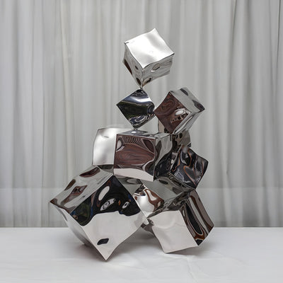
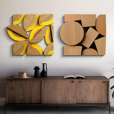
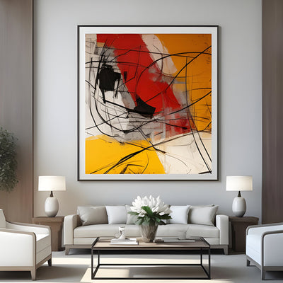
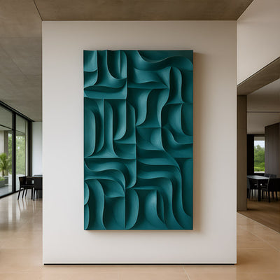
For a single statement piece, aim for artwork that is around two-thirds to three-quarters the width of the dining table. This proportion keeps the art visually balanced with the furniture below it. Large dining room art works especially well in open-plan spaces or rooms with higher ceilings, where smaller pieces can easily get lost.
If you prefer multiple pieces, grouping them closely helps them read as one visual unit. The combined width of the grouped artwork should still follow the same proportion rule in relation to the table or wall beneath it.

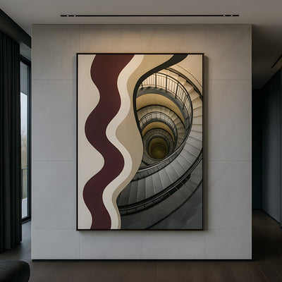
How Placement Changes the Mood of the Room
The position of dining room art can subtly influence how the space feels emotionally. Artwork placed centrally above the table creates symmetry and formality, which suits more traditional dining rooms. Slightly offset or asymmetrical placement feels more relaxed and contemporary.
Art placed on a side wall rather than directly above the table can also work well in smaller rooms. This approach prevents visual crowding while still adding interest and personality. In these cases, the artwork often becomes something guests notice gradually rather than immediately, which can feel more intimate.
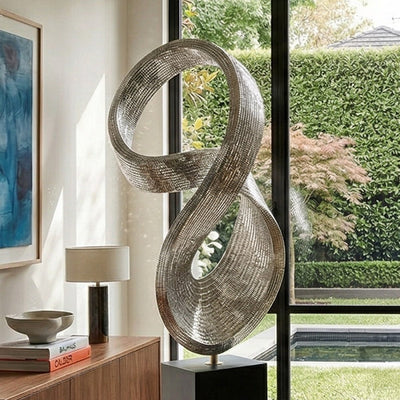
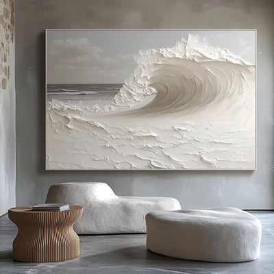
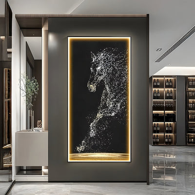
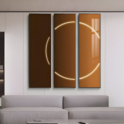
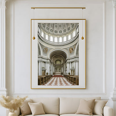
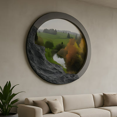
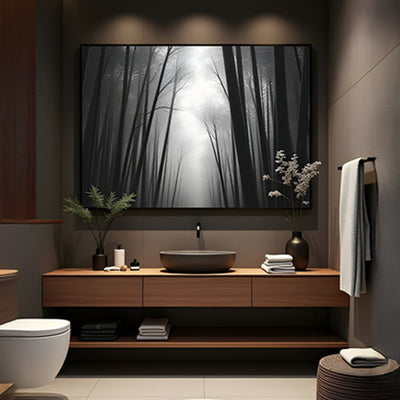
Even the orientation matters. Horizontal pieces emphasise width and make narrow rooms feel broader, while vertical artwork draws the eye upward and adds height to lower ceilings.
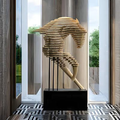
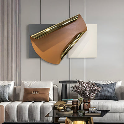
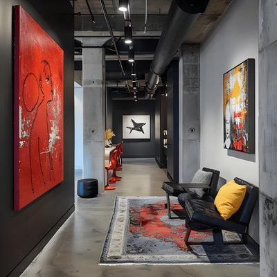
Using Art to Create a Focal Point
Every dining room benefits from a clear focal point. Often, dining room art naturally takes on this role, especially when placed on the main wall opposite the entrance.
To create a strong focal point, avoid cluttering the surrounding area with too many decorative items. Let the artwork breathe. This doesn’t mean the wall must be empty, but additional elements such as lighting or furniture should support the art rather than compete with it.
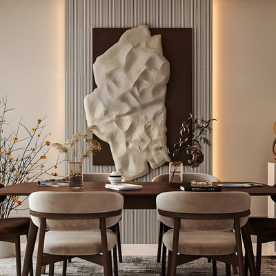
For rooms that already have architectural features, such as fireplaces or large windows, artwork should complement rather than fight for attention. In these cases, slightly smaller or more understated dining room art often works best.

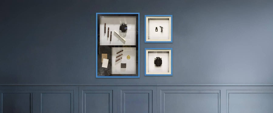
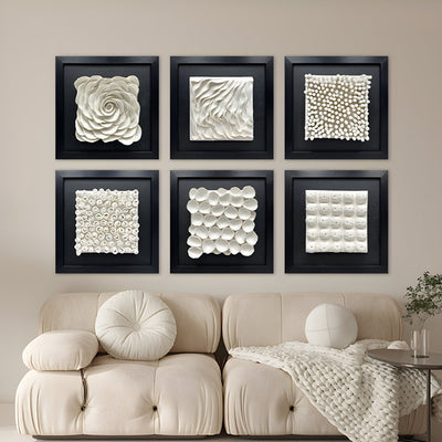
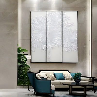
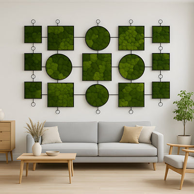
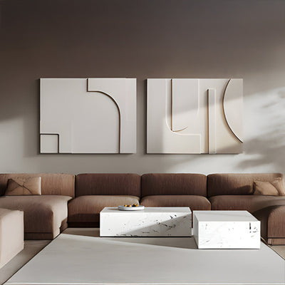
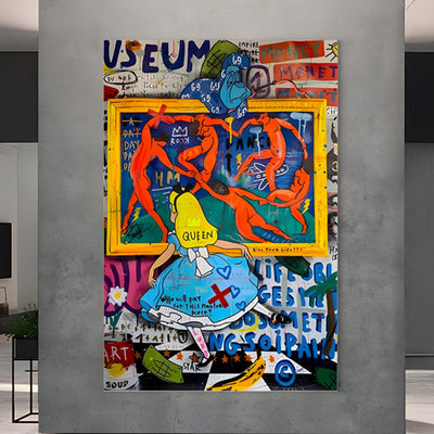
Gallery Walls in Dining Rooms: What Works and What Doesn’t
Gallery walls can be effective in dining rooms when done thoughtfully. The key is structure. Even eclectic displays benefit from an underlying order, whether that’s consistent spacing, a shared colour palette or similar frame styles.
When creating a gallery wall, lay everything out on the floor first. This allows you to experiment with spacing and balance before committing to nails in the wall. Keep gaps between frames consistent, usually around 5-7cm, to avoid a cluttered appearance.
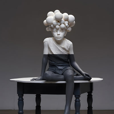
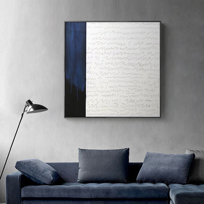
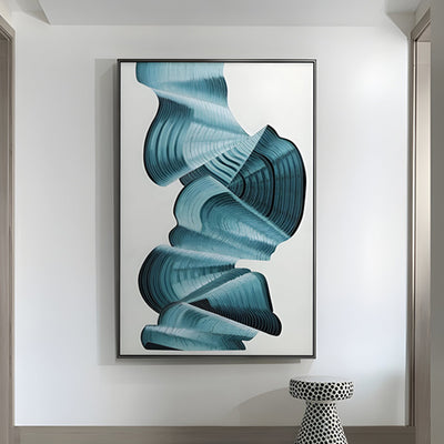
A gallery wall works particularly well along longer dining room walls or in rooms where a single large piece would feel too dominant. It also allows you to introduce varied styles gradually, including a subtle nod to abstract art without overwhelming the space.

Lighting and Dining Room Art Placement
Lighting is often overlooked, yet it dramatically affects how dining room art is perceived. Natural light during the day can highlight textures and colours, while evening lighting sets the mood for meals.
If possible, position artwork where it avoids harsh glare from windows or overhead lights. Wall lights or picture lights can be added to highlight key pieces and create a warm, layered atmosphere during evening dining.
Soft, directional lighting draws attention to the art without distracting from the table. It also makes the room feel more considered and inviting, particularly when entertaining guests.
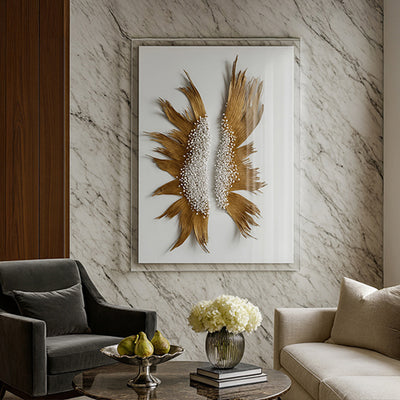
Balancing Art with Furniture and Decor
Dining room art should feel connected to the rest of the room. This doesn’t mean everything must match, but there should be a visual conversation between the artwork, furniture and accessories.
Consider the tones of your dining table, chairs and flooring. Artwork that subtly echoes these colours or materials will feel cohesive. For example, warmer wood tones pair well with earthy or muted artwork, while sleek, modern furniture suits cleaner lines and bolder contrasts.
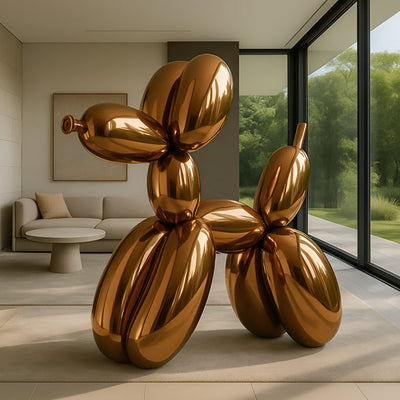
Introducing one unexpected element, such as a small piece of retro art, can add character and depth without disrupting the overall balance, as long as placement remains intentional.

When to Break the Rules
Guidelines are helpful, but dining room art placement isn’t meant to feel rigid or fussy. Some of the most memorable dining rooms bend the “rules” slightly and still look beautifully pulled together. If your room has unusual architecture, awkward wall space, or a statement light fitting, adjusting the placement can create a better overall balance. The goal is for your dining room art to suit the room you actually have, not an ideal layout on paper.
If a piece has personal meaning or a strong emotional connection, where it feels right often matters more than perfect measurements. You can hang it a touch lower for a more intimate feel, or off-centre to work around furniture and sightlines. As long as you keep proportion and spacing in mind, the result will look intentional rather than accidental. The dining room should feel comfortable and lived-in, not like a showroom.

Conclusion: Bringing Dining Room Art and Placement Together
Dining room art placement isn’t just about filling a blank wall. It’s about using proportion, height, spacing and visual balance to make the entire room feel more polished and welcoming. When your artwork is hung at the right level, scaled to suit the wall, and positioned to connect naturally with the dining table and surrounding furniture, the space instantly feels more intentional.
You’ve now got the core placement principles that make the biggest difference: setting art at a comfortable viewing height, choosing the right size so it doesn’t feel lost or overpowering, using placement to shift the mood of the room, creating a clear focal point, and styling gallery walls with structure and consistency. Add thoughtful lighting and a sense of balance with your decor, and your dining room art stops feeling like an afterthought it becomes part of the room’s identity.
If you want to take the next step, explore the collection of dining room art styles and curated pieces that make styling easier, lift your space quickly, and help you create a dining room that feels finished every time you sit down.