



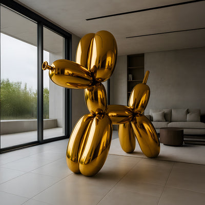



























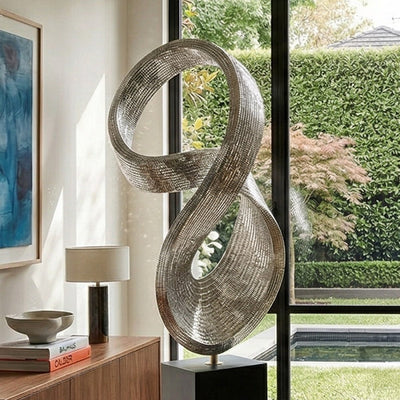











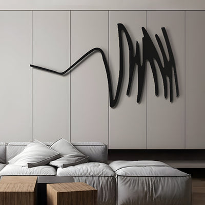

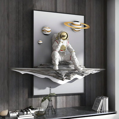

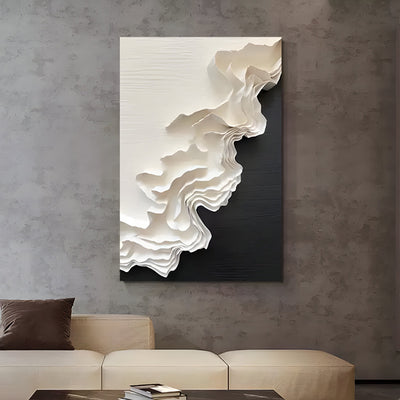
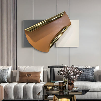
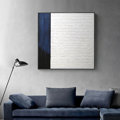
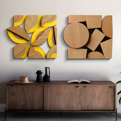

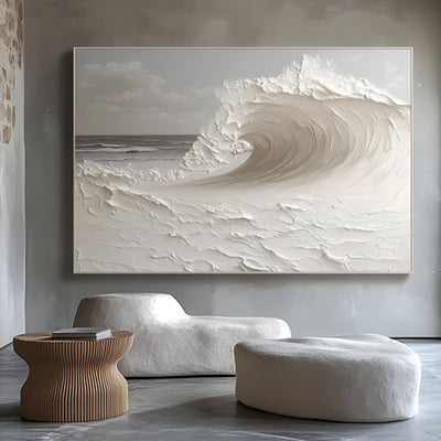
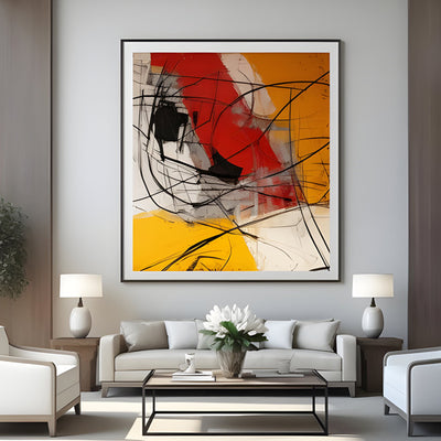
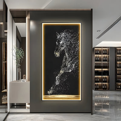
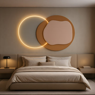
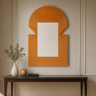
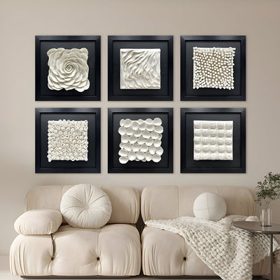
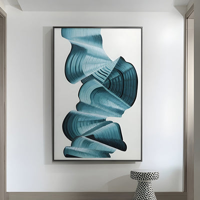
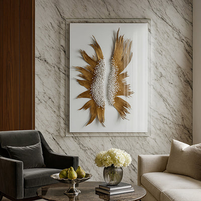
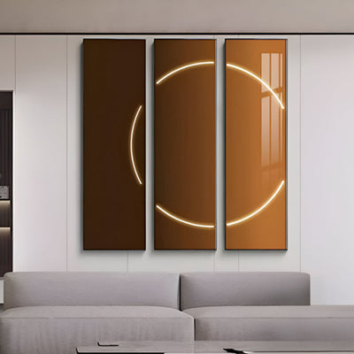
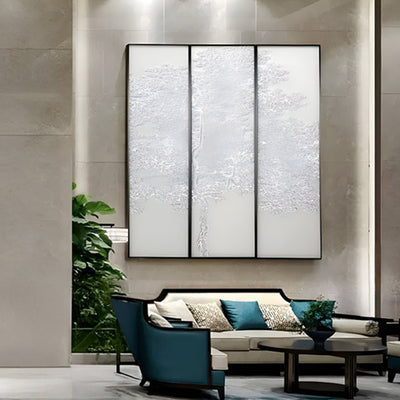
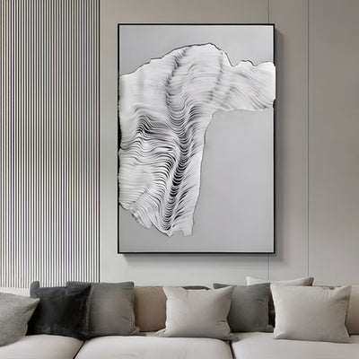
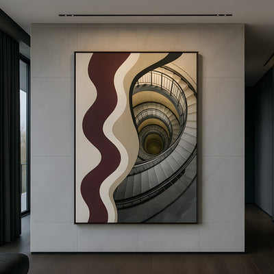
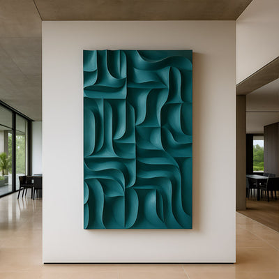
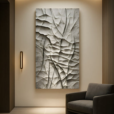
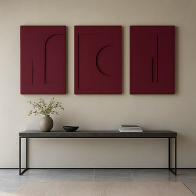
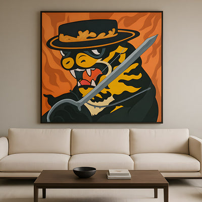
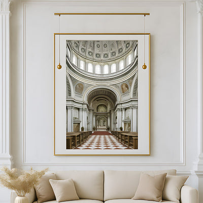
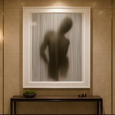
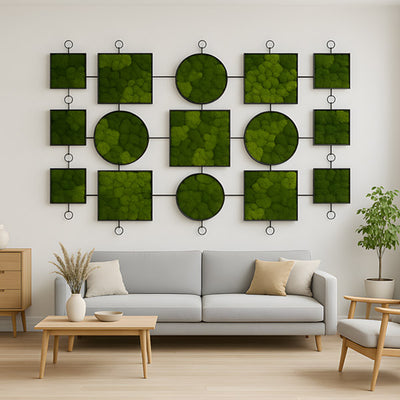
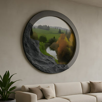
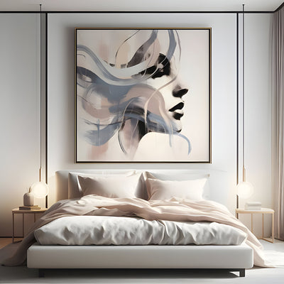
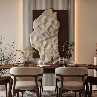
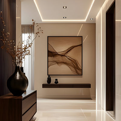
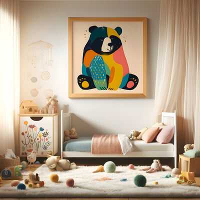
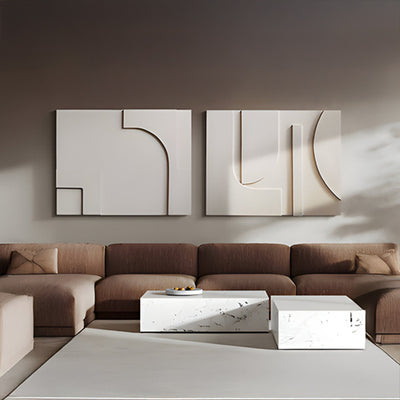
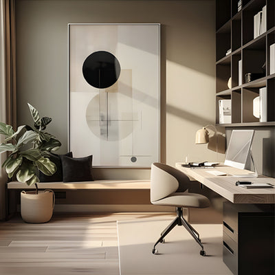












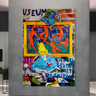
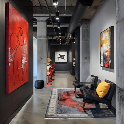





Walk into ten living rooms styled by ten different homeowners and at least seven of them will have made the same mistake: a 24-inch canvas floating over an 8-foot sofa, marooned in white space like a postage stamp on a parcel. Wall art for living room schemes fails more often on scale than on taste. The art itself is usually fine. The wall around it is doing all the talking.
Looking for the full range in this category? Browse our Living Room Art collection for every available finish, size, and configuration of wall art for living room walls.
At Giant Sculptures we spend a lot of our week sizing pieces against client floor plans, and the conversation almost always starts the same way: the wall feels empty, but the piece they bought last year feels wrong. It is almost never wrong. It is just too small for the room it ended up in.

Quick Answer: Sizing Living Room Wall Art
- Above a sofa: art should span roughly two-thirds to three-quarters of the sofa width.
- Above a fireplace: match the mantel width or come within a few inches on either side.
- Center height: aim for 57 to 60 inches (145 to 152 cm) from the floor to the visual center, adjusted up if you have tall ceilings.
- Clearance above furniture: 6 to 12 inches (15 to 30 cm) between the top of the sofa and the bottom of the frame.
- Depth matters: sculptural relief and 3D wall art read better in tall, open rooms than flat canvas, which can disappear under downlights.

Why Most Living Room Walls Are Styled at the Wrong Scale
Designers have a private rule of thumb: whatever size of living room art the client thinks they need, go up one size. The reason is simple. Most people shop for wall art for living room spaces on a phone screen, where a 32-inch piece looks generous. In a room with a 10-foot ceiling and a sectional sofa, that same piece looks like an afterthought.
Large wall art for living room schemes does three useful things at once. It anchors the seating area so the furniture stops drifting visually. It gives the eye a stopping point at adult standing height, which calms the room. And it absorbs sound, particularly if the piece has texture or depth. A flat painted wall in a high-ceilinged Californian great room is an acoustic problem; a textured 6-foot piece is a quiet fix for it. This is also why extra large wall art for living room walls tends to outperform a cluster of small frames in the same footprint.

Reading the Room: Sightlines, Sofa Width, and Ceiling Height
Before you shortlist any living room wall art, measure three things and write them on a sticky note: the sofa or console width below the wall, the wall width from corner to corner or from window to corner, and the ceiling height. Those numbers govern what is possible.
For a standard 84 to 96-inch sofa, you want a single piece around 56 to 72 inches wide (142 to 183 cm), or a paired arrangement that reads as one block of similar width. For taller rooms, 9-foot ceilings and up, you can push vertical. A piece that runs 5 feet tall (152 cm) stops feeling like decoration and starts behaving like architecture.
One detail people miss: where do you sit, and what do you see from the sofa? The best wall art for living room placement is not always opposite the seating; sometimes the strongest piece belongs on the wall you look toward when you walk in. We have shipped several large textured abstracts to homes in Austin and Greenwich where the client originally pointed at the wrong wall. A walk-through with a long tape measure usually resolves it in ten minutes.

Sculptural Wall Pieces vs Flat Canvas: What Changes the Light
Canvas wall art for living room walls has its place, particularly when the room is already busy with texture from rugs, drapery, and timber. A flat painted surface gives the eye somewhere to rest.
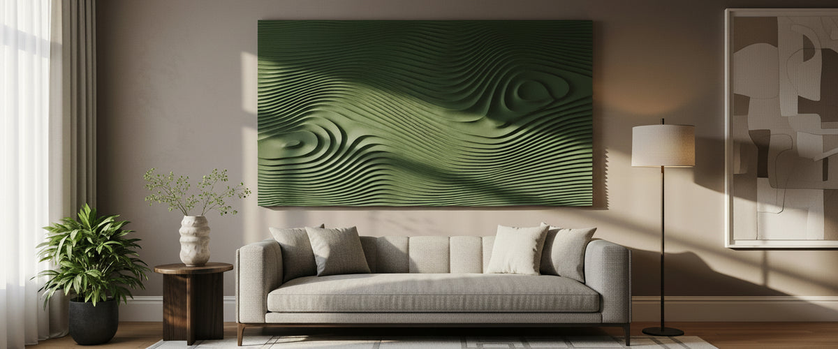
But in rooms with a lot of glass, recessed lighting, or a strong daylight axis, flat canvas can read as a printed poster after sunset. Sculptural and relief pieces behave differently. They cast their own micro-shadows as the light moves through the day, which means the piece looks like a different work at 9am, 3pm, and 9pm. That is what people mean when they say a wall feels alive, and it is one reason unique wall art for living room schemes tends to age better than mass-printed canvas.
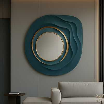
Where the room has strong directional lighting and you want the wall to keep working after dark, a contoured relief piece such as the Terracore Deep Green Contour Relief Abstract 3D Wall Art is closer to the right design language than a flat print. The ridges pick up grazing light from a nearby lamp and throw soft shadow lines back across the wall, so the piece changes character through the evening. For schemes leaning warmer or more neutral, the Terracore Earth Brown Contour Relief Abstract 3D Wall Art and Terracore Grey Contour Relief Abstract 3D Wall Art variants carry the same depth without committing to a strong color statement, which is useful if the upholstery is already doing the heavy lifting.

Color and Composition: Choosing Without Second-Guessing
For wider placement ideas, Metal Wall Art That Earns Its Place on a Big Wall is useful companion reading before finalising the setting and sightlines.
When clients ask how to choose wall art for living room schemes, the honest answer is that color is the easy part and composition is the hard part. Take a photo of the room in natural daylight, drop the candidate piece in using any free mockup tool, and look at it on your phone from across the room. If you cannot read the composition at a glance, the piece is too busy for that wall.
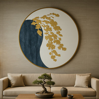
For abstract wall art for living room walls, we usually push clients toward one of two directions. Either pick a piece that pulls a single accent color out of the room (a teal cushion, a brass lamp, a rust-colored rug) and amplifies it, or go fully tonal and let texture do the work. A framed textured abstract like the Trevasse Teal Textured Abstract Framed Wall Art earns its keep in the first scenario, where there is already a cool accent in the room to echo; the second scenario is where a quieter, monochrome piece does more.
Avoid matching the art to the cushions exactly. It looks staged and dates fast.

Material Choices That Hold Up Above a Working Fireplace
This is where buyers of wall art for living room fireplaces get caught out. A working wood-burning or gas fireplace produces heat, soot, and humidity swings that punish unsuitable materials. Paper-faced prints warp. Cheap acrylic glazing yellows. Thin canvas can sag along its stretchers within two seasons.
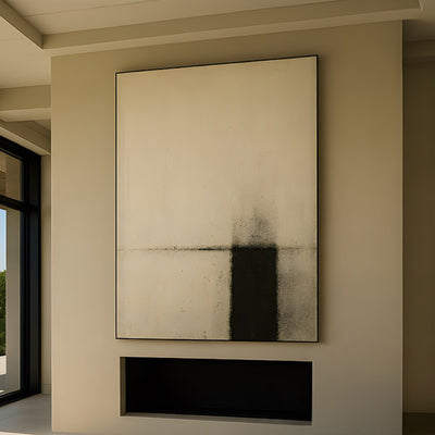
If the piece sits above a working firebox, you want a deep frame with a solid backing, a textured surface that hides minor soot rather than showing it, and a substrate that does not move with humidity. Heavier framed abstracts with built-up texture, such as the Stratum Indigo Drift Textured Abstract Framed Wall Art, sit better in that environment than thin canvas. For decorative fireplaces that never get lit, this is less of an issue.
As a general rule, the Smithsonian's conservation guidance on display environments suggests keeping artwork out of direct, sustained heat sources where possible; in real homes that usually means a deeper mantel, a heat shield, or simply choosing a piece built for the conditions.
Hanging Heights and Clearances We Use in Our Own Installs
The 57 to 60-inch rule for the visual center of a piece is a good starting point when hanging wall art for living room walls, but it assumes a standard 8-foot ceiling and an average eye level. Adjust as follows.
- 10-foot ceilings or higher: raise the center to 62 to 66 inches and let the piece grow vertically.
- Above a sofa: ignore the 57-inch rule and use the sofa as the datum. Bottom of frame 6 to 12 inches above the cushion back.
- Above a console or credenza: bottom of frame 4 to 8 inches above the furniture.
- Paired or stacked pieces: treat the whole group as one rectangle and center that rectangle, not the individual pieces.
For heavier sculptural and relief work, we always specify into-stud fixings or proper toggle anchors rated well above the piece weight. A 40-pound (18 kg) textured panel pulling on a single drywall hook is a service call waiting to happen, and it is the fastest way to ruin a piece of large living room wall art.
How to Arrange Wall Art in a Living Room When You Want a Group
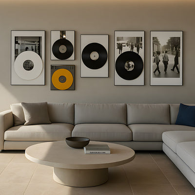
Galleries and salon-style arrangements work as wall art for living room schemes, but only with discipline. The frequent failure is mixing too many frame styles, too many subjects, and too many sizes in one wall. Pick a constraint and stick to it: all frames in the same finish, or all pieces in the same palette, or all works the same size in a strict grid.
For most living rooms, a single strong piece beats a busy gallery wall. Save the salon style for stair walls and hallways where the eye is moving and can absorb complexity.
When a Commissioned Piece Beats Anything Off the Shelf
There is a point at which catalog wall art for living room walls stops working. Usually it is one of three situations: the wall is genuinely oversized (say, a double-height great room with a 14-foot feature wall), the room has an unusual color story that nothing off the shelf will hit, or the client wants a piece that reads as art rather than as decor.
That is the moment to commission. A bespoke piece lets us match scale to the exact wall, match palette to the exact upholstery, and build depth and material into the work so it earns its place. Commissions through Giant Sculptures usually start with floor plans, a few room photos in natural and evening light, and a conversation about what the piece needs to do, anchor a sectional, balance a tall window, hold a 20-foot wall on its own. From there we develop concepts in sketch and small-scale maquette before any final fabrication starts.
Budget on a commission depends on material, scale, depth of relief, finish, framing, and installation; we quote each piece individually rather than working to a fixed list. If you are weighing a large catalog piece against a commission, the simple test is whether anything in the catalog answers the wall. If three pieces of wall art for living room placement are close but none are right, commission. If one is right, buy it.
A Short Checklist Before You Buy
- Measure sofa width, wall width, and ceiling height before shortlisting wall art for living room placement.
- Aim for art that spans two-thirds to three-quarters of the furniture below it.
- Center the visual middle at 57 to 60 inches, adjusted up for tall ceilings.
- Choose textured or relief pieces in rooms with strong directional lighting.
- Avoid thin canvas and paper-faced prints above working fireplaces.
- Specify fixings rated well above the piece weight, into studs where possible.
- If three catalog pieces feel close but none right, commission.
Get the scale of your wall art for living room right and almost any decent piece will look intentional. Get the scale wrong and even a great piece will look apologetic. That is the whole brief.
For general conservation principles, V&A sculpture techniques is a useful external reference, though the final care routine should always follow the material and finish specified for the individual commission.