

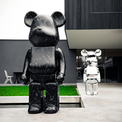

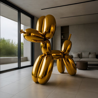
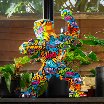
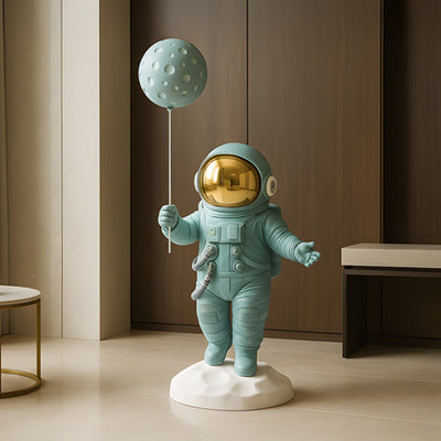





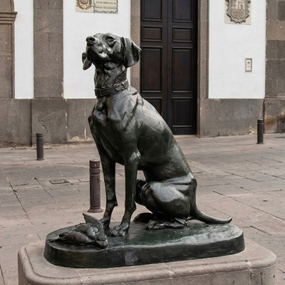


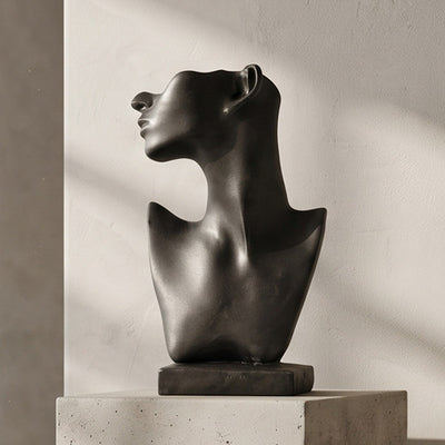

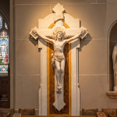
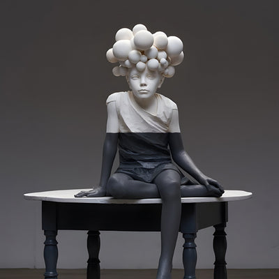









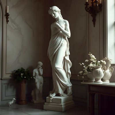
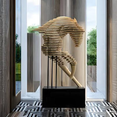
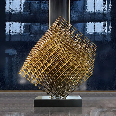
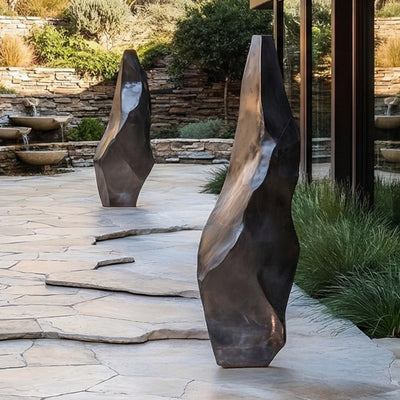






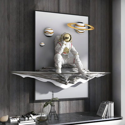

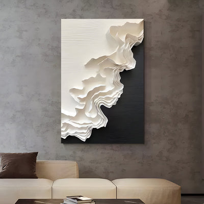
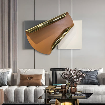
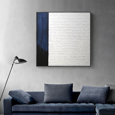
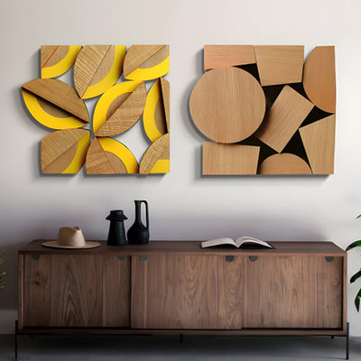

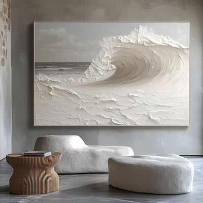
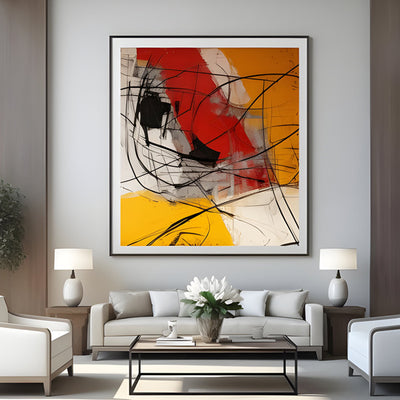
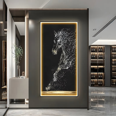
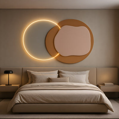
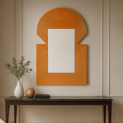
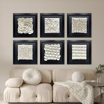
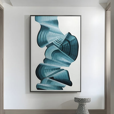
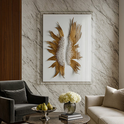
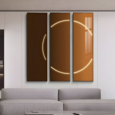
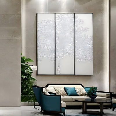
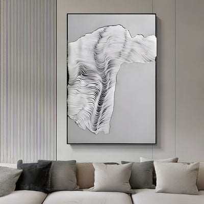
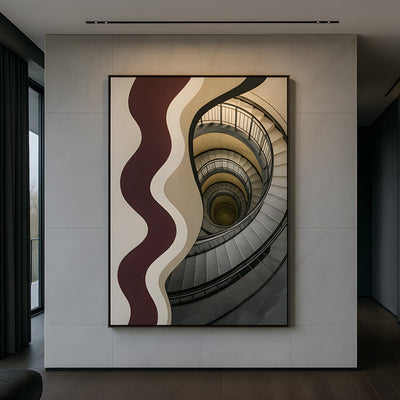
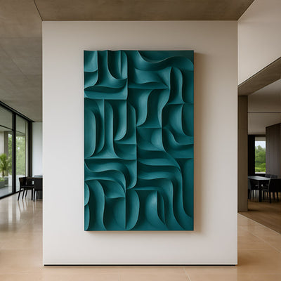
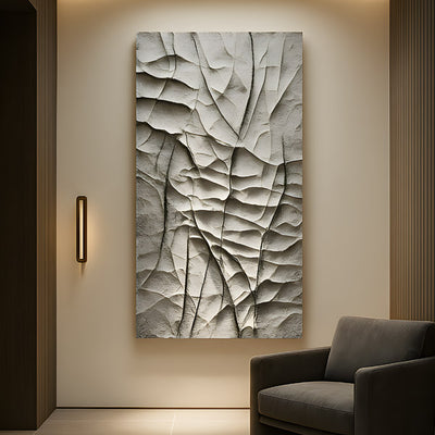
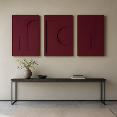
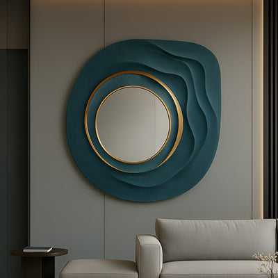
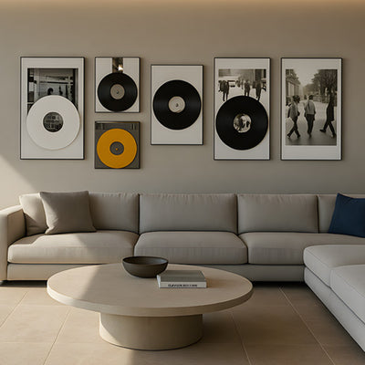
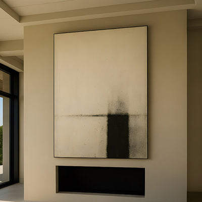
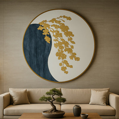
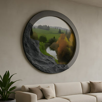
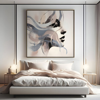
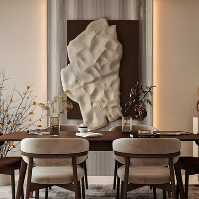
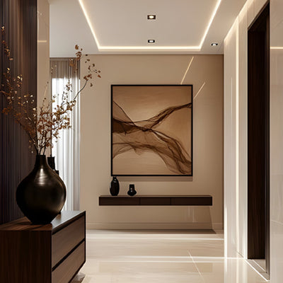













A reception wall the size of a squash court, and a single framed print floating in the middle of it like a stamp on an envelope. We see this constantly. The company spent real money, chose a decent piece, then hung it where nothing could rescue it. Professional office wall art almost never fails on taste; it fails on placement.
The good news is that placement follows rules you can learn. Once you understand how scale, sightlines, and light control the way a piece reads, you can put the right work in the right spot and watch a lobby, boardroom, or garden courtyard shift from generic to intentional. That is the whole promise of professional office wall art done properly.

Key Takeaways for Professional Office Art
Scale beats budget. A well-sized piece in the right spot outperforms an expensive one that is too small for the wall.
Sightlines decide the hero. Whatever people see first from the entrance carries the most weight, so give it your strongest work.
Pedestal height changes meaning. A few inches up or down alters whether a sculpture feels monumental or approachable.
Outdoor placement rewards durable materials. Bronze, stainless steel, and Corten steel hold up where framed art cannot.
Backdrop and light do half the work. Contrast against the wall behind a piece often matters more than the piece itself.

What Professional Office Art Actually Looks Like, Room by Room
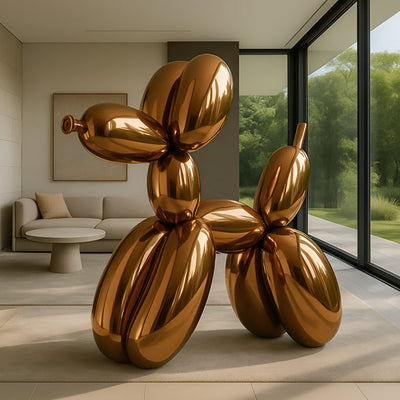
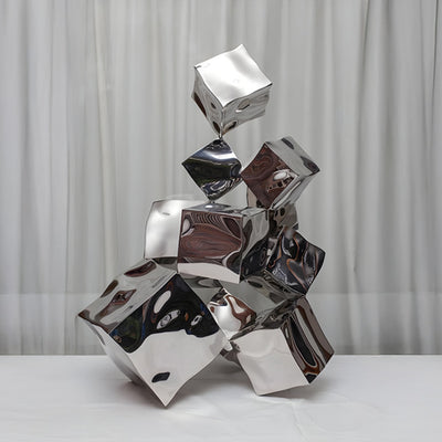
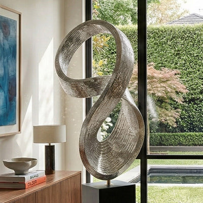
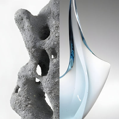
The phrase covers far more than framed prints down a corridor. For one tech headquarters we shipped a brushed stainless steel form for the atrium; for a winery office it was a weathered Corten piece anchoring an outdoor courtyard the staff walk through daily. Both count as professional office wall art done well. Both do a job that a poster never could.
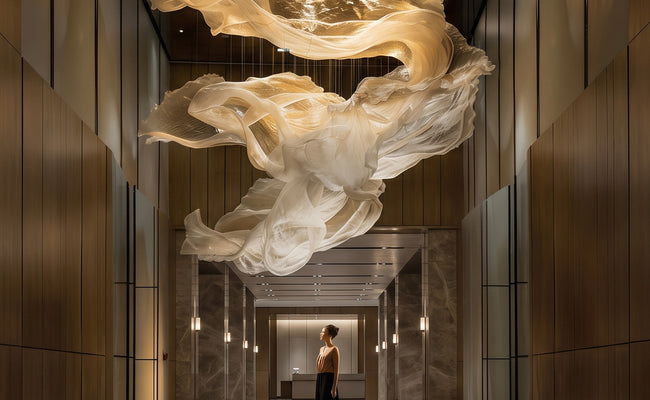
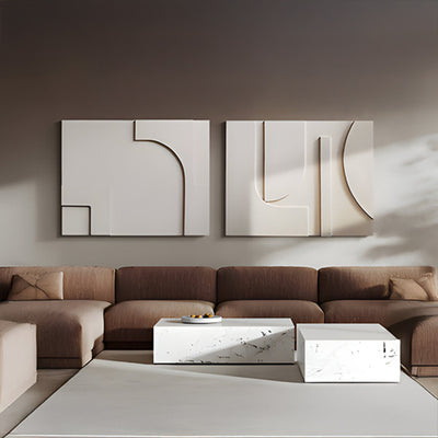
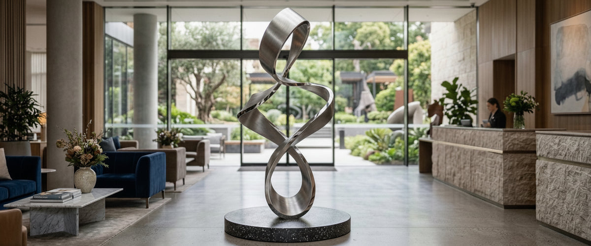
Reception and lobby areas carry the heaviest expectation. This is the first read of your business, and a floor-standing sculpture or a large-scale wall piece sets tone before anyone shakes a hand. Boardrooms want something quieter and more confident, work that holds up under long meetings without shouting. Corridors and breakout spaces can take a lighter touch, and this is where professional office wall art earns its place: a run of considered pieces that give the eye something as people move.
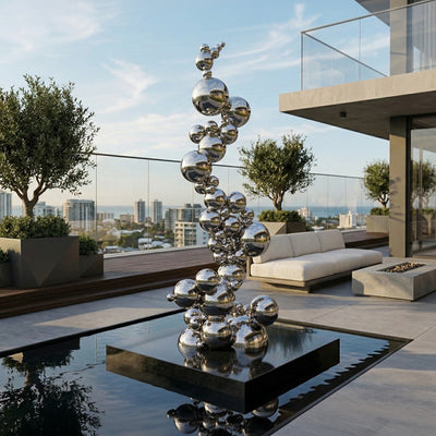
Outdoor settings are the ones buyers underestimate. A landscaped entrance, a rooftop terrace, or a garden courtyard all read as extensions of the brand. An outdoor sculpture out there works harder than most interior professional office wall art because people approach it, circle it, and see it in changing light across the day.

Scale, Sightlines, and Pedestal Height
Scale is the single choice that undoes most professional office wall art installations. A piece that looked generous in a studio or on a website shrinks the moment it goes onto a double-height reception wall. As a working rule, a hero wall piece should fill roughly two-thirds to three-quarters of the clear wall space it commands, and a freestanding sculpture in a lobby wants enough visual mass to hold the room from the entrance, not just from three feet away.
Sightlines tell you where to spend that scale. Stand in the doorway. Whatever your eye lands on first is your hero position, and it deserves the strongest, largest work. Secondary sightlines, the view from a seating area or the turn of a stair, take supporting pieces. Mapping this before you buy stops you spreading budget evenly across walls that do not all carry equal weight.
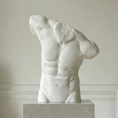
Pedestal height is the quiet lever. Raise a bronze figure so its focal point sits near standing eye level and it reads as approachable and human. Lift it higher and the same piece turns monumental and formal, better suited to a grand lobby than an open-plan floor. Drop it low and viewers look down, which can feel intimate or, in the wrong room, diminished. We often mock this up with the client before finalizing a plinth, because a difference of six inches (about 15 cm) changes the entire mood.

Indoor Versus Outdoor: When Each Wins
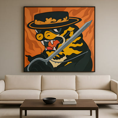
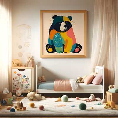
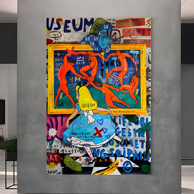
Indoors wins for controlled conditions, framed and paper-based work, and pieces you want experienced at close range under steady light. It is also where metal wall art shines, since interior walls let you play with reflective finishes without weather dulling them. Where a breakout space or a creative studio floor wants character rather than corporate polish, a framed graphic statement such as CineLuxe Léon The Professional Cinematic Poster Wall Art sits more comfortably than a formal reception sculpture would.
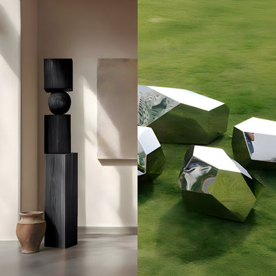
Outdoors wins for presence and permanence. If you want a piece that becomes a landmark, something staff describe when they give directions, an exterior sculpture in a durable material does that. This is where material choice stops being cosmetic. Bronze develops a patina over decades and is prized for outdoor longevity; the conservation team at the Smithsonian maintains outdoor bronzes on exactly this principle of planned, ongoing care. Stainless steel resists corrosion and holds a crisp finish. Corten steel is engineered to form a stable rust layer that protects the metal beneath, which is why it suits gardens and courtyards where a warm, earthy tone works with planting.
The decision usually comes down to one question: do you want the piece protected and precise, or exposed and enduring? Interior programs can lean on canvas and framed professional office wall art; exterior programs should default to engineered metalwork and stone. At Giant Sculptures we plan bespoke workplace commissions around this split from the first conversation, because retrofitting an indoor piece for outdoor life rarely ends well.
Light, Backdrop, and Contrast
Light decides whether a piece has depth or looks flat. Directional light raking across a sculpture pulls out form and texture; flat overhead light erases it. For reception sculptures we usually recommend an accent light angled from the side rather than straight down, and for reflective metal you want to control glare so the finish reads as sheen, not a mirror flashing at visitors. Lighting standards bodies such as the International Association of Lighting Designers publish useful guidance on accent ratios if your fit-out team wants specifics.
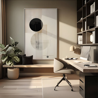
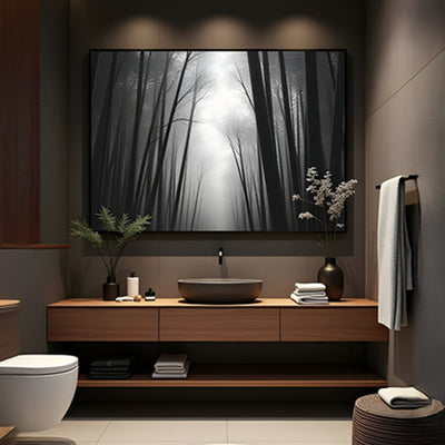
Backdrop is the half of the equation people forget. A pale bronze against a pale wall vanishes. That same bronze against a deep charcoal or walnut backdrop suddenly has presence. Before choosing a piece, look hard at the wall behind its intended position and decide whether you need contrast in tone, texture, or both. Sometimes the cheapest upgrade to an installation is repainting one wall.
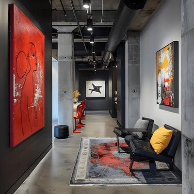
Contrast also governs how professional office wall art sits in a corridor. A run of dark-framed pieces on a white wall gives rhythm; the same pieces on a busy patterned wall become noise. Keep the backdrop calm and let the work do the talking.
Common Placement Mistakes We See in Commissions
For wider placement ideas, Office Wall Art That Earns Its Place on a Boardroom Wall is useful companion reading before finalising the setting and sightlines.
Every studio has its recurring corrections. Here are the ones that come up most often when clients plan professional office wall art, and how to sidestep them.
Buying to the piece, not the wall. People fall for an artwork, then force it into a space it cannot fill. Measure the wall first, then shop.
Hanging too high. Wall art centers should sit around 57 to 60 inches (145 to 152 cm) from the floor for standing viewers, adjusted for very tall rooms. Offices routinely hang a foot too high.
Ignoring approach distance. A detailed piece read from twenty feet away loses its detail. Match the level of detail to how close people actually get.
Under-lighting. A good piece in poor light looks cheap. Budget for accent lighting as part of the install, not an afterthought.
Forgetting weight and fixing. Large-scale work needs structural fixing and, for floor pieces, a floor rated to carry the load. Confirm this early, especially in older buildings.
Treating outdoor as indoor. Paper, unsealed finishes, and lightweight fixings do not survive a season outside. Specify for the environment.
One lesson we learned the hard way: on a boardroom commission the client approved a piece from photos, then found the polished finish threw glare onto the meeting screen every afternoon. We now walk through the light at different times of day before signing off reflective finishes in a working room.
How to Brief a Bespoke Office Commission
If nothing off the shelf fits, a commission lets you size, finish, and detail a piece to the exact wall or courtyard. It is the surest way to get professional office wall art that fits the room rather than fighting it. Bring your architect or landscape designer into the conversation early, share dimensioned photos of the space, and be honest about how the room is used day to day. Budget for professional office wall art depends on material, scale, complexity, engineering, installation, and finishing, so the sensible route is a tailored quote rather than a guess. Browse the office art collection for a sense of range, and tell us the wall before you fall for the work.