




















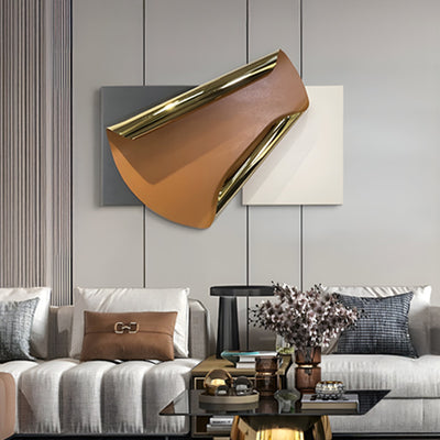
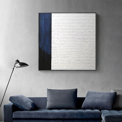

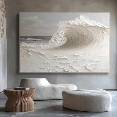
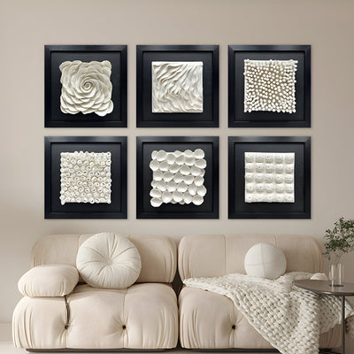
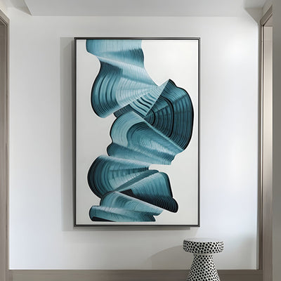
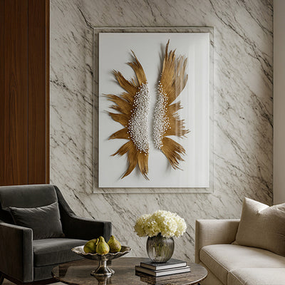
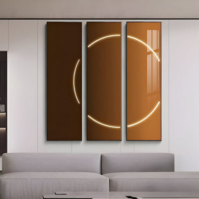
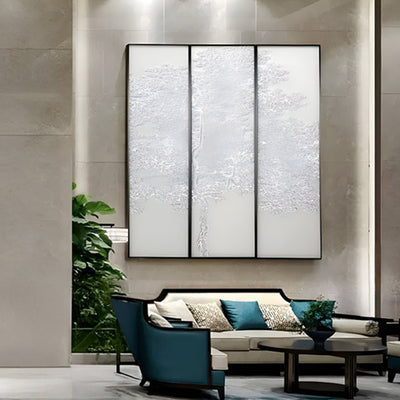
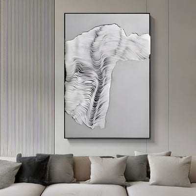
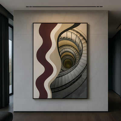
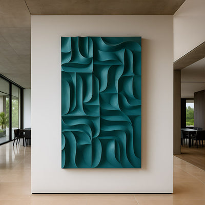








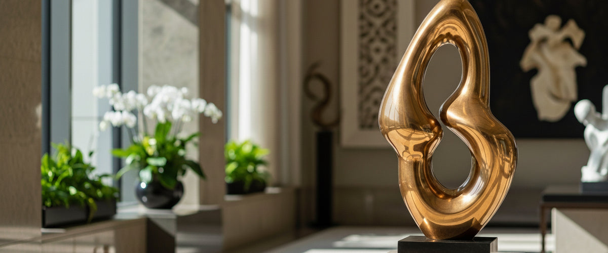

A visitor walking into your reception decides what kind of company you are in roughly eight seconds. The receptionist has not spoken yet. The coffee has not been offered. The office art on the wall behind the desk, or the sculpture on the plinth beside it, is already doing the talking. Get that piece wrong and you spend the rest of the meeting climbing out of a first impression you did not intend to make.
We work with corporate clients, hospitality groups, law firms and family offices on commissioned office art for exactly these moments. The advice below is the placement logic we use when a head of facilities or an interior designer calls us in, whether the brief is a single reception sculpture in Manhattan or a full floor refit in Dallas.

Key Takeaways for Office Art Placement
For wider placement ideas, Office Wall Art That Earns Its Place on a Boardroom Wall is useful companion reading before finalizing the setting and sightlines.
Reception office art is read at a glance; it should hold up at six paces, not six inches.
Boardroom office art has to survive being stared at for two hours without becoming irritating.
Corridors want rhythm and repetition, not a single hero piece fighting the architecture.
Eye-line is decided by whether viewers are walking, standing or seated. Pedestal height follows.
Lighting the art badly is the most common mistake we are asked to fix.
Reception Sculpture and the Eight-Second Problem
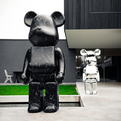
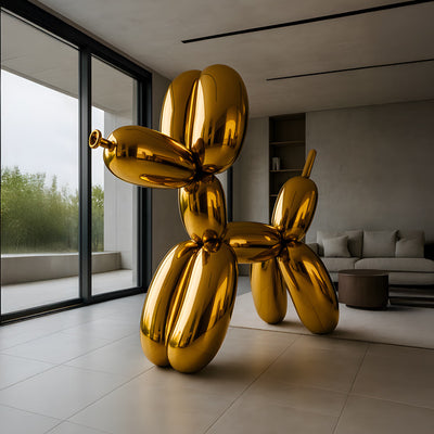
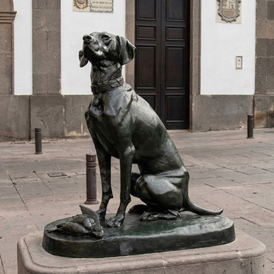
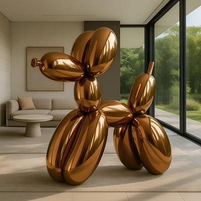
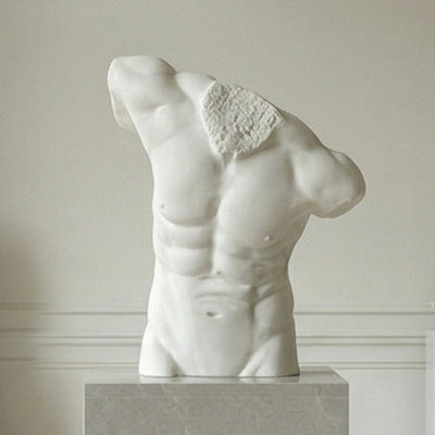
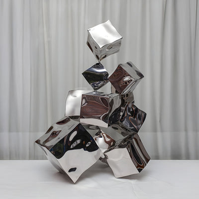
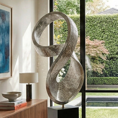
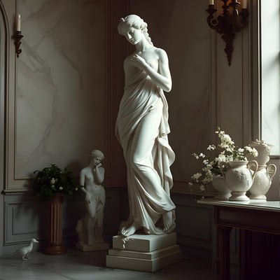
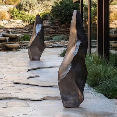
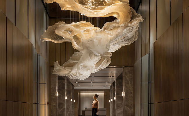
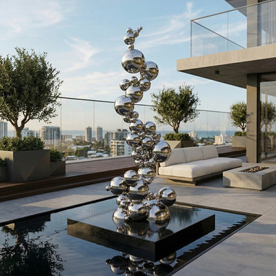
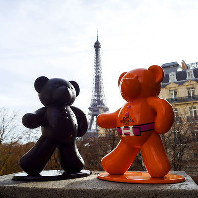
Reception is the only room in the building that has to land instantly. There is no second viewing, no quiet moment to read a wall label. Whatever sits behind the desk or on the floor beside it is the brand statement, full stop. That is why we steer clients away from small, fussy office art in reception and toward sculpture with genuine presence: a figurative bronze at 6 to 8 feet (1.8 to 2.4 m), a stainless steel form catching the daylight from the entrance doors, or a Corten piece anchoring a double-height lobby.
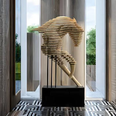
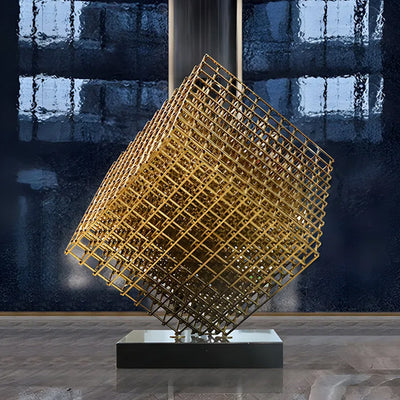
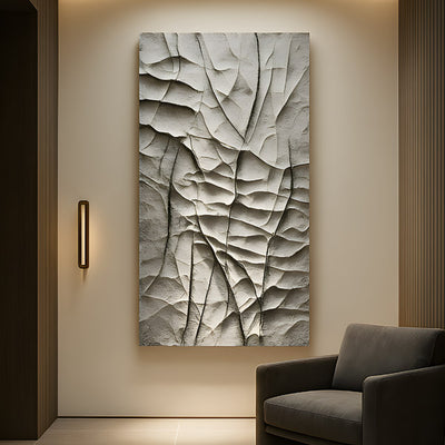
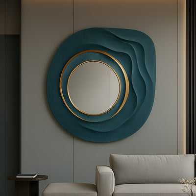
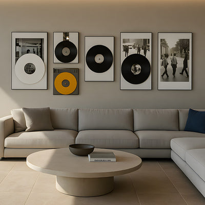
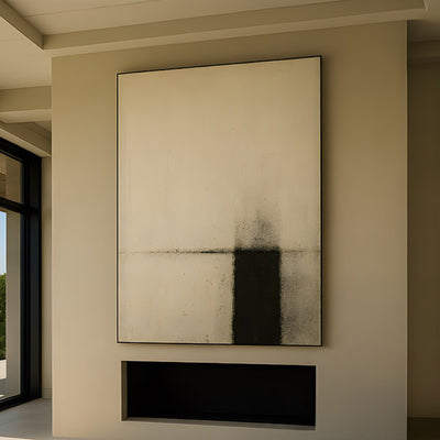
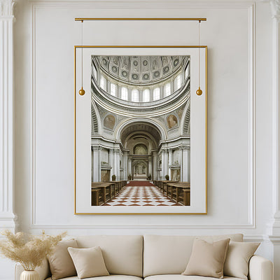
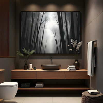
Office wall art for receptions follows the same logic. A single large piece reads cleaner than a grid of four smaller ones, especially in glass-fronted lobbies where reflections already complicate the view. If the client wants something custom, we usually suggest a piece that responds to the architecture: a vertical stainless form for a tall, narrow lobby, a horizontal bronze relief for a long reception wall. Our curated office art collection is a useful starting point for showing decision-makers what scale and material can do before a bespoke brief is written.
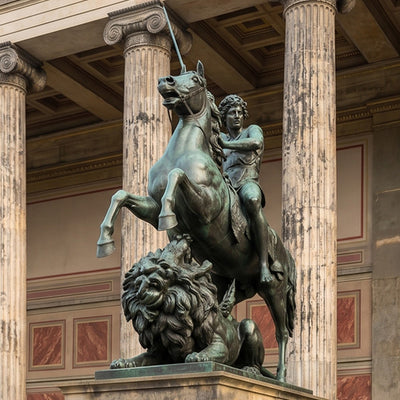
Reception-scale bronze, sized for a double-height lobby.
Boardroom Pieces That Survive Two Hours of Staring
Boardroom office art has a different job. People sit in that room for ninety minutes, two hours, sometimes longer. They will look at the piece. They will look at it again. By the third look it either earns its place or it starts to grate. This is why we advise against anything too literal, too topical, or too clever in a boardroom. A sculpture that wins the room on first glance can become exhausting by the second meeting of the week.
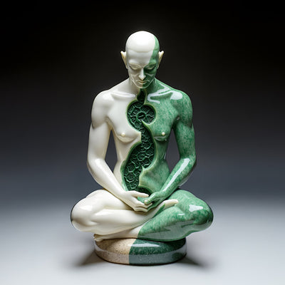
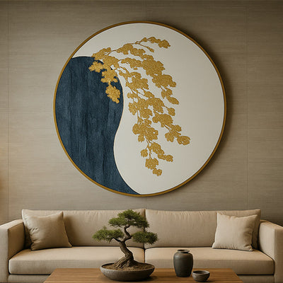
Materials matter here more than subject. Bronze, stone and patinated steel give viewers something to read at different distances; the patina shifts, the surface catches light differently as the afternoon moves. A flat, glossy resin piece, by contrast, looks the same at 2 p.m. as it does at 9 a.m., and that sameness becomes the problem. For boardrooms we often recommend a single mid-scale bronze on a credenza, or a wall-mounted metal wall art piece behind the head of the table, sized to the room rather than to the wall. Inspirational wall art for office boardrooms tends to age better when the message lives in the form, not in a slogan.
Corridor and Breakout Art: Rhythm, Not Centrepiece
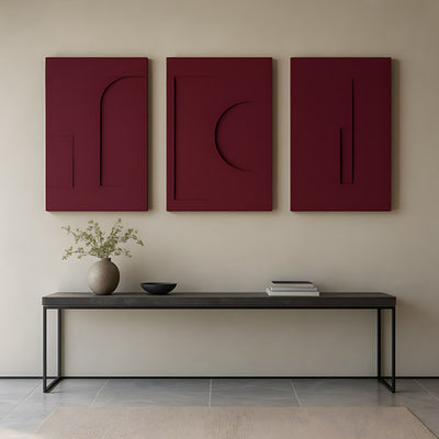
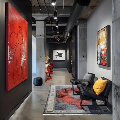
Corridors are where most offices get art wrong. The instinct is to hang a single statement piece halfway down a long hallway, which forces the viewer to stop in a space designed for walking. Rhythm works better. Three or four related pieces of office art, evenly spaced, give the eye something to move with rather than something to interrupt the walk from lift to desk.
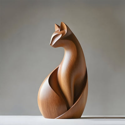
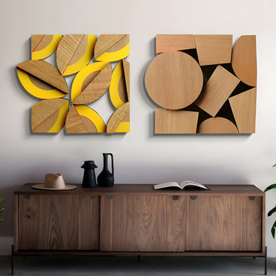
Breakout areas and informal meeting zones can take more personality. This is where we sometimes suggest wood wall art or smaller figurative bronzes, pieces that reward closer inspection because people actually pause there. The mistake is treating breakout office art like reception office art; it does not need to shout, it needs to reward. We have seen everything from abstract steel forms to literal references like police officer clip art used in civic and law-enforcement HQ breakout zones, and the same rule applies: pause-worthy beats statement-making.
Eye-Line, Pedestal Height and the Standing-Versus-Seated Question
Before any office art is delivered, we ask the client one question: where will people be when they look at it? Standing in reception? Seated at the boardroom table? Walking past in a corridor? Each answer changes the pedestal height.
Standing viewers (reception, lobby): the visual centre of the piece should sit at roughly 60 to 65 inches (152 to 165 cm) from the floor.
Seated viewers (boardroom, lounge): drop the centre to around 48 to 54 inches (122 to 137 cm) so the piece reads from a chair.
Walking viewers (corridors): slightly above standing eye-line works because the viewer is moving and the piece needs to register quickly in peripheral vision.
Pedestals themselves are part of the composition. A bronze figure on a 12-inch (30 cm) plinth reads differently from the same figure on a 36-inch (91 cm) plinth, and the difference is not just height. The taller plinth pushes the work into ceremonial territory; the shorter one keeps it conversational. Neither is wrong; both are decisions.
Lighting the Piece Without Lighting the Meeting
The most common request we get from facilities managers six months after delivery is: "Can someone come and look at the lighting?" Sculpture and office lighting are usually designed by different people who never met. The result is a piece lit by ceiling downlights aimed at the floor, or wall pieces washed out by the same fluorescent panels that light the desks.
For sculptural office art, we recommend a dedicated narrow-beam spot from above and slightly to one side, set at roughly 30 degrees from vertical. This gives the form shadow and dimension without creating glare in the room. For wall pieces, a linear LED wash mounted above is usually cleaner than individual picture lights, especially in open-plan spaces where picture lights compete visually with desk task lighting. The Getty Conservation Institute has useful published guidance on lighting levels for works of art that holds up well in commercial settings; their material on display lighting is worth a read before any major install (see getty.edu/conservation). Municipal programs such as the Seattle Office of Arts and Culture publish similar guidance for civic installations, and the principles translate directly to private workplaces.
One practical note: dimmable circuits are worth the extra spend. The light that flatters a bronze at 8 a.m. is not the light that flatters it at 6 p.m., and a board meeting that runs into the evening should not end with a sculpture suddenly looking flat.
Mistakes We Keep Being Called in to Fix
After a decade of commercial commissions, the same office art problems show up repeatedly. Worth knowing before you commit:
Buying for the empty space, not the occupied one. The reception that looks generous in CAD has a desk, three chairs, a coffee table and two visitors in it by 9.30 a.m. Scale the piece for the busy room.
Choosing material by photograph. Bronze, stainless steel, Corten and stone all photograph similarly under studio lighting. In a real office under real light they behave nothing alike. Ask for samples, the way Catskill Art & Office Supply and other reputable suppliers will let you handle stock before you commit.
Forgetting the cleaning crew. A polished stainless piece in a high-traffic corridor will be fingerprinted within a week. Brushed finishes hide handling far better than mirror polish.
Hanging office wall art too high. Domestic hanging heights do not work in offices with 10-foot (3 m) ceilings. The piece floats and the wall below looks empty.
Skipping the structural check. A 200-pound (90 kg) bronze on a plinth needs a floor that can take it. We have been asked, more than once, to relocate a piece because the original spot sat on a raised access floor.
Commissioning Art for a Specific Space
Most of our commercial office art is bespoke because off-the-shelf rarely fits the architecture, the brand and the sightlines all at once. A commission typically starts with floor plans, photographs of the space at different times of day, and a conversation about what the room is for. From there we develop maquettes, agree material and finish, and build to scale.
Budget depends on material, scale, complexity, engineering, installation and finishing, so we always recommend a tailored quote rather than working from a guessed range. Lead times for large office art pieces, particularly cast bronze or fabricated stainless steel, run into months rather than weeks; planning the artwork alongside the fit-out rather than after it saves clients a lot of frustration.
Whether the brief is a single reception sculpture in a Texas headquarters, a series of corridor pieces for a Boston law firm, or a boardroom centrepiece for a Napa winery's hospitality suite, the questions are the same: who sees it, from where, for how long, and what should they feel when they do. Art in offices that answers those four questions tends to outlast three rounds of refurbishments. Office art that does not, gets replaced.