


Most office art fails for the same reason: someone picked the piece before they understood the room. A canvas chosen for the marketing deck ends up swallowed by a 14-foot wall. A sculpture intended to anchor reception sits behind a security turnstile no one walks past. The brief was never written down, so the office art ended up as decoration rather than a working part of the space. This guide is for the people who sign off on workplace sculpture and want it to actually earn its place: facilities directors, design leads, founders, and the architects we work with on commercial fit-outs.

Key Takeaways Before You Start Specifying Office Art
The boardroom, the lobby, and the breakout corner are three different briefs. Treat them that way.
Scale is set by viewing distance and ceiling height, not by the budget line in the FF&E schedule.
Sculpture and three-dimensional wall pieces change a room's acoustics; flat canvases do not.
Screen glare, daylight, and ceiling grids fight each other. Plan the lighting before you plan the office art.
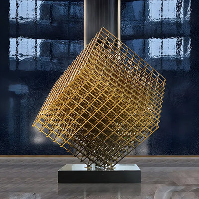
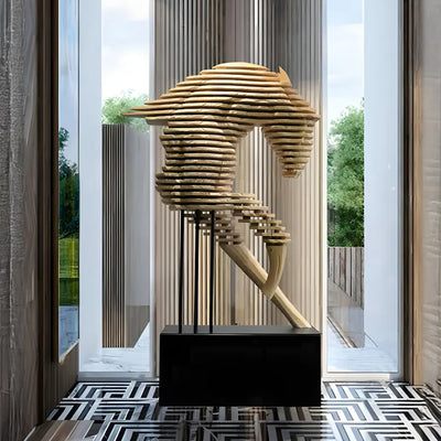
Bespoke commissioning makes sense when the wall, the brand, or the ceiling height is non-standard. Off-the-floor office art works when the space is generic.

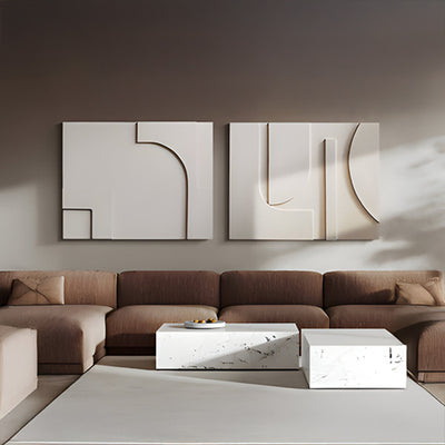
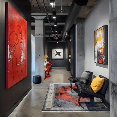
The Boardroom Wall and the Breakout Corner Are Not the Same Brief
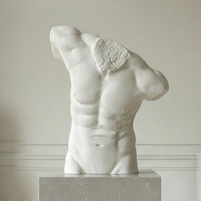
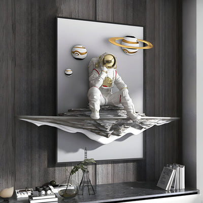
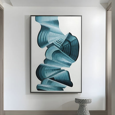
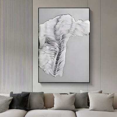
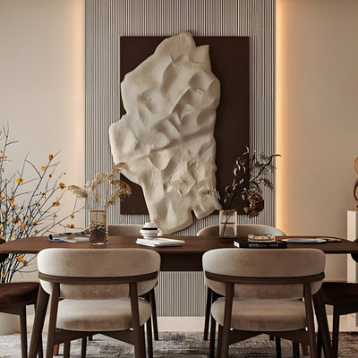
The boardroom is a slow room. People sit, they look, they have time to register surface, depth, and material. A boardroom piece needs to hold up to close inspection: hand-finished bronze, hand-polished stainless steel, carved stone, or a textured metal panel with real depth. The breakout corner is the opposite. People are passing through, talking, holding coffee. The piece needs to read in three seconds and survive shoulders, bags, and the occasional spilled flat white.
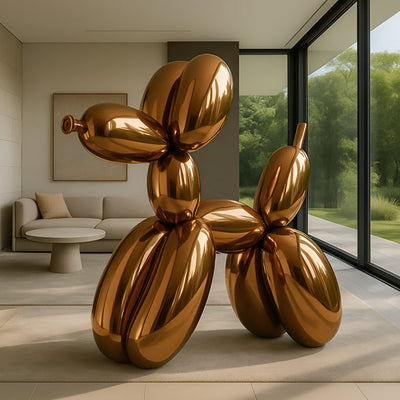
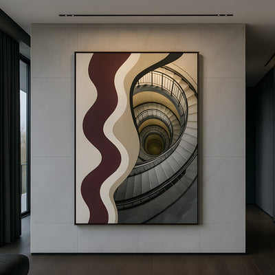
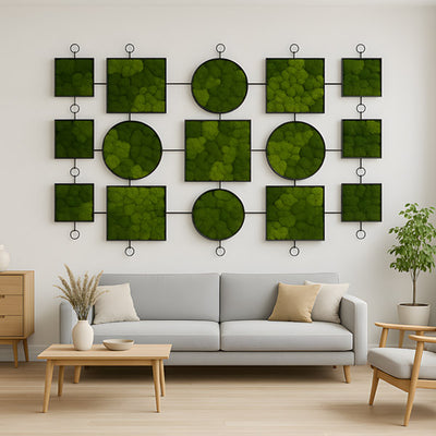
When clients ask us to brief workplace office art across a whole floor, the first thing we do is separate the rooms by dwell time. Long dwell time (boardrooms, executive offices, private dining) gets the quieter, more crafted work. Short dwell time (lobbies, lift lobbies, corridors, breakout areas) gets bolder forms with strong silhouettes. Mixing these up is the most common mistake we see in finished workplaces, and it is why so much corporate decor feels generically expensive rather than considered.
Why the Piece Behind the CEO's Chair Almost Always Fails
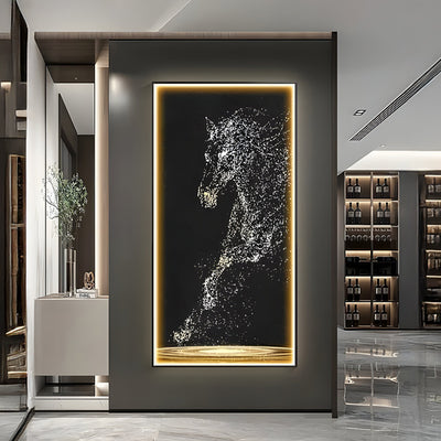
The wall behind the principal chair in a boardroom is the single most photographed surface in most workplaces. It shows up on every video call, every press shot, every internal town hall. And it is almost always specified badly. Either the piece is too small and floats like a postage stamp above the headrest, or it is busy enough that it competes with the speaker's face on camera.
The fix is simple once you know it. The office art needs to either fully fill the visible wall behind the chair (typically 6 to 9 feet / 1.8 to 2.7 m wide for a single principal seat) or sit clearly above the camera frame so it never reads as competing background. For sculptural wall pieces, we ask for a sample of the camera setup before signing off scale. A bronze relief or a brushed metal installation that is calm in person can flare badly under a ring light, and that is a conversation worth having before the piece is cast, not after.
Open-Plan Acoustics: How Sculpture Changes the Room's Sound
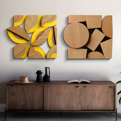
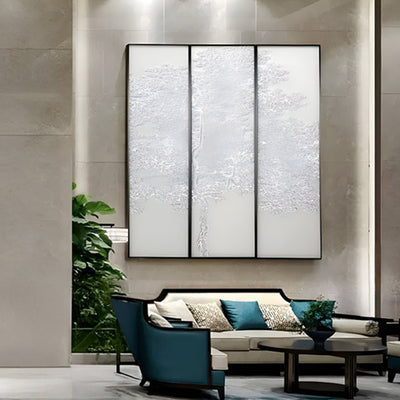
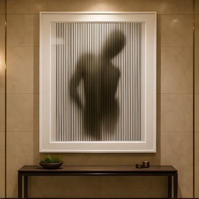
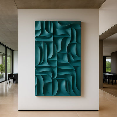
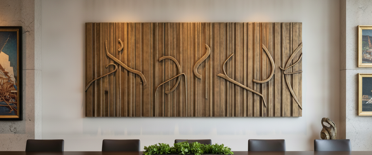
Open-plan workplaces have an acoustic problem that flat artwork does nothing to solve. Hard floors, glass partitions, and exposed soffits bounce voices around until everyone is talking louder to be heard. Three-dimensional wall sculpture, particularly deeper relief work in wood or layered metal, breaks up those reflections in a way a stretched canvas simply cannot. It is not an acoustic panel, and we never sell it as one, but a deep textured installation across a 12-foot wall measurably softens the room.
If acoustics are a serious concern, talk to your acoustician first and let the office art sit within their plan rather than fighting it. For browsing the kinds of three-dimensional pieces that do this work, our wood wall art and metal wall art collections are the right starting points, including office wall art sized for boardrooms and reception walls.
Light From Screens, Light From Windows, Light From Grids
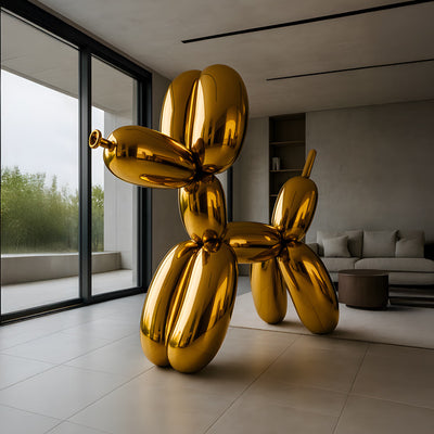
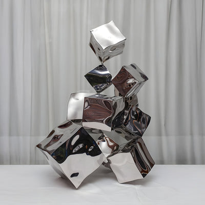
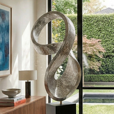
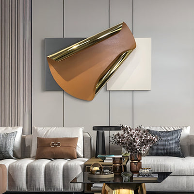
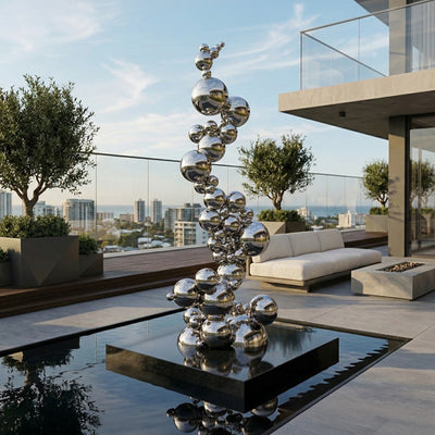
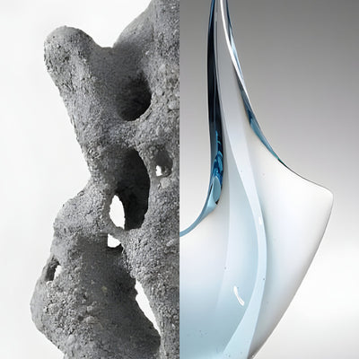
Workplace lighting is the quietest enemy of any wall piece. You have three light sources fighting each other: cool screen light at desk height, daylight from the perimeter, and a ceiling grid pumping out flat 4000K downlight. Polished bronze and mirror-polished stainless steel can look extraordinary in a domestic setting and look cheap under a square LED panel because the highlights blow out.
For ceiling-grid interiors, we usually steer clients toward brushed, patinated, or matte finishes for their office art. They handle flat overhead light far better than high-gloss surfaces. For lobbies with double-height glazing, the opposite is true: a polished piece can take full advantage of the changing daylight and earns its keep across the day. If the budget allows, add dedicated track or recessed accent lighting on the piece at roughly a 30 degree angle. It costs less than people expect and changes the result completely. The Illuminating Engineering Society publishes practical guidance on accent lighting angles that is worth handing to your electrical contractor.
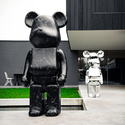
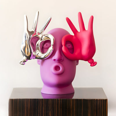
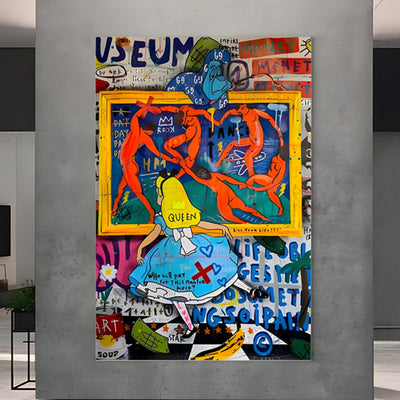
The Cliche Pieces We Keep Being Asked to Replace
For wider placement ideas, 10 Stunning Animal Sculptures to Buy for Your Home or Office is useful companion reading before finalising the setting and sightlines.
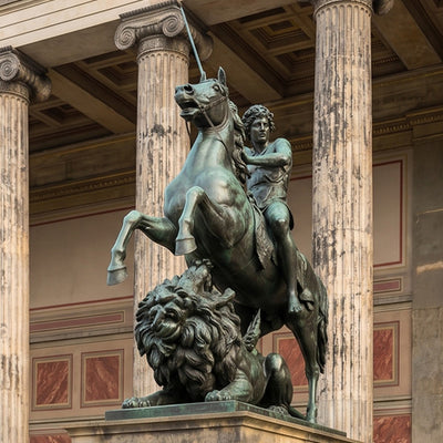
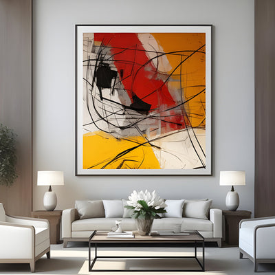
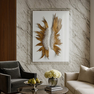
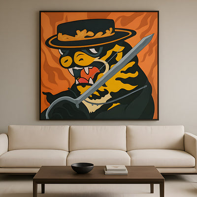
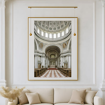
A few patterns come up again and again when we are brought in to refresh workplace office art. The oversized motivational typography canvas. The framed black and white photo of a city skyline that has nothing to do with the company. The abstract acrylic in the same three colors as the brand guidelines. The Don Draper era leather-and-mahogany decor, complete with a generic equestrian print, transplanted into a glass-walled Seattle headquarters where it makes no sense at all. We also field steady requests to swap out novelty wall graphics, including framed police officer clip art in security-adjacent firms, for something with more presence.
None of these are offensive. They are just forgettable, which is worse. When clients ask us what to put in their place, the answer is usually a single considered sculptural piece per major room rather than a wall of decorative filler. One well-made bronze, one carved stone form, one substantial metal wall installation. Fewer objects, more weight per object. Our office art collection is organized around that principle, and pairs naturally with wall art for office spaces where a single anchor piece does the work of a dozen prints.
When to Commission, When to Buy Off the Floor
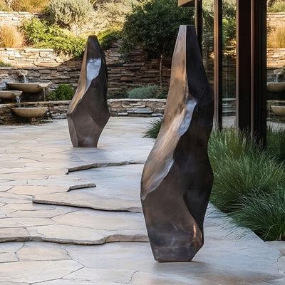
Commissioning bespoke office art is the right call when at least one of three things is true. The wall or floor space is genuinely non-standard (double-height atriums, curved reception desks, ceiling heights above 14 feet / 4.3 m). The brand has a specific story that a generic piece cannot carry. Or the client wants a piece that will move with them if they relocate in five years, which makes durable materials such as bronze, stainless steel and stone the sensible choice.
Off-the-floor works well when the space is standard, the timeline is tight, and the client wants to see the exact piece before committing. For a single executive room or a mid-sized boardroom in a typical Class A building, a finished piece from an existing collection will usually serve as considered art for office interiors without months of lead time. For a flagship lobby in Manhattan, a tech campus near the Seattle Office of Arts district, or a Texas headquarters with a 30-foot atrium, commissioning office art is almost always the better answer. We have shipped enough commercial commissions to know that the briefing conversation is where the value is created, not the catalog.
A Practical Buyer's Checklist for Office Art
Map dwell time per room before you specify any office art. Long dwell rooms get crafted, quieter pieces. Short dwell rooms get bolder forms.
Measure the wall, not just the room. Photograph it from the seated viewing position and the standing approach.
Confirm ceiling height and lighting type. Brushed and patinated finishes for grid lighting; polished surfaces for daylight-rich spaces.
Decide camera-facing walls early. Anything behind a principal seat needs to either fill the frame or sit above it.
Choose materials that will survive a relocation. Bronze, stainless steel, stone, and engineered metal travel; foam-backed prints do not.
Ask for a sample finish, especially on bespoke metal work. A 4 by 4 inch (10 by 10 cm) sample under your actual workplace lighting answers more questions than any rendering.
Plan installation access before you sign off scale. Lift dimensions, door widths, and floor loading rule out more art in offices than budgets do.
Working With Giant Sculptures on a Commercial Brief
Most of the commercial office art we ship is large-scale: bronze figures for corporate lobbies, stainless steel forms for tech campuses, Corten pieces for landscaped grounds, carved stone for hospitality interiors. Budget on a commissioned piece of office art depends on material, scale, structural engineering, surface finishing, crating, and installation, so we always quote against a specific brief rather than publishing bands that would mislead. If you are early in a fit-out and want a second opinion on what the room is asking for, that conversation is free and usually saves money downstream.