


Table of Contents
- Why Dark Hallways Feel Uninviting
- Choosing Hallway Art That Reflects Light
- Scale and Proportion: Avoiding the “Floating Frame” Effect
- Using Colour to Add Warmth
- Creating a Gallery Wall in a Dark Corridor
- Lighting: The Silent Partner of Hallway Art
- Strategic Placement for Maximum Impact
- Common Mistakes That Darken a Corridor Further
- Budget-Friendly Ways to Upgrade Your Hallway Art
- Conclusion: Bringing Light and Character into Your Corridor
- FAQs
Dark corridors are common in many homes, particularly in properties where hallways sit in the centre of the floor plan without windows. These spaces often feel narrow, flat and slightly uninviting. Yet with the right approach, hallway art can completely change the mood and perception of the space.
Artwork does more than decorate a wall. In darker environments, it reflects light, introduces depth and creates a focal point that guides the eye. When chosen carefully, hallway art can make a corridor feel wider, brighter and far more intentional.
This guide explains how to select, position and style artwork so your hallway feels balanced and welcoming rather than dim and forgotten.
Why Dark Hallways Feel Uninviting
A lack of natural light reduces contrast and shadow. Without visual interest, the walls can appear flat and featureless. Over time, this makes the corridor feel smaller than it truly is.
Dark paint colours, heavy frames and poor lighting can compound the issue. When there is no focal point, the eye moves quickly through the space without engaging with it. Thoughtfully selected hallway art introduces structure. It provides a resting point for the eye and adds personality to an otherwise transitional area.
Understanding this is the first step. The goal is not simply to “add décor”, but to use art strategically.
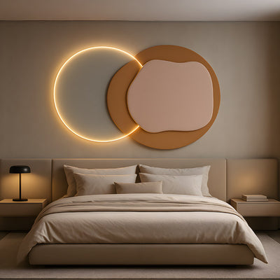
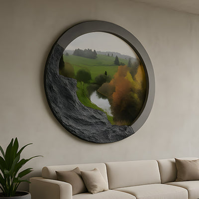
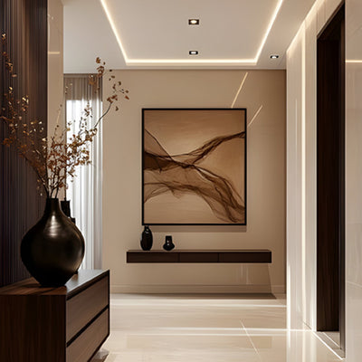
Choosing Hallway Art That Reflects Light
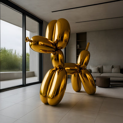
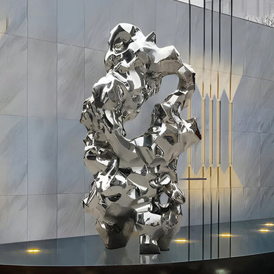
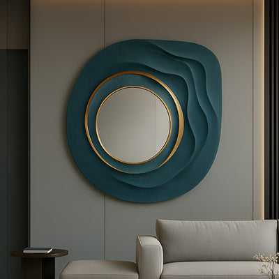
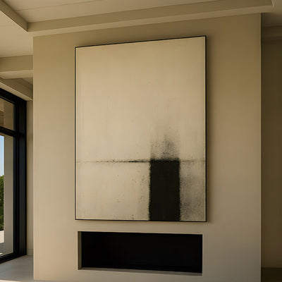
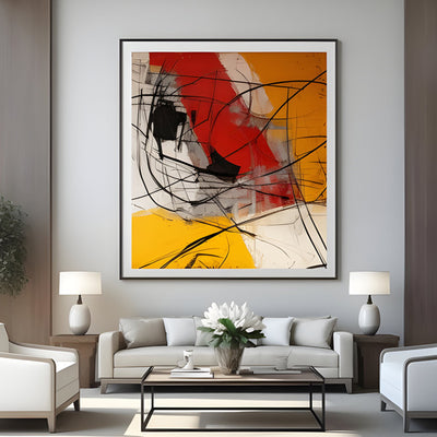
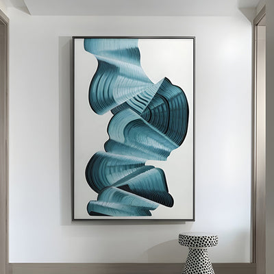
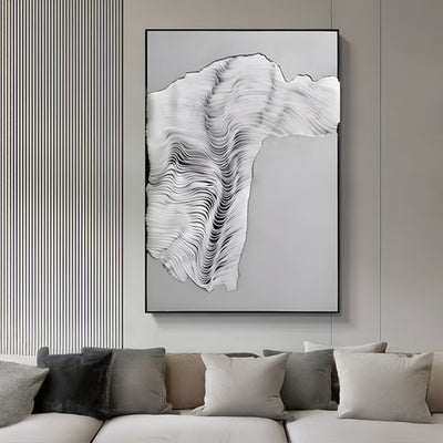
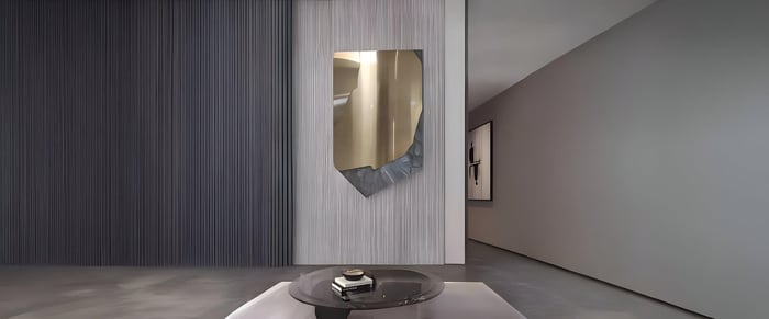
In darker spaces, reflective qualities matter. Artwork with lighter backgrounds, subtle sheen or glass framing can help distribute available light more effectively.
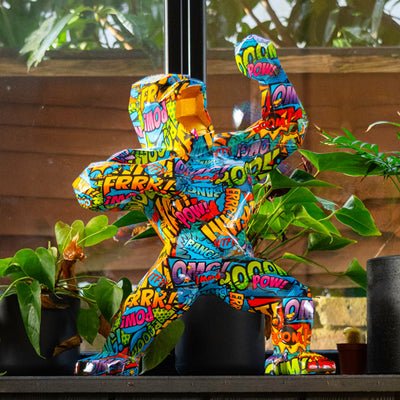
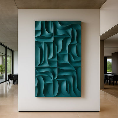
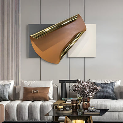
Metallic finishes or soft neutral palettes prevent walls from absorbing too much brightness. Even abstract prints featuring gentle layers of cream, taupe or muted blush can warm up the corridor significantly.
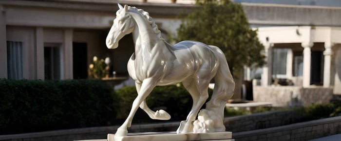
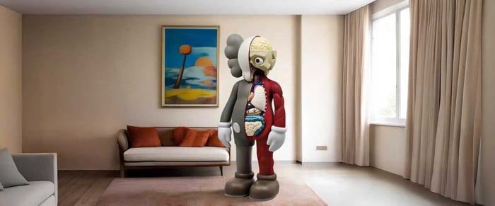
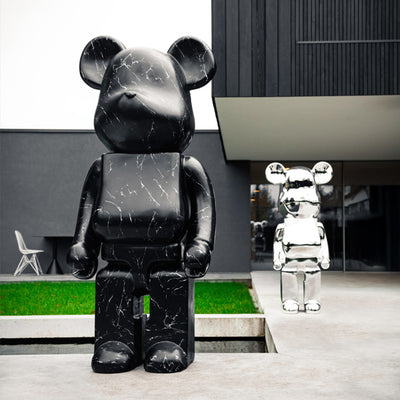
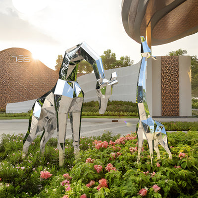
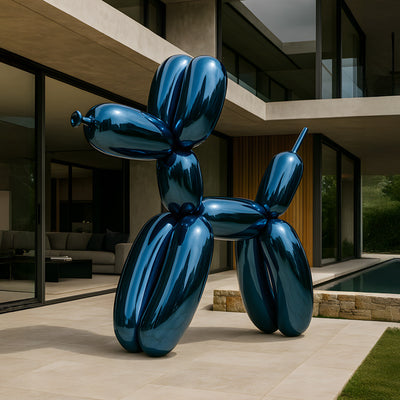
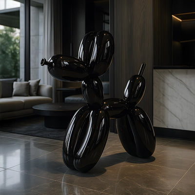
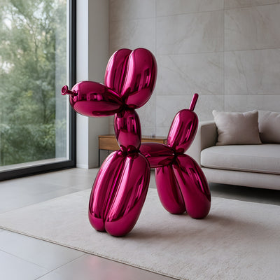
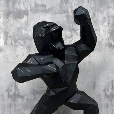
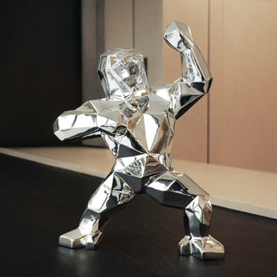
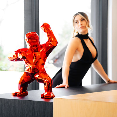
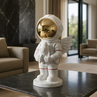
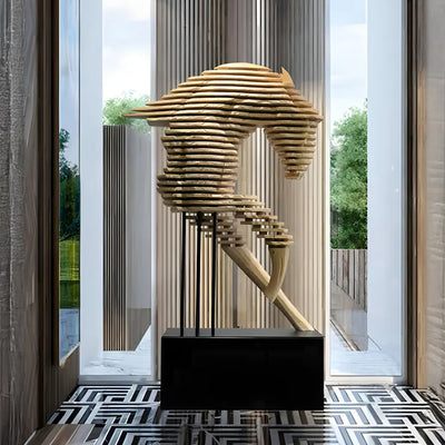
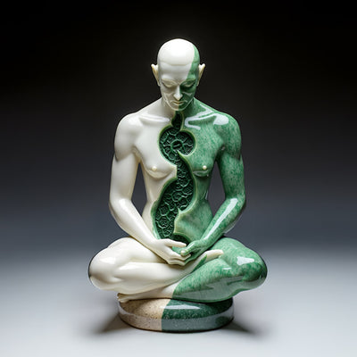
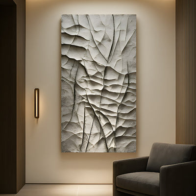
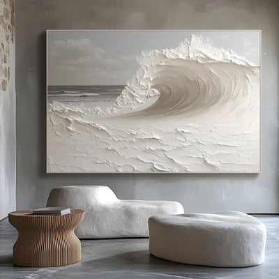
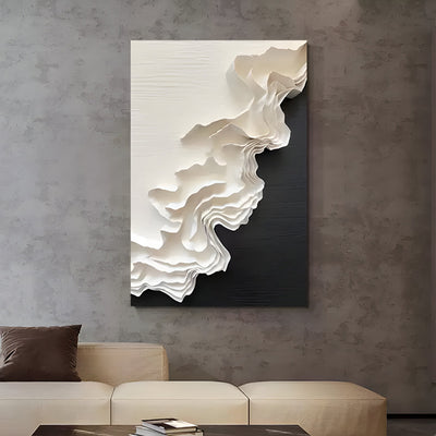
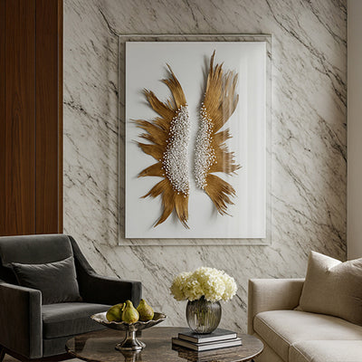
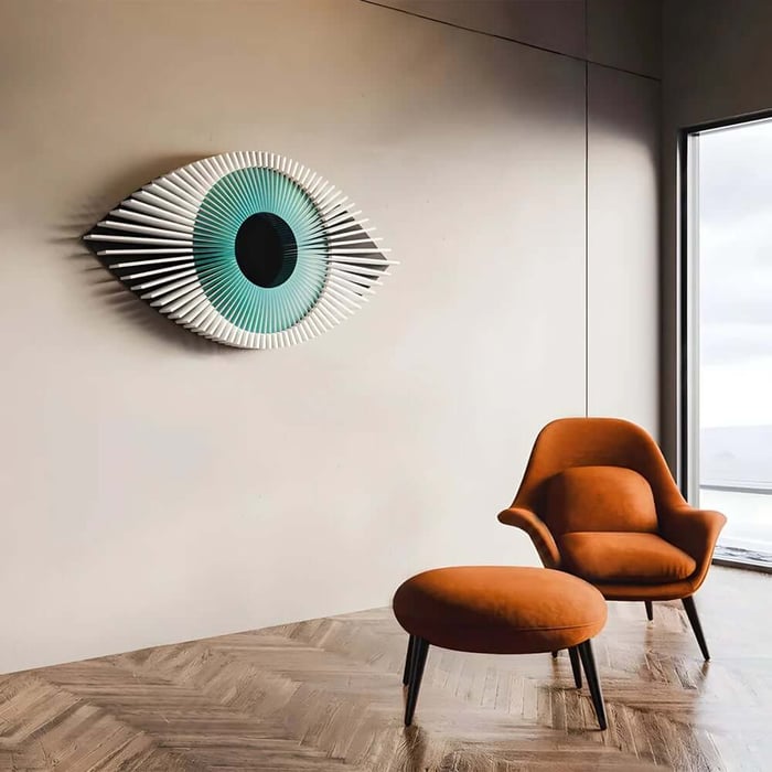
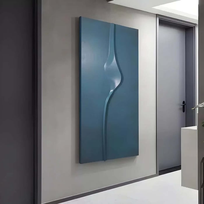
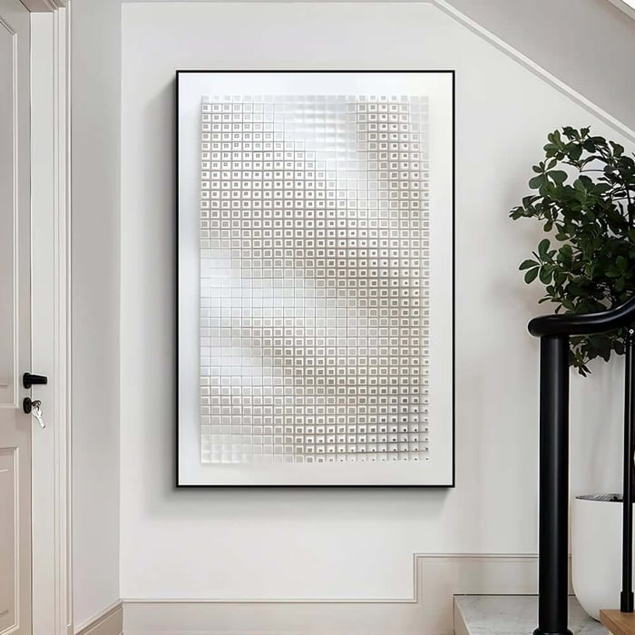
If you prefer something with texture, subtle 3D art can be particularly effective. Raised surfaces catch light at different angles throughout the day, creating natural variation without overwhelming the space. The effect is understated yet impactful.
The key is balance. You want brightness without glare.
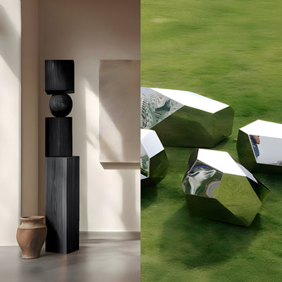
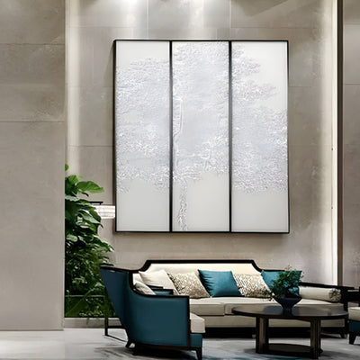
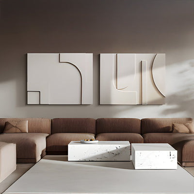
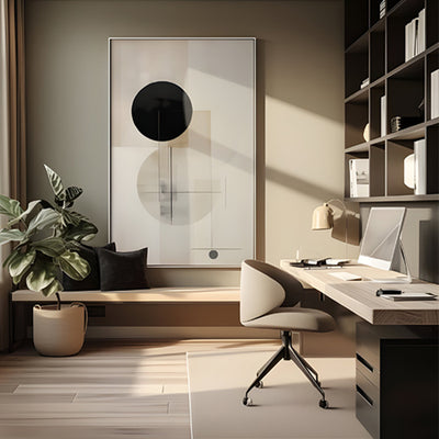
Scale and Proportion: Avoiding the “Floating Frame” Effect
One of the most common hallway mistakes is choosing artwork that is too small. In dim corridors, small frames can disappear into shadow and make walls feel disconnected.
Instead, consider these structured options:
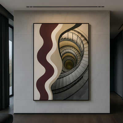
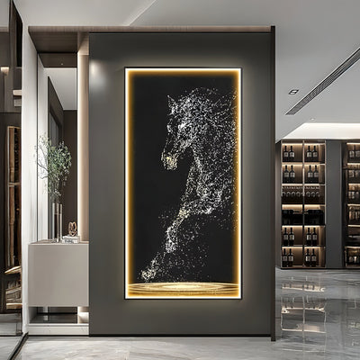
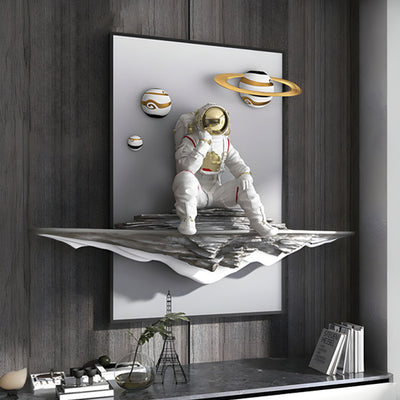
A single oversized canvas at the end of the corridor
A carefully measured gallery wall with consistent spacing
Vertical artwork to elongate low ceilings
A panoramic piece to stretch long hallways visually
Larger hallway art creates presence. It grounds the space and prevents visual fragmentation. If you are unsure about scale, outline the dimensions on the wall with masking tape before committing.
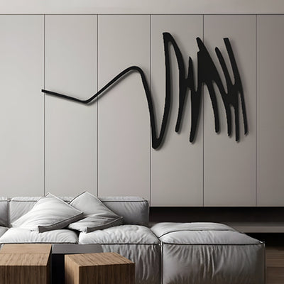
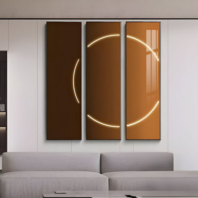
Using Colour to Add Warmth
Colour plays a subtle but powerful role in dark interiors. Cool blue tones may look elegant in bright rooms, but in shadowed hallways they can appear colder than intended.
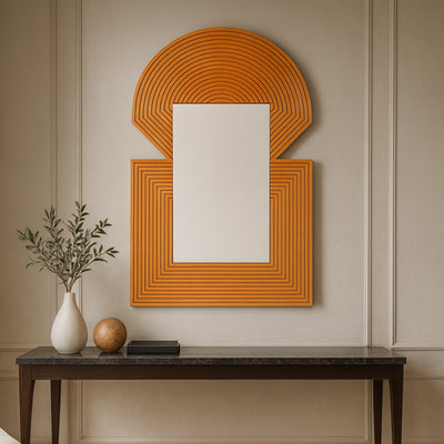
Warm neutrals, earthy shades and soft muted tones introduce comfort. Gentle terracotta, sandy beige or warm greys can brighten without becoming overpowering.
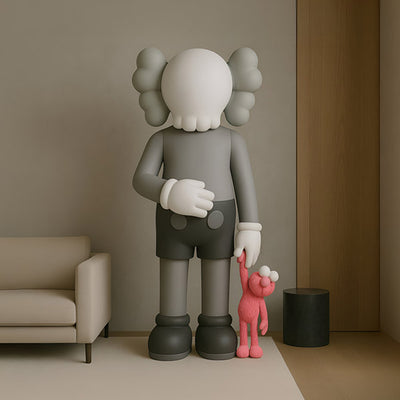
If your home carries vintage influence, a thoughtfully chosen piece of retro art can add warmth and personality. Mid-century palettes often include ochre, burnt orange and soft olive shades that work beautifully in darker corridors.
Consistency with your overall décor style keeps the hallway feeling cohesive rather than disconnected.
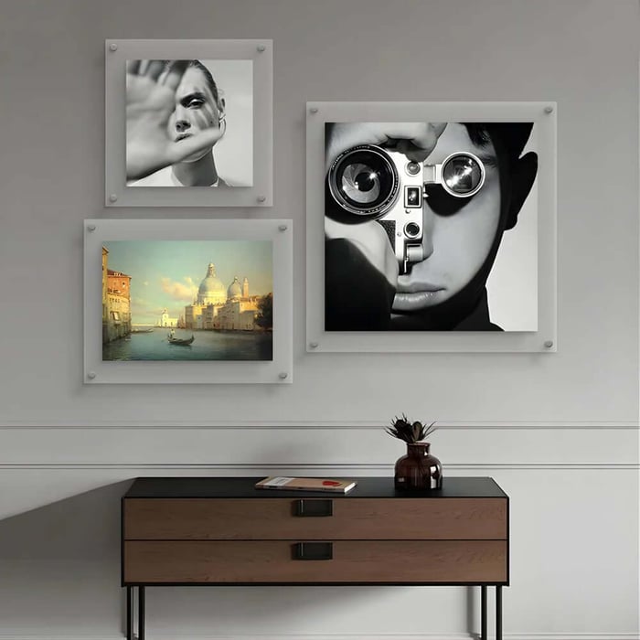
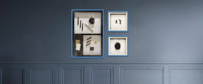
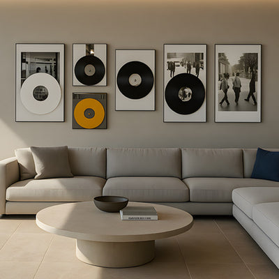
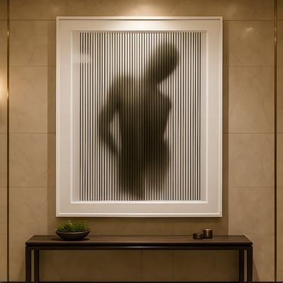
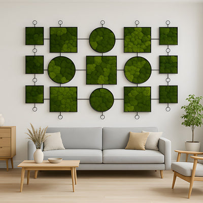
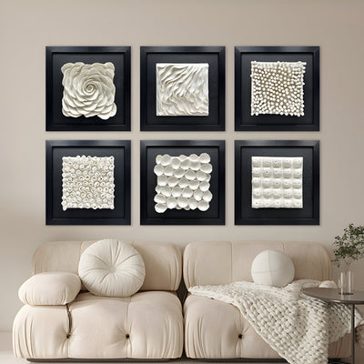
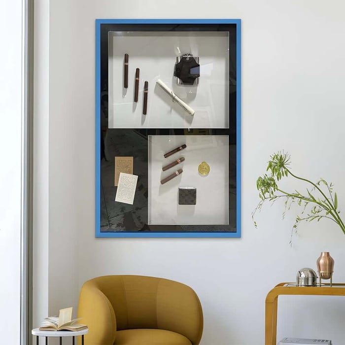
Creating a Gallery Wall in a Dark Corridor
A gallery wall can work extremely well in low-light areas, provided it is structured properly. Random placement rarely succeeds in narrow spaces.
Maintain even spacing between frames. Align either the centre line or the top edge to create order. Using similar frame finishes keeps the arrangement calm and considered.
Black and white photography is especially effective because it introduces contrast without overwhelming colour. Alternatively, keeping all prints within a single tonal family maintains visual harmony.
Well-executed hallway art arranged in this way turns an overlooked corridor into a curated feature.
Lighting: The Silent Partner of Hallway Art
Even the most beautiful hallway art will struggle under poor lighting. Harsh overhead bulbs create glare, while weak lighting leaves artwork looking dull.
Layered lighting produces better results:
Wall sconces positioned beside key pieces
Slim picture lights fixed above a statement artwork
Warm LED bulbs rather than stark white tones
Directional spotlights angled to highlight texture
Lighting should enhance, not dominate. A gentle wash of warm light across the surface of your art makes colours richer and textures more visible.
Strategic Placement for Maximum Impact
Positioning can dramatically alter how bright the corridor feels.
End-of-Hall Focus
Placing bold hallway art at the far end draws the eye forward. This creates depth and makes the corridor appear longer.
One-Sided Styling
In very narrow hallways, decorate only one wall. Filling both sides can feel cramped. A single curated display often looks more refined.
Above Furniture
If you have a console table, bench or slim storage unit, artwork above it anchors the arrangement. This creates structure rather than a floating effect.
Keep the centre of your artwork roughly at eye level, around 145 cm from the floor. This ensures balance and natural viewing.
Common Mistakes That Darken a Corridor Further
Certain styling choices unintentionally make hallways feel gloomier.
Avoid:
Hanging artwork too high
Mixing too many competing frame colours
Using very dark artwork on dark-painted walls
Overcrowding narrow spaces
Ignoring how shadows fall at night
Thoughtful restraint often produces a brighter result than over-decoration.
Budget-Friendly Ways to Upgrade Your Hallway Art
Improving a dark corridor does not require a large investment. Consider practical solutions that still feel refined.
High-quality digital prints placed in well-made frames can look impressive. Reframing older artwork in lighter wood tones can instantly refresh the space. Rotating seasonal prints keeps the corridor feeling current without constant spending.
The focus should remain on impact rather than quantity. A single strong piece of hallway art is often more powerful than multiple smaller items competing for attention.
Conclusion: Bringing Light and Character into Your Corridor
Dark hallways present challenges, but they also offer opportunity. With careful planning, the right hallway art can reflect light, add warmth and introduce visual structure.
Focus on scale, choose colours that soften shadows and position artwork thoughtfully. Support your display with balanced lighting and avoid overcrowding. When each element works together, the corridor feels intentional rather than overlooked.
A well-styled hallway sets the tone for the entire home. Explore the collection to discover hallway art that enhances brightness, complements your interior style and transforms your corridor beautifully.
FAQs
What type of Hallway Art works best in dark corridors?
Artwork with lighter backgrounds, reflective finishes or subtle texture works best in dark corridors. These styles help distribute available light and prevent the walls from feeling heavy. Choosing the right scale is equally important to create a strong focal point.
Should Hallway Art match the rest of the house?
Hallway Art should feel connected to your overall interior style, but it does not need to match exactly. Repeating similar tones, materials or themes helps create a natural transition between spaces. Cohesion keeps the home feeling thoughtfully designed.
Can large artwork make a narrow hallway look smaller?
Surprisingly, a single large piece can make a narrow hallway feel more intentional and spacious. Small scattered frames often create visual clutter, while one bold focal point adds structure. Proportion and placement matter more than size alone.
How high should Hallway Art be hung?
The centre of the artwork should generally sit at eye level, around 145 cm from the floor. This creates comfortable viewing and visual balance. In stairways or sloped areas, adjust slightly to maintain alignment as you move through the space.
How can I brighten a hallway without adding more lighting?
Choosing Hallway Art with warm tones, lighter backgrounds or reflective elements can brighten the space visually. Textured finishes and glass framing help bounce existing light around the corridor. Even subtle colour adjustments can make a noticeable difference.