


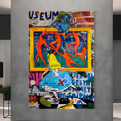

Retro Art is everywhere right now on prints, posters, packaging, social feeds, and brand identities that want to feel familiar without looking dated. The best part is you don’t need years of experience to make it work. You need a repeatable process: choose a decade, limit your colours, build bold shapes, add print-style texture, then finish with typography that matches the era.
This guide is built to be practical and profitable. You’ll learn a clear, beginner-friendly method (so you can finish pieces instead of abandoning them halfway), plus smart decisions that matter if you want to sell downloads, create print-ready posters, or offer client work later. Whether you’re using Procreate on an iPad or Photoshop on desktop, the workflow stays the same.

What Retro Art Is (and Why It Sells So Well)
Retro Art is modern artwork that borrows the visual language of earlier decades most often the 1950s through the 1990s. It isn’t about tracing an old poster line-for-line. It’s about using recognisable cues: simplified shapes, bold colour blocks, halftone dots, grain, thick outlines, and poster-style composition.
That’s why Retro Art is friendly for beginners. You don’t need flawless rendering. Most styles reward clarity over detail. Instead of painting tiny gradients, you focus on a strong silhouette, confident colours, and texture that feels printed rather than glossy.
It also reads quickly. A good Retro Art piece communicates a mood in seconds playful, nostalgic, bold, cosy, rebellious depending on the decade, palette, and typography.

Pick Your Direction in 5 Minutes (So You Don’t Waste Hours Later)
Before you open Procreate or Photoshop, make three quick decisions. This small bit of planning stops you drifting and makes the final piece look intentional.
1. Choose your decade
50s-60s: mid-century shapes, clean layouts, optimistic “advertising” feel
70s: warm earthy palettes, curved forms, groovy type
80s-90s: neon accents, grids, high contrast, rougher texture
If you’re unsure, pick one and commit. Retro Art looks best when it’s decisive.
2. Choose a subject that reads clearly
A retro look depends on a clear silhouette. Start with something simple: fruit, plants, a cassette, a roller skate, a face in profile, a car, a building, or a single character object. If you’re already comfortable with figure art, you can still use this method just simplify the pose and reduce the detail so the shapes lead the design.
3. Decide your output (this affects everything)
Are you making:
a poster (big type, central image, bold layout),
a print (more breathing room and softer hierarchy),
or a social graphic (square format, higher contrast)?
If you plan to sell your Retro Art, decide the format early so you don’t have to rebuild the layout at the end.

The Beginner Workflow You Can Repeat in Procreate or Photoshop
This is the repeatable formula you’ll use every time:
Thumbnail layouts
Palette + value plan
Flat colour shapes
Graphic shading
Print-style texture (grain / halftone / distress)
Era-true typography
Export for web and print
Follow that order. It prevents the most common beginner mistake: adding detail too early and losing the retro feel.

Thumbnail Like a Designer (Best Layouts for Posters and Prints)
Make six tiny thumbnails. Keep them quick and messy. You’re solving composition, not polishing linework.
Here are classic Retro Art layouts that reliably work:
Centred subject + burst shape behind it (instant energy)
Diagonal banner + badge (great for “headline” posters)
Stacked shapes + big title block (clean and modern-retro)
Cropped subject (adds drama with minimal effort)
Framed border (simple, but it reads like a finished print)
Choose the thumbnail that reads best when you zoom out. If it works at postage-stamp size, it will work on a wall.
Make it sell-ready: Decide where text goes now. A poster layout with planned type is easier to export into standard sizes and easier to turn into a product series later.

Build a Retro Colour Palette That Looks Good on Walls
Retro Art becomes convincing when your palette is tight. Too many colours makes it feel modern and messy.
A palette rule that rarely fails
Pick 3 to 6 colours:
one dark anchor (charcoal, deep navy, chocolate brown)
one light base (cream, off-white, pale mint)
two mid-tones (warm beige, muted teal, dusty pink)
one accent that pops (mustard, orange, hot pink, bright cyan)
If you plan to sell prints, test your palette on both a light and dark background so it still reads in real rooms with different wall colours and lighting.
Procreate tip
Create a custom palette and stick to it. Don’t keep colour-picking new shades halfway through. Limitation is part of what makes Retro Art feel era-true.
Photoshop tip
Build a palette strip down the side of your canvas little squares of your chosen colours so you can sample quickly without guessing.
Make it repeatable: Save your palette as a named set. That makes it easy to build a matching Retro Art poster series (and consistency is what makes collections look “buyable”).

Block Bold Shapes First (Clean Edges = Print-Ready)
This is where your Retro Art starts looking real fast. Ignore details. Build large shapes first.
In Procreate
Sketch your subject on a top layer
Create a layer underneath and block flat colour
Use Selection + Fill for crisp edges
Keep a hard-edged brush for flats
In Photoshop
Use Shape layers whenever possible (Ellipse, Rectangle, Pen tool)
If painting flats, use a hard round brush and clean selections
Name layers early: Background / Subject / Shadow / Texture / Type
At this stage, aim for a finished-looking image using only flat colour. If the piece looks strong now, everything after this is polish not rescue.
Make it product-friendly: Keep your flats on separate layers. It’s the quickest way to create colour variations for shop listings or client options without repainting the whole thing.

Add Graphic Shading That Prints Cleanly
Retro Art shading isn’t about perfect realism. It’s about readable forms.
Pick one approach and stick to it:
Option A: Single shadow shape
Create one shadow layer and apply it consistently. Same light direction across everything. Clean, fast, and very “poster”.
Option B: Two-tone shading
Pick a darker version of your base colour and add simple shadow blocks. Avoid soft airbrush shading it often looks too modern and can print unevenly.
Option C: Cut-paper look
Hard edges and layered shadows make Retro Art feel like printed collage. It’s a great option for beginners because it hides small drawing imperfections.
For client work: Two-tone shading is a safe default. It scales well, prints cleanly, and looks consistent across a series.

Add Print-Style Texture Without Ruining the Design
Texture is one of the biggest differences between flat digital art and Retro Art that feels like a physical print.
Grain: the easiest upgrade
Add a grain layer above your colours.
Blend mode: Multiply, Overlay, or Soft Light
Opacity: lower it until you just feel it
Grain should support your artwork, not smother it.
Procreate: Use a grain brush or import a paper texture image and test blend modes.
Photoshop: Add noise (Filter → Noise → Add Noise), then soften slightly with blur if needed.
Halftone: use it as an accent
Halftone dots are powerful, but easy to overdo.
Use halftone on shadows, background shapes, or one feature area
Keep dot size consistent
Leave some areas clean so the eye can rest
Distress: keep it believable
Distress works best at edges and corners, where wear would naturally happen. Random scratches across the centre usually look forced.
Make it sell-ready: Save a “texture on” and “texture off” version. Buyers often want both a crisp file and a gritty one, and it gives you more options for product listings.

Retro Typography That Looks Era-True (and Still Reads Fast)
Typography can rescue a decent piece or ruin a good one. In Retro Art, type is part of the design, not a label you slap on at the end.
A simple type system
Headline: one bold display font
Support line: one clean font for small text
Optional badge text: condensed caps or curved type
Layout moves that feel retro
Put the headline in a banner or block
Add a badge (“Edition”, “Classic”, “Since 1986”, etc.)
Use arched or circular text around a simple icon
Keep alignment consistent: centred and poster-like, or deliberately offset for energy
Keep it readable. Posters are meant to communicate quickly.
Make it scalable: Convert your type layout into a reusable template. That way you can swap headlines fast for different poster themes, niches, or client briefs without rebuilding the hierarchy.

Finishing Touches That Make It Look Like Real Wall Art
These small edits separate “finished” from “nearly”.
Add a thin border frame (very poster-like)
Introduce one background shape to support the subject (burst, circle, arch)
Check values in greyscale: does the subject still pop?
Simplify one noisy area
Tighten contrast: deepen your dark anchor slightly, lift your light base
If you like making landscape art, this is where you control depth without adding extra detail. Use value contrast and simple shape layering to separate foreground, midground, and background in a bold, graphic way.
Print check: Zoom in and tidy edges now. Clean edges matter more in print than on social posts, and they’re one of the first things people notice on a physical Retro Art poster.

Procreate Setup for Print and Digital (Beginner-Safe Settings)
Canvas sizes
Social square: 3000 × 3000 px
Poster: A3 at 300 DPI (or your preferred print size at 300 DPI)
Layer structure
Sketch
Flats
Shadows
Texture (grain/halftone)
Type
Border/frame
Export
Web: PNG or high-quality JPG
Print: PNG/TIFF at 300 DPI (keep a clean version without heavy distress)
If you plan to sell Retro Art downloads, keep your master file layered so you can update colours and text later without starting from scratch.

Photoshop Setup for Fast Variations (Perfect for Series and Client Rounds)
Photoshop shines when you want consistency across multiple pieces ideal for series work, client deliverables, and product-style Retro Art collections.
Build with structure
Use Shape layers for clean edges
Keep texture in a folder so you can toggle it on/off
Use adjustment layers for quick palette shifts
Export
Web: Export As (JPG/PNG)
Print: Save a copy at 300 DPI, avoid crushing shadows, and don’t oversharpen
Make variations quickly: Photoshop’s non-destructive workflow makes it simple to produce multiple colourways and sizes from one Retro Art design useful for shop listings and client rounds.

Common Retro Art Mistakes (and the Fixes That Save Your Piece)
Mistake 1: Too many colours
Fix: Cut your palette down to five. Choose one accent colour and commit.
Mistake 2: Soft shading everywhere
Fix: Replace it with hard-edged shadow shapes. Retro Art likes clarity.
Mistake 3: Texture dominates the design
Fix: Reduce opacity and keep distress mostly to edges.
Mistake 4: Typography feels out of place
Fix: Use one bold display font, add a banner, and simplify supporting text.
Mistake 5: Everything has equal importance
Fix: Decide what’s the hero: the subject or the headline. Then support it with quieter elements.
These fixes keep your Retro Art consistent, which is exactly what helps a set of posters feel like a collection rather than random experiments.

Make It Sellable Without Changing Your Style
If you want this to be more than a fun experiment, here are simple ways to turn Retro Art into something you can sell or use for clients without changing your style.
1. Make a poster series (fastest path to a portfolio)
Create three posters in the same style:
same palette family
same border and type system
different subjects
Consistency sells your skill better than one perfect image.
2. Offer print-ready downloads
Export in standard sizes and name files clearly. Include:
a clean version
a lightly textured version
a bold textured version
That gives buyers choice and makes your product feel considered.
3. Create an add-on pack
Even beginners can build a useful digital product:
5 retro palettes
10 background shapes (bursts, arches, badges)
3 textures (grain, paper, halftone)
2 poster templates
If you already work with acrylic art traditionally, scan painted textures and use them as overlays. It’s a simple way to make Retro Art feel tactile and personal, and it helps your work stand out from generic digital textures.

Conclusion: Make Retro Art Once, Then Turn It Into a Series
Retro Art isn’t about fancy tricks. It’s about strong choices made in the right order: pick a decade, limit your palette, build bold shapes, add graphic shading, layer print-style texture, then finish with typography that matches the era. Follow the same workflow in Procreate or Photoshop and you’ll get results you can repeat whether you’re making one poster for fun or building a small collection to sell.
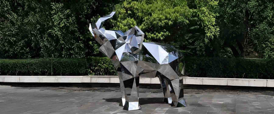
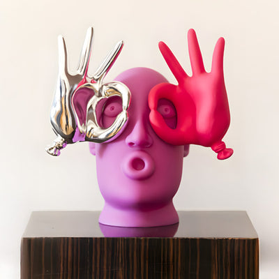
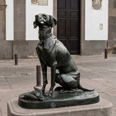
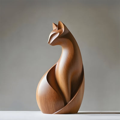
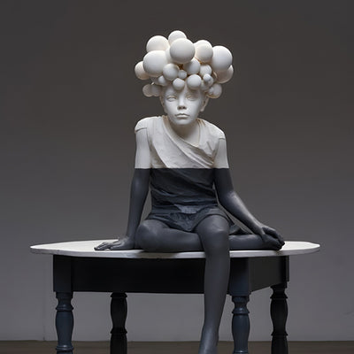
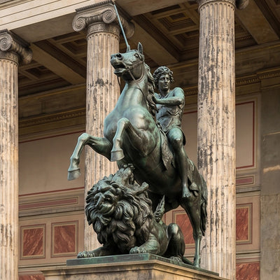
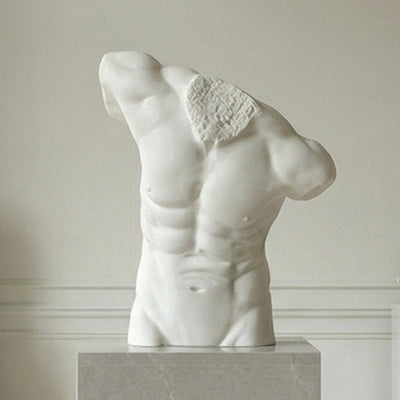
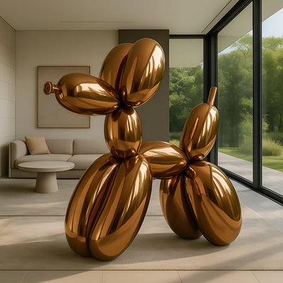
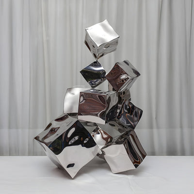
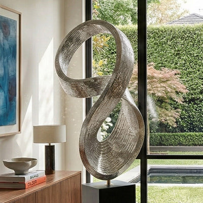
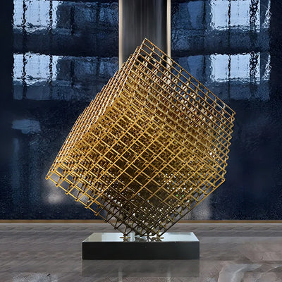
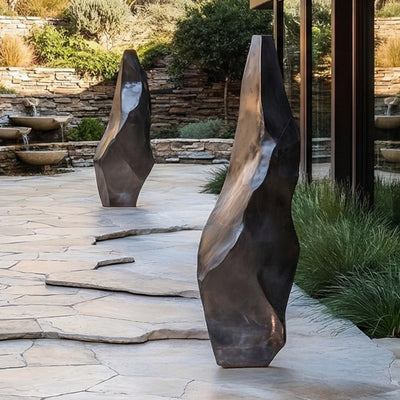
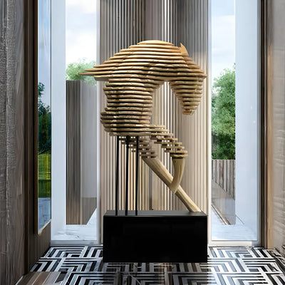
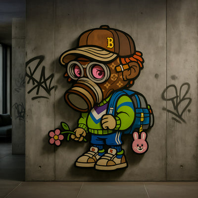
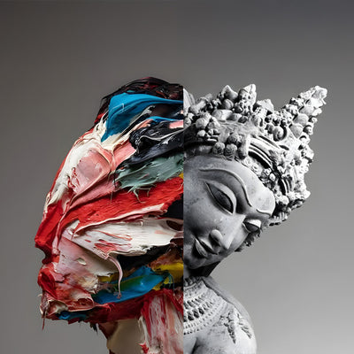
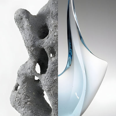
Now do the next useful thing: choose one decade, pick one simple subject, and finish one piece today. Export a clean version and a textured version, then post it, print it, or add it to your portfolio. If you want a real-world creative brief to practise with, take a look at Giant Sculptures for bold, high-impact visual inspiration you can translate into Retro Art poster layouts. If you want to move faster, create three variations using the same template and palette your Retro Art will start to look like a proper series, and that’s what gets attention, clients, and sales.