


Table of Contents
- Introduction - Why Matching Matters
- Understanding the Relationship: Table, Light & Wall Art
- Choosing Wall Art That Complements Your Table
- Matching Art with Lighting: What to Watch For
- Placement & Composition Strategies
- Styling Tips & Visual Flow
- Practical Considerations & Common Pitfalls
- Conclusion - Synchronized Dining Ambience
- FAQs
Introduction - Why Matching Matters
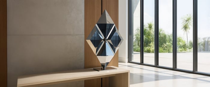
Your dining room wall art doesn’t exist in isolation, it interacts directly with your table and lighting. Think of the table as the heart of the room, lighting as the mood-setter, and art as the vertical presence that ties them together. When these three are aligned, the result is an atmosphere that feels intentional, welcoming, and elegant.
Matching, in this context, doesn’t mean everything should look identical; it means creating harmony in scale, proportion, and visual rhythm. The art should echo the energy of the table while responding to the play of light. In this article, we’ll cover how to choose dining room wall paintings that complement your table, how lighting affects art, placement strategies, and tips to keep the visual balance natural and cohesive.
Understanding the Relationship: Table, Light & Wall Art
Your dining room works as a visual ecosystem.
The table acts as a horizontal anchor - broad, stable, and central.
The wall art is the vertical counterpart, pulling the eye upwards and framing the gathering space.
The lighting (pendants, chandeliers, sconces) bridges these two, influencing how both the table and artwork are perceived.
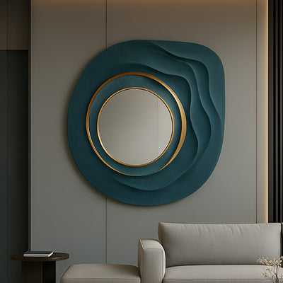
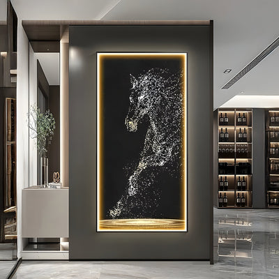
When wall art for dining rooms clashes with the table or lighting, the imbalance is obvious: a canvas that is too small looks lost above a large oak table, or a reflective framed piece placed under a harsh pendant light can appear washed out.
Core design principles come into play here:
Contrast prevents monotony.
Rhythm ensures repeating forms or colours guide the eye.
Proportion keeps artwork, table, and lighting in balance (a chandelier that’s too wide or artwork that’s too narrow will disrupt flow).
Light also has an underrated role - colour temperatures can soften or intensify tones, while glare or shadows can either enhance or ruin the viewing experience.
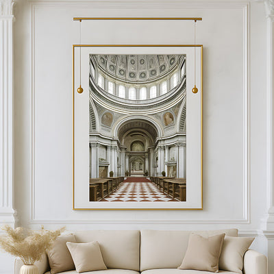
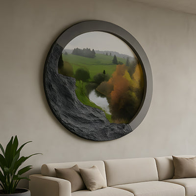
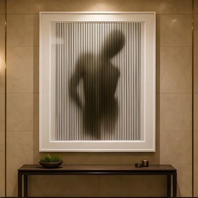
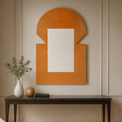
Choosing Wall Art That Complements Your Table
Selecting the right dining room wall art begins with proportion.
Scale & Proportion
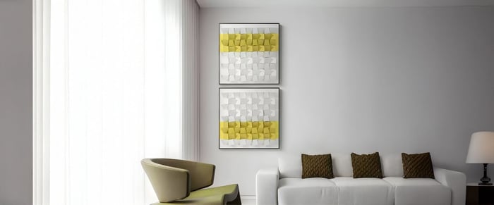
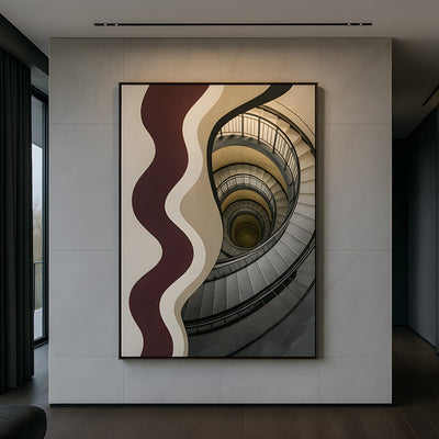
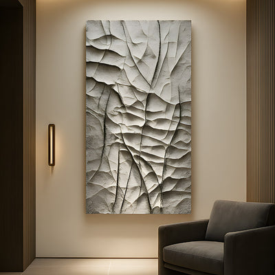
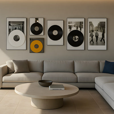
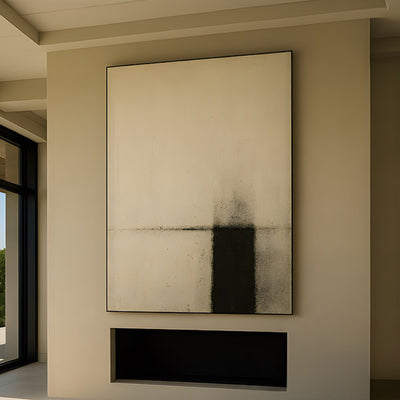
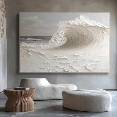
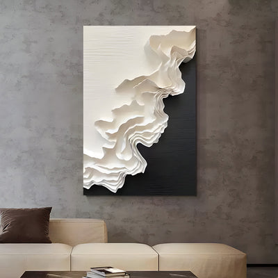
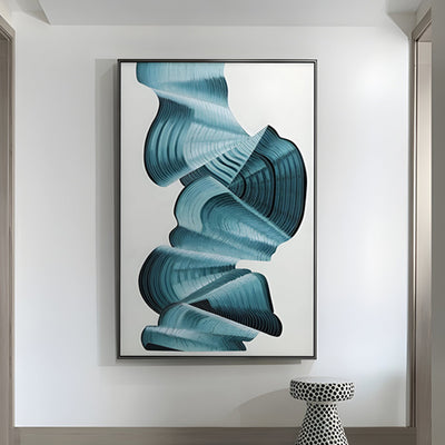
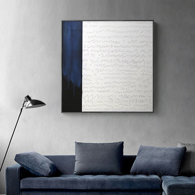
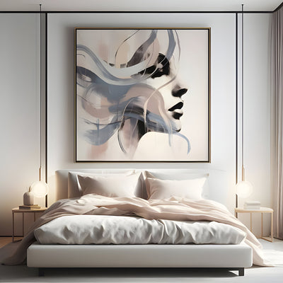
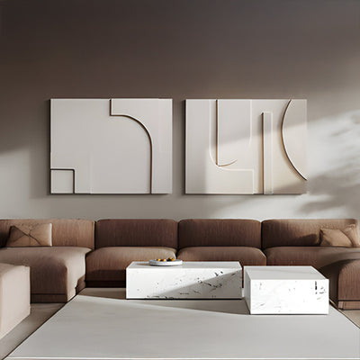
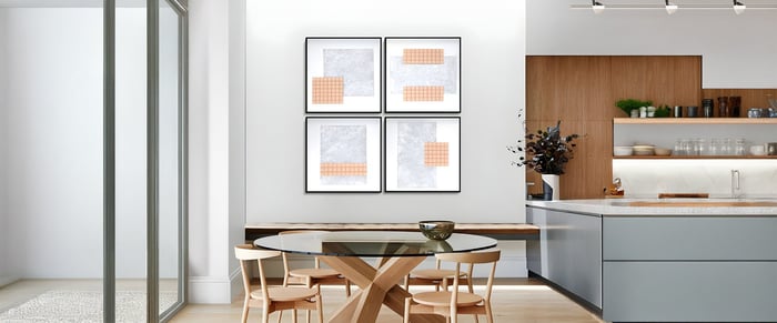
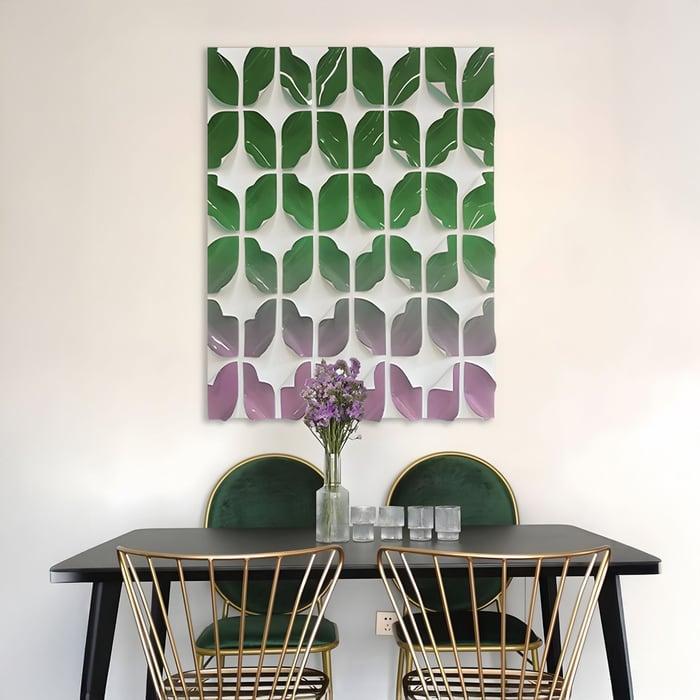
A good rule: artwork should measure about two-thirds the width of the dining table. This provides balance without overpowering the space. For smaller tables, vertical panels or narrow abstract art works well, while large dining room art pieces suit generous rectangular or round tables.
Style Harmony
Your table’s style should inform your choice of art:
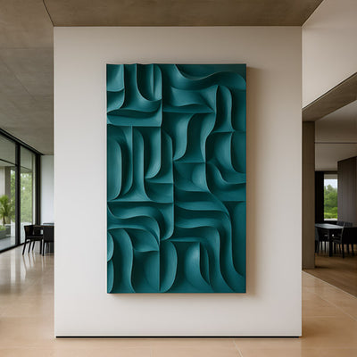
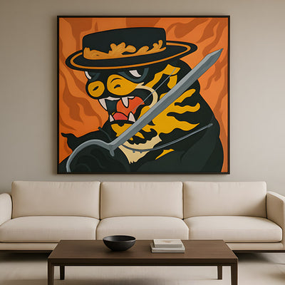
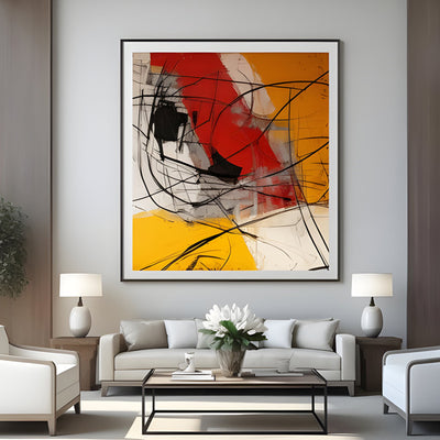
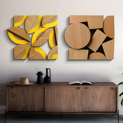
Modern tables pair beautifully with geometric art, canvas prints, or minimalist wood panels.
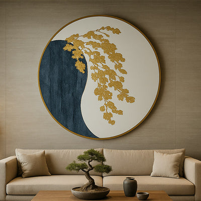
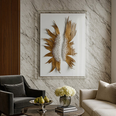
Traditional dining sets can handle landscape art or painterly dining room wall art.
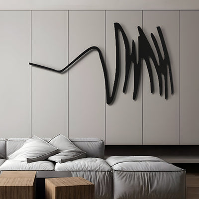
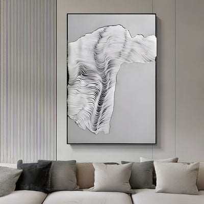
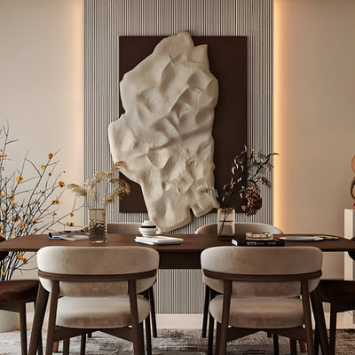
Industrial or rustic tables work well with textured or abstract art in muted earthy tones.
Material & Finish
Finish plays a critical role. Glossy art may clash with high-gloss tables under pendant lighting, whereas matte finishes reduce glare and work seamlessly with natural wood tables.
Colour & Tone
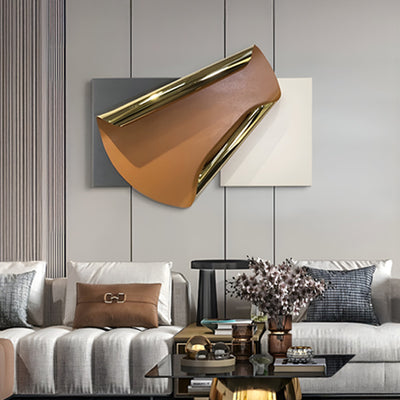
Pick tones that either complement the table or act as contrast. A walnut table benefits from cool-toned abstract art to balance warmth, while glass or marble tables look good paired with bold, colourful pieces.
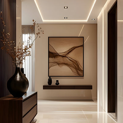
Framing Decisions
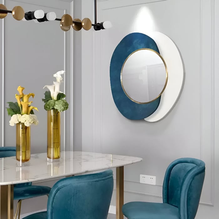
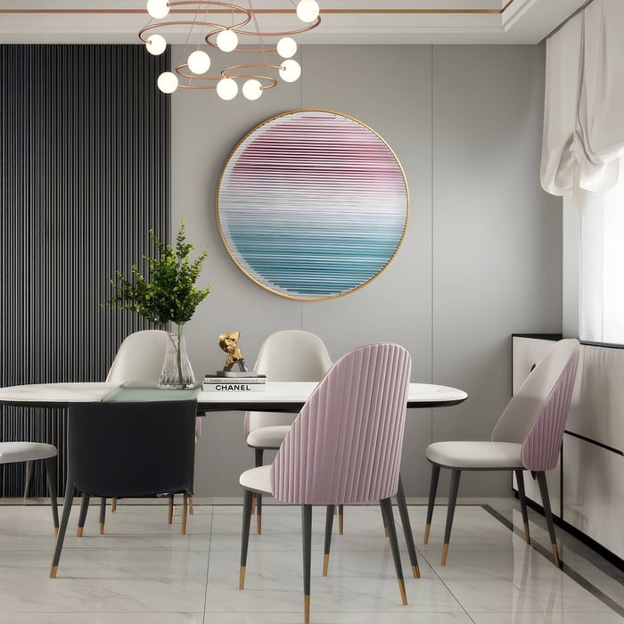
Match metal frames with chandelier finishes (brass, black, chrome). Frameless canvas art or floating frames keep things understated for Scandinavian-inspired spaces.
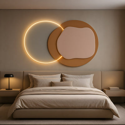
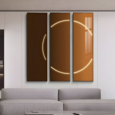
Matching Art with Lighting: What to Watch For
Lighting can make or break dining room wall art.
Directional Lighting
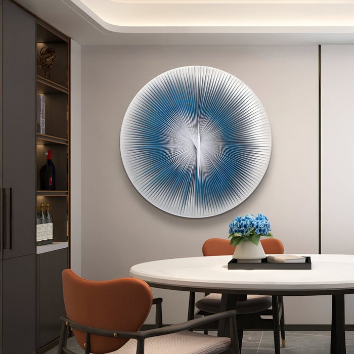
Use accent lighting to spotlight large art pieces. Picture lights or adjustable wall sconces are perfect for textured panels or abstract art.
Pendant / Overhead Interaction
Pendant lights above dining tables are common, but beware of glare. Low-hanging glass pendants may reflect into glossy framed artworks, while matte abstract art will diffuse light gently.
Colour Temperature & Bulb Choice
Warm white bulbs (2700–3000K) enhance earthy, muted art. Cooler bulbs may flatten warmer tones but can boost blue, grey, and geometric art.
Layered Lighting
Use a combination: ambient overhead light, wall sconces for depth, and a pendant or chandelier as the centrepiece. This ensures your wall art is never lost in shadows.
Height & Angle
Keep art high enough to avoid pendant interference, and angle directional lighting slightly downward to reduce glare.
Placement & Composition Strategies
Good placement brings dining wall décor lighting and art into harmony.
Height: Hang dining room wall art so the centre is at eye level (145–155 cm). If centred above the table, adjust height based on chandelier drop.
Alignment: Centre art with the table or create an offset cluster if your table is longer than the artwork.
Breathing room: Leave space on all sides. Avoid cramming art into corners or competing with sconces.
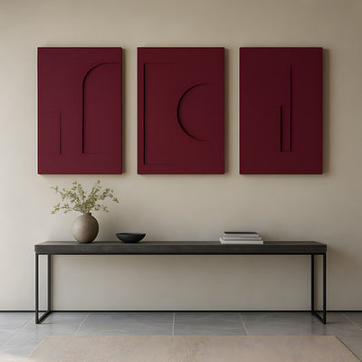
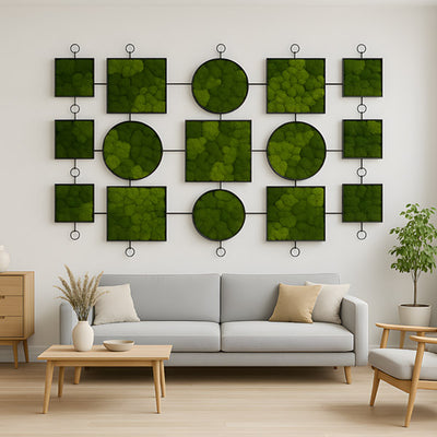
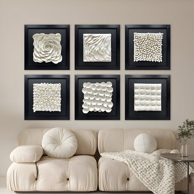
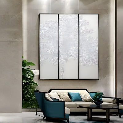
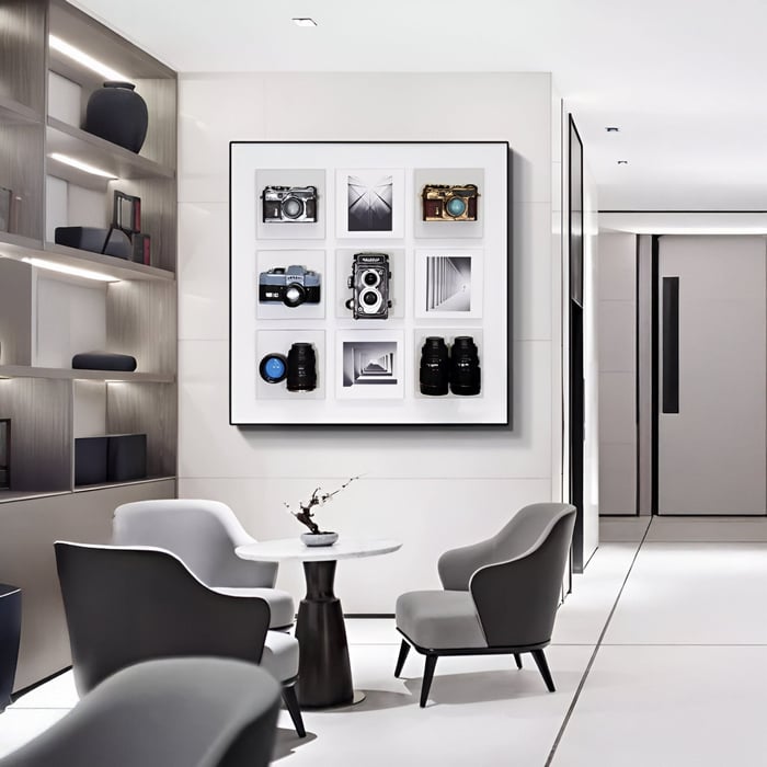
Pairing multiples: Try diptychs or triptychs aligned with table length. Multiple small abstract art pieces can form a gallery wall above a rectangular table.
Anchoring décor: Repeat colours from the art in your runner, centrepiece, or rug. This ties the space together effortlessly.
Styling Tips & Visual Flow
Styling is about maintaining balance.
Rhythm & Repetition: Echo chandelier shapes (circles, lines) in geometric art. Repetition creates flow.
Contrast & Texture: If your table is rustic wood, pair it with bold, smooth modern paintings. If the table is sleek glass, add depth with textured wood art panels.
Focal Balance: Don’t let both chandelier and artwork compete. If you have a bold chandelier, go softer on the artwork, and vice versa.
Seasonal Refresh: Rotate smaller dining room art ideas, like muted canvas in winter and brighter abstract paintings in summer, to keep the dining area fresh.
Practical Considerations & Common Pitfalls
Avoid conflict with sconces: Don’t let them cast uneven shadows over artwork.
Glare issues: Skip reflective frames near strong pendants.
Narrow spaces: Use vertical panels or slim geometric art for small dining rooms.
Test lighting: Check how art looks during day vs night before permanent hanging.
Securing artwork: Large dining room wall paintings should be anchored properly - dining rooms are high-traffic spaces, and vibrations from movement may loosen fixtures over time.
Conclusion - Synchronized Dining Ambience
Dining room wall art completes the story of your table and lighting. When chosen and placed with care, it does more than decorate; it anchors the dining space, enhances mood, and sparks conversation. Think about proportion, light, and material together, not separately.
Start small: match one painting to your table and pendant and observe the transformation. With the right choices, dining rooms evolve from functional spaces into memorable settings for meals and connection.
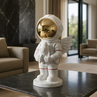
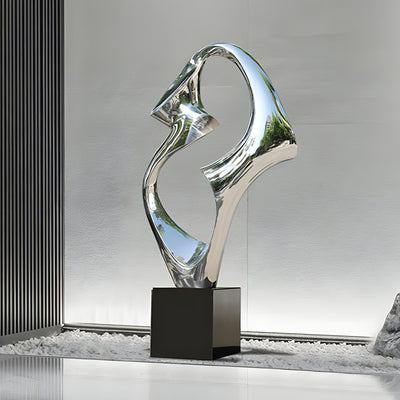
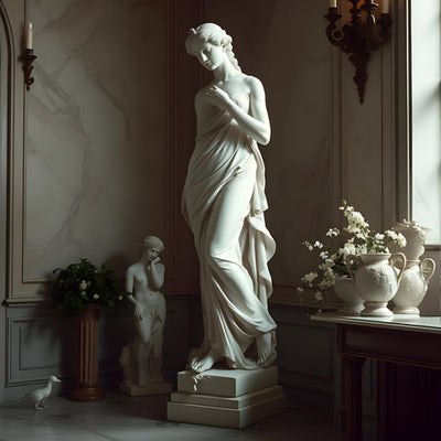
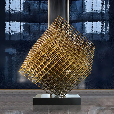
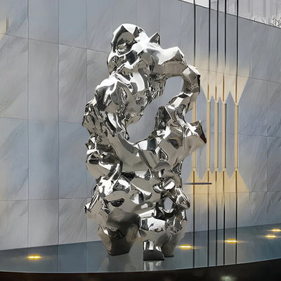
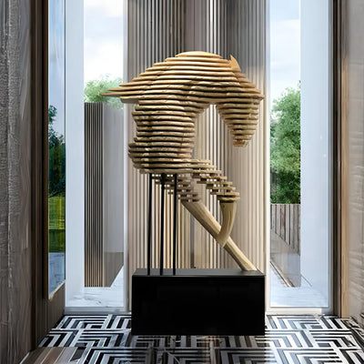
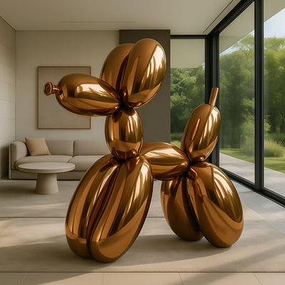
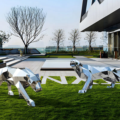
For inspiration, explore the curated dining room art collection at Giant Sculptures and find pieces that bring balance, warmth, and personality to your home.
FAQs
How high should I hang dining room wall art?
Centre at eye level, usually 145–155 cm from the floor.
Can I use large artwork if my pendant light is low?
Yes, but keep the art’s top edge lower to avoid competing visually.
What colour temperature is best for showcasing dining room art?
Warm white (2700–3000K) enhances most dining wall décor.
Is gallery wall style suitable above a dining table?
Yes, but keep spacing even, and treat the group as one composition.
Should art lighting be on a separate dimmer?
Ideally, yes. A dimmer allows you to shift focus between table and art depending on occasion.