


Table of Contents
- Introduction - The Healing Power of Acrylic Art & Colour
- Colour Psychology Fundamentals: What Different Hues Do
- Why Acrylic Art Works for Colour Therapy
- Choosing Acrylic Wall Paintings for Specific Emotional Goals
- Placement, Lighting & Display: Enhancing the Therapeutic Effect
- Styles & Techniques: Acrylic Trends That Enhance Mood
- Care & Maintenance: Keeping Your Colour Therapy Alive
- Conclusion - Transform Your Walls, Transform Your Mood
- FAQs
Introduction - The Healing Power of Acrylic Art & Colour
Our surroundings influence mood more than we often realise. The colours and textures that surround us in our homes and workplaces play a direct role in how we feel, focus, and connect with others. Enter acrylic art: bold, versatile, and endlessly expressive. When combined with the science of colour psychology, acrylic paintings can shift the atmosphere of a room, acting almost like therapy on your walls.
Acrylics are particularly well-suited to this purpose because of their vivid pigments, quick drying times, and adaptability. Artists can layer, blend, glaze, and texture to create anything from soft gradients to energetic brushstrokes. In this article, we’ll explore how different colours affect mood, why acrylic art is so powerful in colour therapy, and how you can style, place, and maintain pieces that bring harmony and energy to your space.
Colour Psychology Fundamentals: What Different Hues Do
Colour therapy isn’t new—it’s rooted in centuries of belief that colours influence human behaviour. Modern psychology confirms many of these associations.
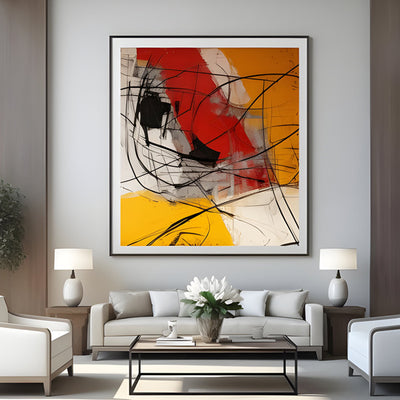
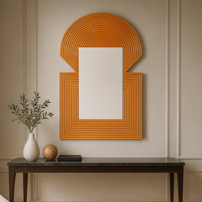
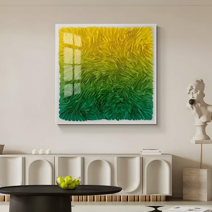
Warm colours (reds, oranges, yellows): These hues stimulate energy and passion. Red can feel intense and energising, while orange brings sociability, and yellow sparks optimism and creativity.
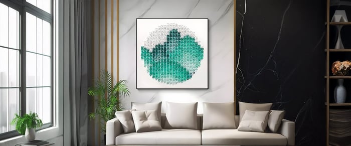
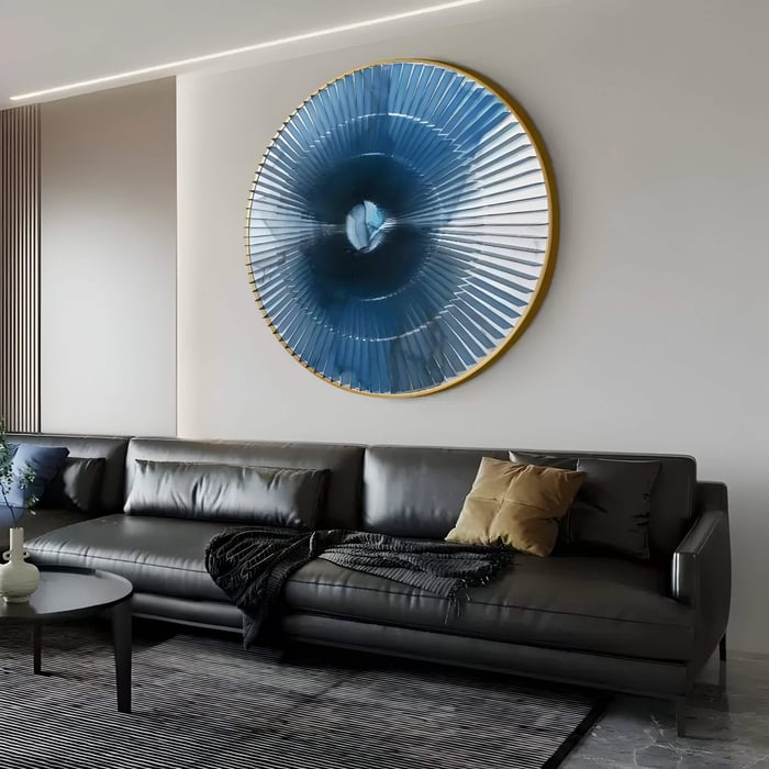
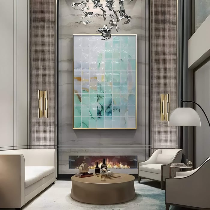
Cool colours (blues, greens, purples): These tones calm the nervous system. Blue is often associated with trust and serenity, green with renewal and balance, and purple with introspection.
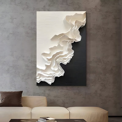
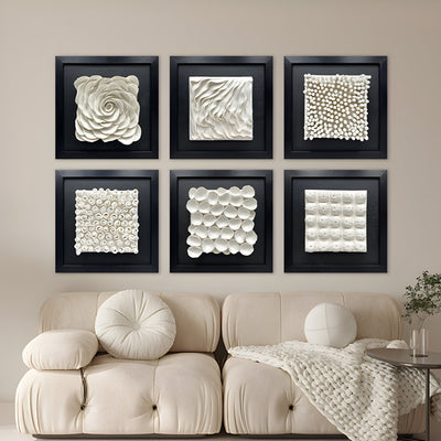
Neutrals (white, beige, grey, black): These provide grounding. They can either balance bold tones or stand as minimalist backdrops in their own right.
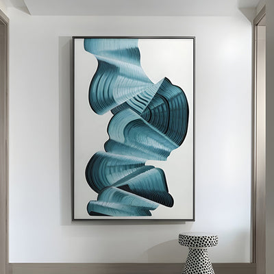
Tone and saturation matter as much as colour choice. For example, pastel acrylic paintings in pale blue feel calming, while vibrant acrylic abstract art in cobalt or sapphire adds dramatic focus. Similarly, muted greens soothe, while bright lime invigorates.
Colour combinations also shift perception: pairing complementary tones (like blue and orange) creates balance, while monochromes emphasise harmony and focus. Understanding these basics is the foundation of choosing acrylic wall art that works as colour therapy.
Why Acrylic Art Works for Colour Therapy
Acrylics are unique in their ability to hold strong, pure colours while also being manipulated into translucent or textured finishes. This makes them ideal for artworks intended to shift mood.
Pigment intensity: Acrylics carry brilliant, saturated hues, ensuring both calming and energetic acrylic paintings remain vivid.
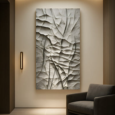
Versatility in technique: Artists can create smooth gradients, sharp lines, or impasto-style textured acrylic wall paintings. The medium allows both subtle and bold expressions.
Durability: Compared with some natural pigments, acrylic colours are less prone to fading, meaning their therapeutic effect lasts longer.
Layering ability: Acrylics dry quickly, allowing artists to glaze or layer multiple colours, creating depth and complexity that influences the emotional impact of the piece.
Simply put, acrylic art is one of the best mediums for expressing the psychological and emotional nuances of colour.
Choosing Acrylic Wall Paintings for Specific Emotional Goals
Every space in your home has its own mood. Acrylic wall art can be chosen intentionally to support those moods:
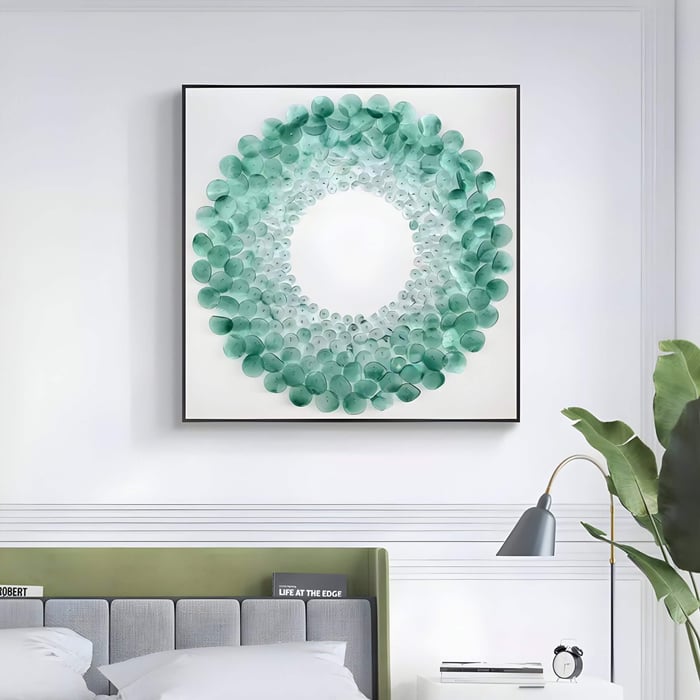
Calm & Serenity
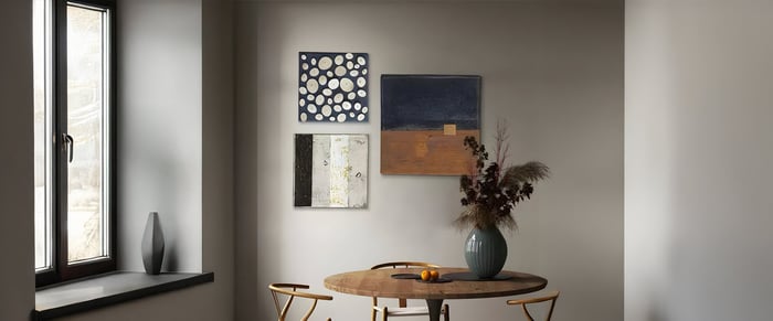
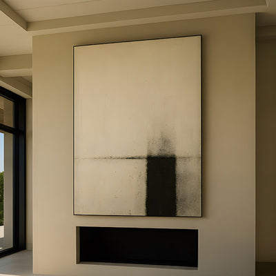
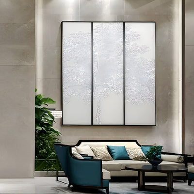
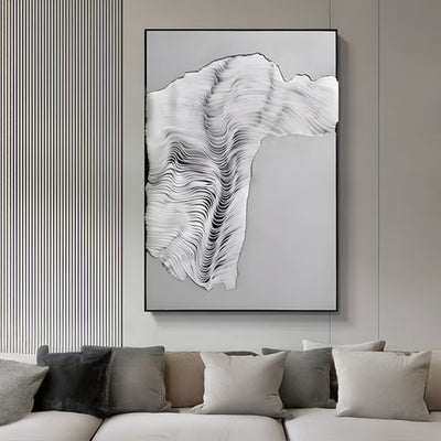
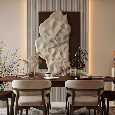
Opt for pastel acrylic paintings in soft blues, sage greens, or neutral creams. These work beautifully in bedrooms or dining spaces, where relaxation is essential. Textured pieces that mimic rippling water or soft gradients enhance a sense of calm.
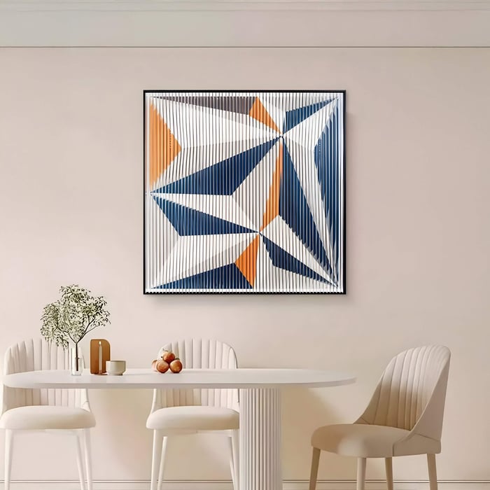
Energy & Creativity
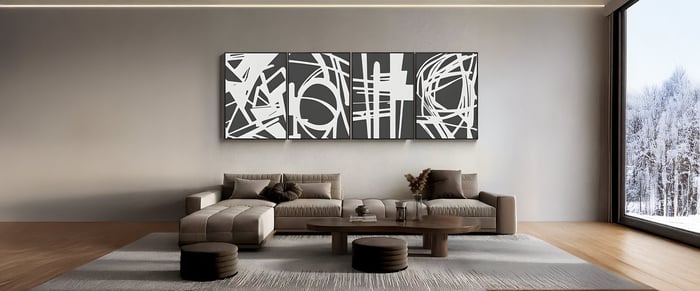
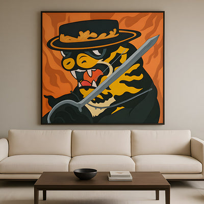
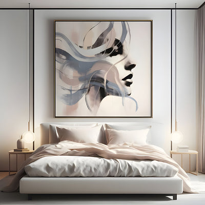
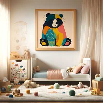
For home offices, studios, or living rooms, energetic acrylic paintings with warm tones - reds, oranges, and yellows, add vibrancy. Vibrant acrylic abstract art with dynamic brushstrokes can inspire brainstorming and conversation.
Balance & Harmony
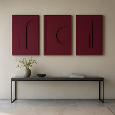
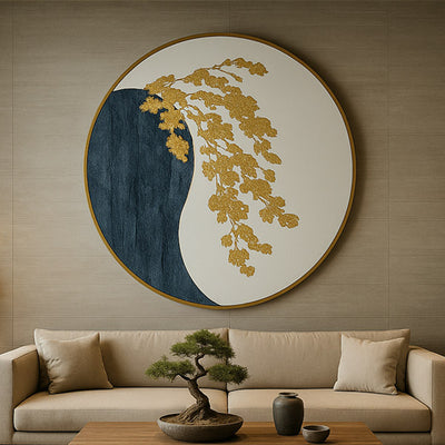
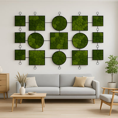
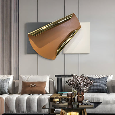
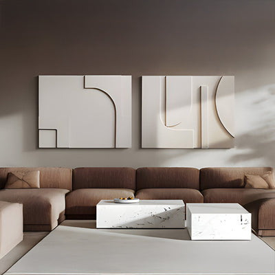
Earth tones, like terracotta or muted browns, paired with soft greens or blues, provide a grounded feeling. These are excellent in multifunctional rooms, such as open-plan living spaces, where activities range from relaxation to socialising.
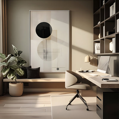
Focus & Clarity
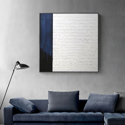
Monochrome colour schemes in cool shades, often seen in minimalist acrylic wall art, are perfect for study areas. Clean edges and uncluttered compositions help reduce distraction and sharpen concentration.
By aligning acrylic colour therapy with your goals, you can turn each room into a space that truly supports your lifestyle.
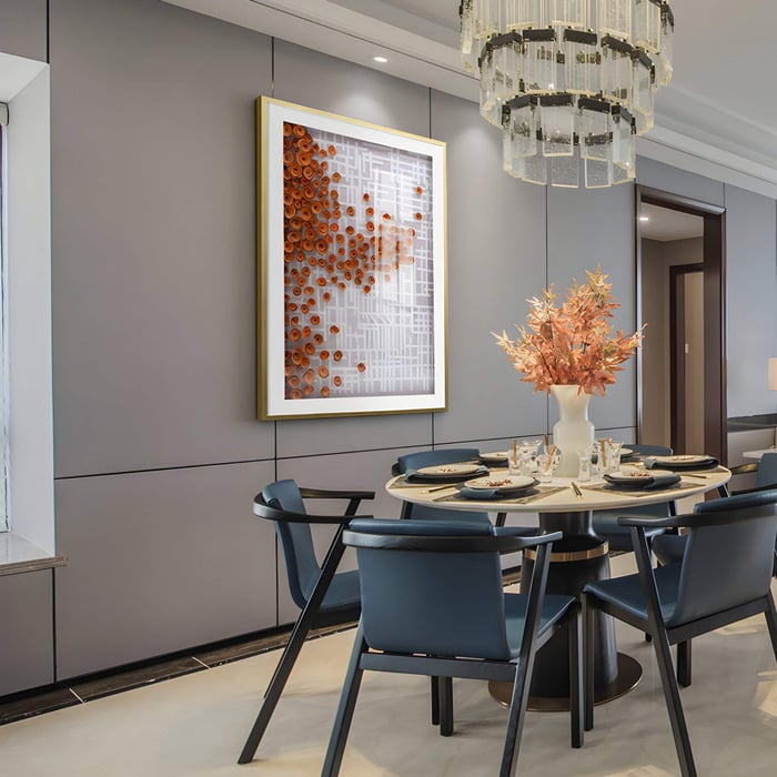
Placement, Lighting & Display: Enhancing the Therapeutic Effect
Placement determines whether your acrylic wall art has the impact you want.
Best locations:
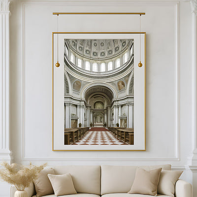
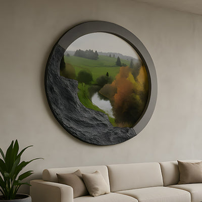
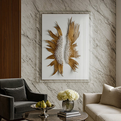
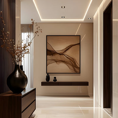
Living rooms: use colourful acrylic wall art above sofas or mantels for social energy.
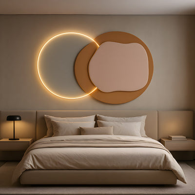
Bedrooms: opt for calming acrylic art near the headboard for restful ambience.
Workspaces: place bright wall paintings opposite desks to boost creativity.
Lighting: Natural light brings out true colours, but warm artificial light can enhance pastels and make textured acrylic wall paintings glow. LED spotlights work well for vibrant pieces, while diffused lighting suits calming works.
Size & proportion: Large walls benefit from oversized pieces or multiple panels. Small rooms suit compact 3D art or grouped collections.
Background harmony: Consider your wall colour. A navy wall may enhance a pastel painting, while neutral walls make vibrant pieces pop.
Correct placement and thoughtful lighting ensure that your acrylic wall art works in harmony with your décor while maintaining its therapeutic effect.
Styles & Techniques: Acrylic Trends That Enhance Mood
The medium itself offers diverse styles, each contributing differently to colour therapy.
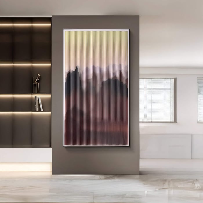
Fluid / Pour Acrylics: Flowing, organic forms create soothing, mesmerising visuals. Great for relaxation and dining rooms.
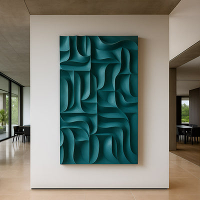
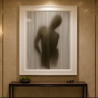
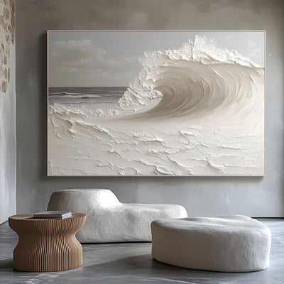
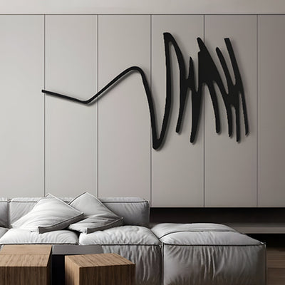
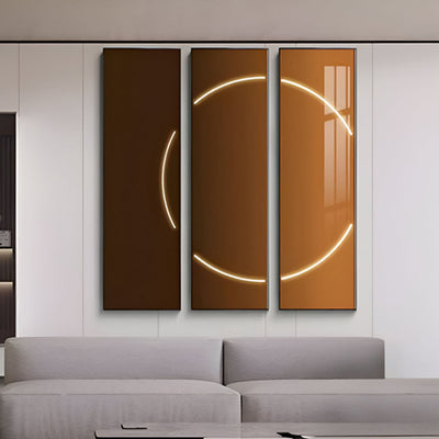
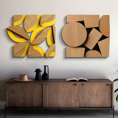
Abstract & Textured Acrylics: Bold strokes and impasto textures add depth and energy, making them excellent as living room art.
Mixed Media & Layered Acrylics: Combining acrylics with plaster, fabric, or metallics creates mood-rich, dimensional works.
Minimalist gradients and colour blocks: Soft transitions or blocks of muted tones are ideal for clean, calming interiors.
Each technique has its own emotional resonance. For example, a textured acrylic wall painting in warm earth tones feels grounded and rustic, while pastel acrylic paintings with soft gradients feel airy and contemplative.
Care & Maintenance: Keeping Your Colour Therapy Alive
Acrylics are relatively low maintenance, but a few steps help preserve their vibrancy:
Routine cleaning: Dust gently with a soft, dry cloth.
Avoid direct sunlight: While acrylics are durable, prolonged exposure can still cause fading over decades.
Protective coatings: Varnishes or UV-protective sprays help extend the life of vibrant tones.
Moisture management: Avoid damp environments for stretched canvas; if necessary, use a dehumidifier.
Occasional refresh: Professional varnish reapplication can restore brilliance if colours appear dull.
Well-maintained, colourful acrylic wall art can remain vibrant for decades, ensuring your investment in colour therapy continues to support your mood.
Conclusion - Transform Your Walls, Transform Your Mood
Acrylic art isn’t just décor, it’s a tool for shaping how you feel at home. Through colour psychology and acrylic colour therapy, you can curate walls that energise, calm, focus, or inspire creativity. From pastel acrylic paintings that soothe, to vibrant acrylic abstract art that sparks energy, the medium’s versatility makes it uniquely powerful.
View your walls not just as surfaces, but as opportunities for healing, reflection, and connection. By intentionally selecting and placing acrylic art, you transform spaces into environments that nurture both mood and wellbeing.
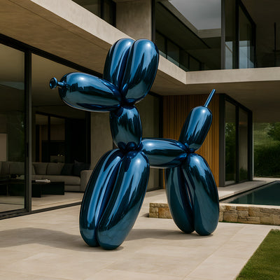
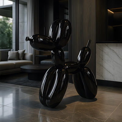
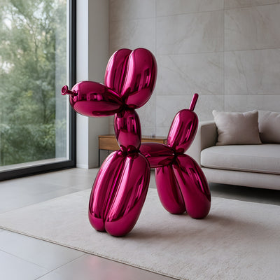
Explore curated collections of acrylic wall art at Giant Sculptures to discover colourful, mood-enhancing pieces tailored for your home.
FAQs
Can acrylic art really affect mood long-term?
Yes. Consistent exposure to colour psychology through acrylic art can create lasting mood associations.
Which colours are best for bedrooms vs living rooms?
Bedrooms suit calming blues and pastels, while living rooms thrive with vibrant reds, oranges, or abstract acrylics.
Do I need professional lighting to get the full effect?
Not always. Natural daylight works beautifully, but adjustable lamps and warm lighting can enhance specific moods.
How do I mix acrylic paints to get soothing tones?
Blend high-pigment acrylics with white or neutral shades, layering glazes to soften bold colours into therapeutic pastels.